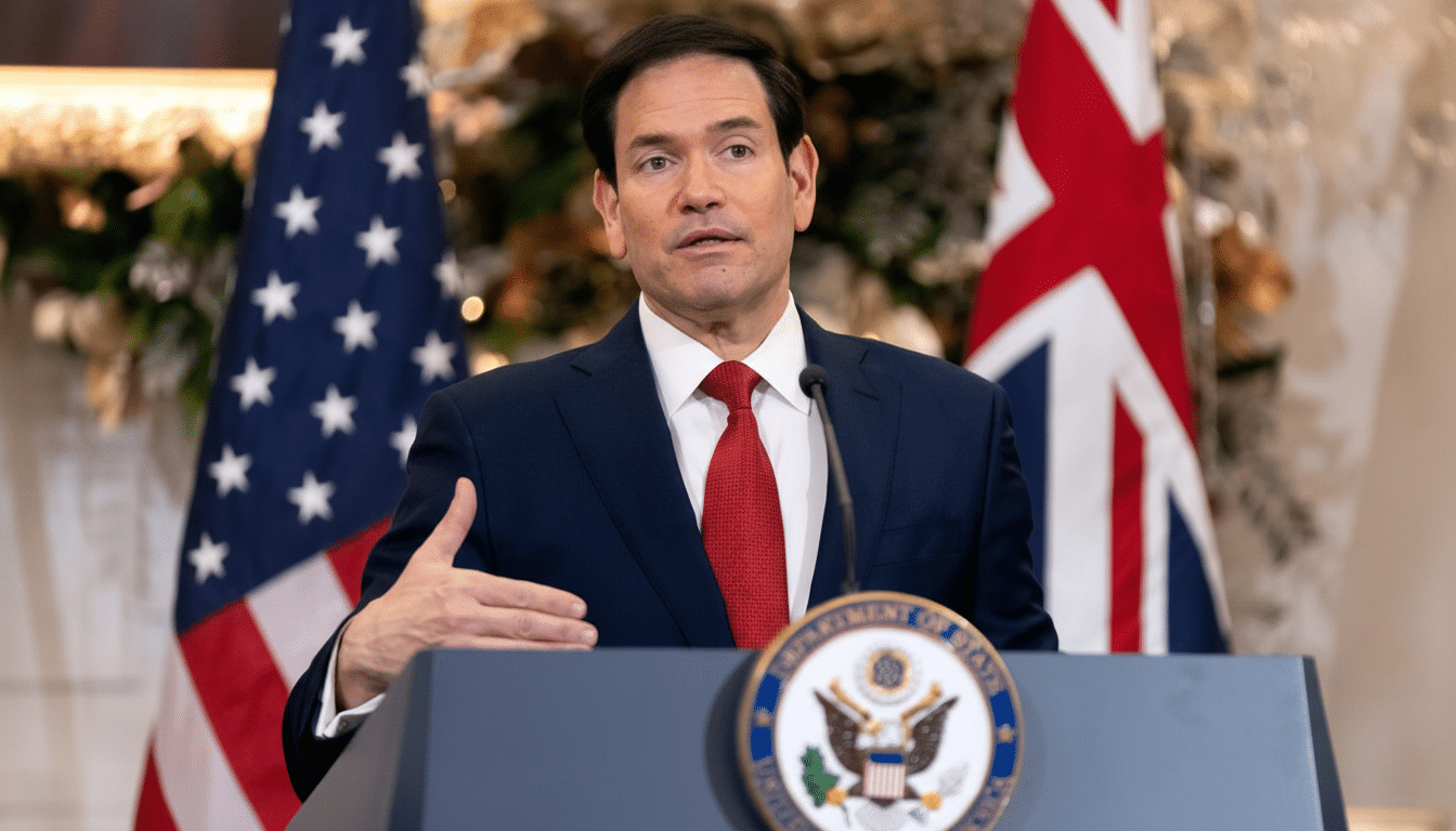
U.S. Secretary of State Marco Rubio has directed the State Department to replace Calibri with Times New Roman, casting the former sans-serif typeface as representative of diversity, equity, inclusion and accessibility efforts he is undoing at the department. The move, first reported by The New York Times after it obtained a memo laying out the decision, came in an effort to “restore decorum and professionalism” to official correspondence, Rubio said.
The memo and the reasoning behind the font shift
Rubio’s directive reversed a 2023 switch that had made Calibri the department’s new default font. That prior move, which was led by the department’s DEIA office, prioritized screen readability and accessibility for staff and global audiences. And the office has now been disestablished as part of larger anti-DEI directives, and the memo positions the font change as one step in restoring traditional norms to diplomatic writing.
- The memo and the reasoning behind the font shift
- Accessibility stakes and the studies cited by advocates
- A wider signal on DEI and institutional identity
- Practical effects for diplomats across the department
- How other institutions treat fonts in policy and practice
- What to watch as the State Department enforces the change
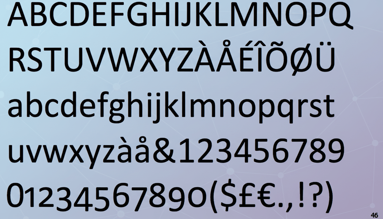
While Rubio acknowledged Calibri was not the “most illegal, immoral, radical and wasteful” expression chosen in service of DEI (it is hard to argue with that), he argued its use helped lead to the “degradation we are seeing in official communications.” The Times New Roman font, long the standard for writing serious government and legal documents, is now enshrined as the must-use typeface for cables, memos and any other kind of official internal correspondence.
Accessibility stakes and the studies cited by advocates
Typography is more than just a matter of aesthetics. Accessibility proponents have been urging agencies to think about legibility for people with dyslexia, low vision and all kinds of different screen conditions. The International Dyslexia Association has estimated that as many as 15–20% of people exhibit symptoms of dyslexia — a huge portion of a general-audience document format.
With screens, many digital design guidelines favor sans-serif typefaces. The U.S. Web Design System (which is widely deployed across federal websites) defaults to a sans-serif family and advocates for a minimum of 16px as the base font size. Meanwhile, evidence on serif vs sans readability is mixed: research referenced by accessibility advocates and Nielsen Norman Group indicates that differences in overall legibility are small with appropriately sized/tight/contrasted designs.
Importantly, the Web Content Accessibility Guidelines do not specify a font but rather focus on contrast, scalable text and clear hierarchy. The Rehabilitation Act’s Section 508 mandates accessibility of communications, but it also grants agencies wide discretion in how to achieve those goals. In reality, however, many have opted for sans-serif on screens and serif in print-intensive workflows.
A wider signal on DEI and institutional identity
Within government, fonts can often become shorthand for institutional identity. The 2023 switch from Calibri was to be accompanied by a suite of inclusive design standards intended to accommodate aging readers, non-native English speakers and varied display quality in embassies. By linking Calibri with DEI, Rubio’s memo turns a technical setting into an overtly political statement, one that aligns the department with the administration’s broader rollback of diversity-branded initiatives.
The move is yet another illustration of how culture-war flashpoints can flare at the level of administrative minutiae. What starts as a readability tweak can turn into a referendum on values, even though the underlying evidence is too thin to specify or prescribe just one true path, given medium and audience.
Practical effects for diplomats across the department
More than symbolism is at stake with the move, which will require retooling of thousands of templates for cables, letterhead and briefing product. Posts abroad will have to revise styles in shared drives, secure messaging platforms and translation memory tools. Times New Roman is everywhere, and license-free — so at least if you decide to go with the most readily available typeface in the English-writing world, your units won’t have trouble procuring it, so long as consistency-looming admins take nothing from this book besides a few chuckles.
From the user end, Times New Roman tends to print well and has good support on low-end systems (useful for hard copies of notes and treaty documents).
On a very high-resolution (e.g., modern HD) screen, sans-serif families can render more legibly at small sizes. The trade-off is that the department may have to rely more on font size, spacing and contrast to keep a document readable without Calibri.
How other institutions treat fonts in policy and practice
The federal judiciary often requests 14-point Times New Roman or the equivalent in filings, which suggests a focus on print-based norms. Meanwhile, civilian agencies and public websites with a connection to the U.S. Web Design System have settled on sans-serif for digital properties. In the proprietary segment, Microsoft replaced Calibri as its default with Aptos in 2023, claiming it was optimized for modern monitors and global script support.
These examples reinforce a practical divide: the reign of serif is unchallenged where print and tradition hold sway, whereas sans-serif rules in screen-first environments. Both approaches can meet accessibility guidelines as long as size and weight, spacing and color contrast are all taken into account.
What to watch as the State Department enforces the change
The State Department has not publicly outlined the timelines or exceptions for providing accessible accommodations. Disability advocates and unions could push to include that flexibility under Section 508 in particular, as some workers may need sans-serif fonts on screen. Oversight entities, like the Government Accountability Office, typically evaluate outcomes, not font arrangements, but a rise in accessibility complaints could complicate what is expected to be a messy rollout.
For now, the memo sets a decisive course: diplomatic writing is going to hew more traditionally, even as the department’s readership becomes more globalized, digitized and demographically diverse. Whether that visual shift will make “decorum” better while keeping the fonts highly legible will be assessed less in rhetoric than in the daily ease with which users parse the cables and briefs necessary to keep U.S. diplomacy going.