Google’s Pixel Watch app will now look different enough from other Wear OS watch apps that you’ll actually be able to tell the difference. New icon, total layout refresh in Material 3/Expressive style, and a story-style carousel bringing key features like Fitbit and Wallet to the front.
What’s new in Pixel Watch app version 4.1 for Android
The first thing you’ll notice is the change to your app drawer, with that classic four-color watch icon gone and replaced by a blue-and-purple graphic of a watch that actually shows off some details of its case, crown, and band.
- What’s new in Pixel Watch app version 4.1 for Android
- Material 3 design goes fully Expressive in this update
- Onboarding that actually helps surface key features
- A streamlined Pixel Watch experience across devices
- Rollout and availability for the Pixel Watch app update
- Why it matters for Wear OS users and Pixel Watch owners
Material 3’s “Expressive” design even gets a shoutout in the pill-shaped watch hands, bringing the app into harmony with recent changes to Google’s Clock utilities like Alarm, Timer, and Stopwatch.
Within the app, a swipeable story-style carousel appears on top of the main screen. It showcases those key features—Fitbit health tracking, Personal Safety tools, Gemini assistance, and Google Wallet—you’d hope would educate someone new to this device as well as help returning users rediscover what that thing on their wrist can do without having to repeatedly poke through menus.
Material 3 design goes fully Expressive in this update
Menus and settings are full of Material 3’s Expressive containers—rounded cards, clearer grouping, and improved spacing that makes it easier to scan.
An example of the new design elements in Android settings picture-in-picture windows.
- Faster, more stable performance: The OS has an average 1.7x faster startup time when restarting your Android device with currently running apps on Pixel devices versus five popular smartphones’ launchers.
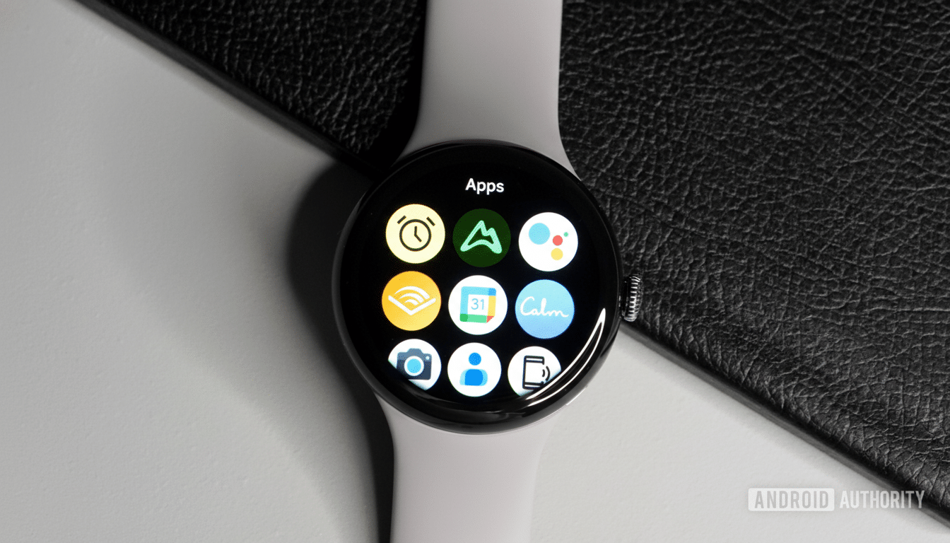
The splitter control will help you split explicit width or dynamically calculated width while resizing at runtime. Tiles get the same treatment in the management screen, with each tile assigned a more clearly identifiable container and a visual hierarchy that results in fewer mis-taps and less fiddly reordering.
This is not just a new coat of paint. The Material Design direction is all about hierarchy, readability, and animation to emphasize meaning. In practice, the revamped Pixel Watch app deploys bolder color accents and more generous padding to visually pop key actions—a tweak that’s particularly beneficial on smaller screens and in quick-glance scenarios like those we frequently encounter with wearables.
Onboarding that actually helps surface key features
Story-style carousels are more and more popular to decrease setup friction. In the sequence here, it’s more about funneling users into high-value features—connecting to Fitbit for metrics like resting heart rate and sleep stages, turning on the Personal Safety feature Emergency SOS, setting up Gemini for voice help, or adding cards to Wallet for tap-to-pay. Clear, first-run education also tends to lift feature adoption, and Google’s design research advocates surfacing benefits at the moment of need.
For instance, surfacing Wallet during onboarding eliminates the need to dive into deeper settings later, and it matches the flow that watch users encounter. That consistency shortens the learning curve and lessens support requests for common tasks, like payments and tile management.
A streamlined Pixel Watch experience across devices
This app update, along with the one coming to Fitbit’s watch devices and app, links up the phone experience of the Pixel Watch to what you get on its round face and in the Fitbit fabric. Google has been rolling Material 3 out across its core apps over the last year—Gmail, Calendar, Maps, and other software all bear a familiar look that’s also present in MD2. Extending that to the Pixel Watch app would create one design language from setup, use, and health tracking.
The new iconography also helps to reduce brand fragmentation. By matching the watch illustration and color scheme to various first-party tools, people can recognize Google apps at a quick glance—which is convenient when you’re sorting through alerts and rapid tap-through moments while on the move.
Rollout and availability for the Pixel Watch app update
The update is available now on the Play Store as version 4.1 with a staged rollout in place, so you may not see it right away. If it hasn’t reached your device, head to the app’s info page or wait for the automatic update. It’s a refresh for all supported Pixel Watch models connecting to Android phones.
Early sightings of the redesign were noted by 9to5Google, and the changes align with the larger Material Design direction of Google’s design team. More polish should make its way to the rollout in the next few weeks.
Why it matters for Wear OS users and Pixel Watch owners
Little interface decisions add up
One at a time, small interface decisions can accumulate when you’re navigating a smartwatch. Under Plexiglas, brighter accents, clear containers, and a more informative home screen all work together to help cut down on the time it takes to tweak settings, rearrange tiles, or find new features you may not have even known were there. In brief: fewer taps, quicker results, and a Pixel Watch experience that at long last looks and feels cohesive from start to finish.