Samsung’s next interface update is flirting with a dramatic visual change. Earlier One UI 8.5 test builds have shown us app icons edging toward a gradient, raised effect with drop shadows draped liberally all over the shop — and instant parallels to TouchWiz’s glossy days on the S6 came flooding through as soon as we clapped eyes on that new style of icon design. The shift has set off a lively debate among the company’s old guard, who recall when skeuomorphic flourishes defined Samsung’s visual look.
What’s New in One UI 8.5 Icon Design Changes
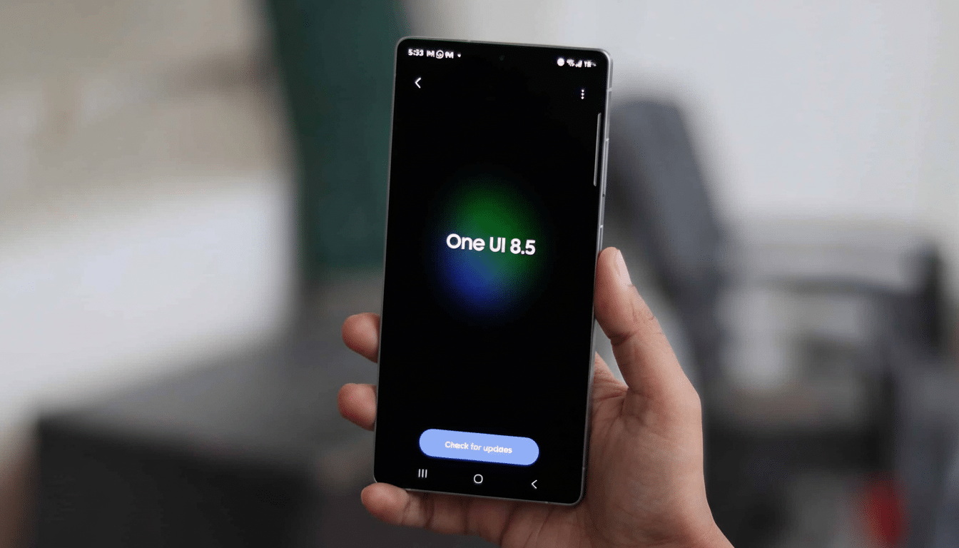
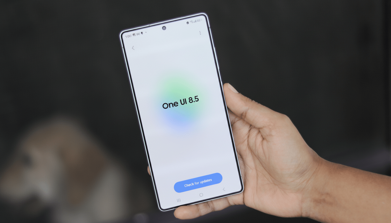
Leaked images posted by popular tipster Ice Universe on Weibo suggest there are systemic icon changes baked into One UI 8.5. And in place of the trend toward flat, pastel shapes for icons that many apps and phone makers have gone with lately, app icons now come across as being gently elevated, with soft shadows providing a 3D-like result. Importantly, the treatment is uniform between system apps and popular third-party apps such as YouTube and the Play Store, suggesting that Samsung is using a blanket mask or style, rather than hoping for app-by-app adoption.
These updated icons match other details we've seen in a new build that’s on the way, like more defined “bubbles” within the Settings app. Much of this is signaling a broader design pivot to favor depth and layered cues, rather than the consistently flat motifs that have pervaded much since the Material Design wave.
A TouchWiz Throwback, Minus the Gluttony
Veteran Samsung owners will sense the vibe. The beveled edges were the icing on the cake for everybody chuckling at mid-2010s TouchWiz’s generous application of beveling, flat-design gradients, and shadows. The One UI 8.5 approach seems more restrained — less gloss, subtler parallax and shadowing — as the wider industry reverses away from flatness. Glassy, vision-style effects on all platforms and a renewed hunger for tactile cues indicate that skeuomorphism never died; it just learned to mind its P’s and Q’s.
There’s usability logic here. Studies, of course, have long pointed to the fact that dimensional cues can enhance recognizability and touch targeting for less technically savvy users (such as this one from the Nielsen Norman Group). Some of the “popping” icons may mitigate visual confusion in a busy home screen, perhaps even at smaller sizes or under daylight conditions.
Performance and Battery Concerns in One UI 8.5
Not everyone is cheering. Early testers, including Ice Universe, have noticed higher battery drain on pre-release builds. Leakage may not be the culprit, but effects that focus on depth (as if you’re looking behind objects) and more elaborate animations both contribute to a heavier GPU load. Android developer guidance has stressed time and again the perils of blurry shadows and multi-layered compositions that may balloon render times (translation: potential #jank) unless we’re on top of our game, as well as determining how lightweight memory requirements are to draw power.
Context matters: beta firmware does not yield the same level of performance as final, release-candidate firmware, and Samsung continues to fine-tune the performance. Anticipate iteration on compositor behavior, shadow radius, and animation timings before shipping. If indeed the effect is as shown, perhaps there could be a toggle to reduce icon depth, or an Accessibility option that would flatten visuals — product pragmatism reflected in settings.
Consistency Versus Material You in Samsung One UI
One underappreciated angle is consistency. Material You brought themed icons to Google, though adoption among the broader Android universe has been uneven. It appears that Samsung, through its theming engine, has decided to take matters into its own hands by introducing a system-wide level of depth for not only system icons but also some third-party ones. This, of course, could be the unifier people have been requesting without requiring every developer to update their assets.
The trade-off is taste. The new icons may strike some people as stylish and legible; others may look at them and see something of a step backward to a busier, more ornamental era. For a brand that over-corrected from TouchWiz maximalism to One UI minimalism, the sweet spot is probably a shallow depth effect that accents, rather than fights with, wallpaper, widgets, and color theming.
What to Watch Before One UI 8.5 Is Released
Check Samsung’s beta feedback channels on the Samsung Members app. Check for options to change the scale of icons, how soft their shadows are, and what “easing” is applied to animations, and you can always opt out if you yearn after a flatter look. Designers will be monitoring how the new iconography works with Galaxy Themes packs and whether or not third-party launchers can maintain that effect sans hacks.
One UI 8.5 could also find novel ways of adding depth — preserving battery life while addressing visual hierarchy, for example — if Samsung strikes the right tuning, setting depth in a direction that feels new rather than like nostalgic cosplay. If not, assume the company moves quickly to iterate: Few companies lurch in a more agile manner due to UI feedback than Samsung.
For now, treat this as a high-profile experiment in pushing dimensionality back into Android’s most popular skin. It’s drawing from the swagger of Samsung’s TouchWiz years, but with that 2019 sensibility of less is more — performance above all else, and access most importantly (if, in fact, the final build comes through on that).