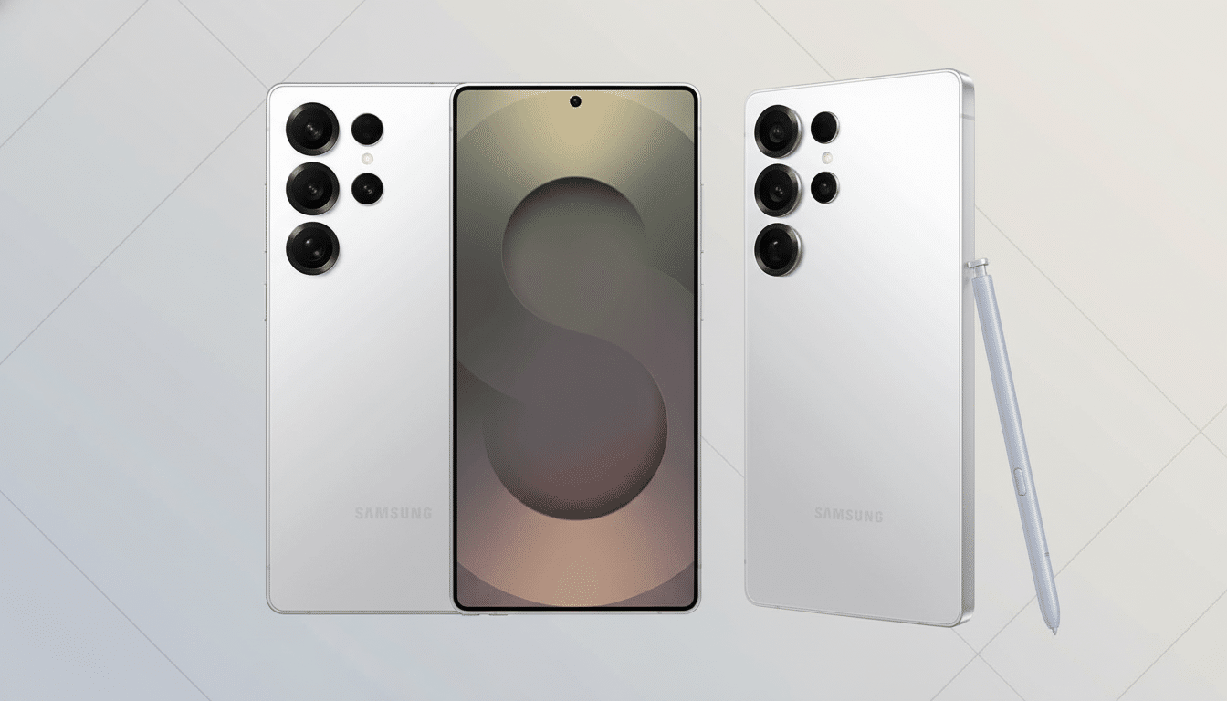
A leaked One UI 8.5 build on the Galaxy S25 Ultra is providing by far the best look we’ve had at Samsung’s next big interface revamp. A hands-on demo courtesy of SamMobile suggests a blunter, slightly more ergonomic design language full of pill-shaped elements, curved corners, and bottom-aligned controls alongside deeper customizations in meaningful places.
A Softer Visual Language Across The System
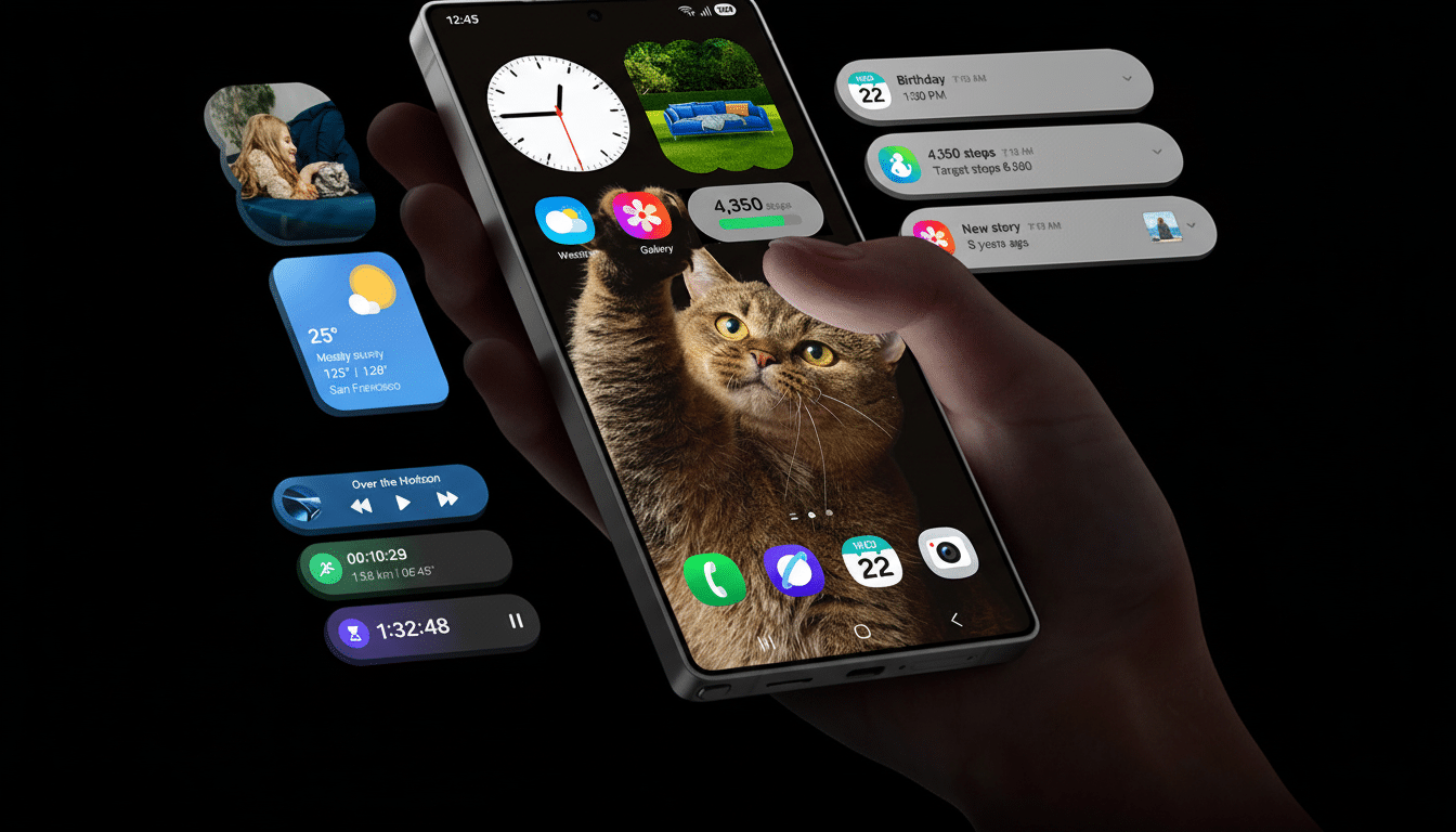
The tone is set by Samsung’s settings app: the bigger corner radii, more airy spacing, the relocated search bar that drops to the bottom so your thumb can reach it on big screens. This reflow is in line with the company’s transition to bottom bars across a number of core apps, and reflects an industry-wide trend to cater for one-handed experiences on 6.7-inch+ devices.
- A Softer Visual Language Across The System
- Quick Settings Goes Modular With Flexible Layouts
- Core Apps Get Smarter Touches And Useful Tweaks
- Battery And Status Bar Changes Emphasize Readability
- Privacy And Sharing Could Head Up The Feature List
- Why This Matters for the Scale of Samsung
- Rollout Expectations And Eligible Phones
System-wide, icons and tiles have adopted pill-shaped outlines and more subtle shadows. The lock screen is now a blurred notification shade that better matches today’s modern wallpaper choices. The net result is less chrome, more clarity, and visual consistency that should make the UI feel a little calmer without losing any discoverability.
Quick Settings Goes Modular With Flexible Layouts
So what’s new? The most dramatic change is a redone Quick Settings panel. In the main screen, toggles can be rearranged vertically or horizontally and can be separately placed with free movement or removed. Power users can consolidate their connectivity controls, show their most commonly used tiles at the bottom for easier access while keeping favorites under a smaller grid, or create a minimalist, function-focused Quick Settings panel with only Wi‑Fi, Bluetooth, and Do Not Disturb.
This is Samsung doubling down on customization, but it also suggests a clearer hierarchy: fewer taps to key actions, and less cognitive load. The approach pays homage to Google’s Material 3 ethos while keeping the density and control Galaxy owners are used to.
Core Apps Get Smarter Touches And Useful Tweaks
SamMobile’s demo reveals small yet helpful modifications in Samsung’s apps. There’s now a Direct Voicemail button in the Phone app, which helps reroute chosen callers directly to voicemail — a small victory for spam‑rattled locales. Tidier toolbars and context menus can also be observed in Gallery and My Files, while Camera’s controls appear consistent with the wider design refresh.
These aren’t tentpole features by themselves, but consistency is what helps a redesign feel purposeful. Little UI tidiness like this can make the difference between an occasional mis‑tap and a sense of flow during a hectic day’s work.
Battery And Status Bar Changes Emphasize Readability
Perhaps the oddest experiment in this build flattens the old battery icon to make room for a simple percentage readout.
There are also hints of a background highlight option to make important numbers like percentages easier to spot. Samsung should offer comparable toggles here; battery indicators represent one of the most personal parts of a UI for many users.
Privacy And Sharing Could Head Up The Feature List
Not found in the hands-on, but rumored from previous leaks are some headline features that bring all-new functionality to the phone: a Privacy Display mode for making sure snoopers don’t see what’s on screen in public places, NFC-based Quick Share for tap-to-send sharing between phones, and Automatic Call Screening to deal with unknown callers.
If they do land on 8.5, the update will strike a balance between a visual refresh and significant capability upgrades.
Why This Matters for the Scale of Samsung
Design changes at Samsung spread far and wide. That’s because industry trackers like IDC and Counterpoint Research routinely have Samsung either at the top or very close to the top of global smartphone shipments, which means even minor UI changes will reach a vast active user base that covers everything from flagships, foldables, and mid-range models. An accessibility-focused layout and clusterable controls might lower the barrier for millions of one-handed operators or those who like tight, flexible panels.
Rollout Expectations And Eligible Phones
It’s early software, of course — clearly unfinished, but the direction is obvious. Traditionally, Samsung matches new One UI point releases to new hardware; One UI 5.1 came with the Galaxy S23 family and One UI 6.1 accompanies the S24 series. According to industry gossip, One UI 8.5 should settle around the launch of the Galaxy S26 series, with a quick deployment to new-ish flagships, foldables, and some A-series phones, where it will commence beta testing via the Samsung Members app.
If the existing preview is anything to go by, One UI 8.5 will bring a more calming look, smarter ergonomics, and even more customization without sacrificing the power-user tools that continue to define Galaxy devices. The design direction feels locked in, and it’s a bold one. Expect more features to appear as development moves along, but based on what we’ve seen so far, this confident style looks like the final result.