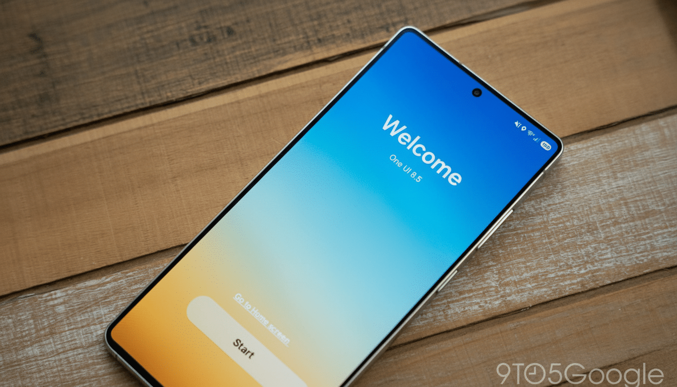
Sideloading the One UI 8.5 beta onto a Galaxy S25, I couldn’t escape a startling first impression: my Samsung was unequivocally an iPhone. And it’s not the typical clickbait, “Android can do that too” convergence. It’s a sweeping suite of visual and interaction indicators that closely follow the look of modern iOS, dramatically retooling how Samsung’s software looks, moves, and asks you to navigate.
With a twist: A lot of it is actually pleasant to use. The update is implemented well and is very stable considering it is an early build. But the whole disorganized show raises some real questions about design identity — what made One UI feel like One UI.
- Quick Settings That Mimic Control Center
- Samsung apps get floating bottom bars for navigation
- iOS-like details multiply across One UI elements
- There’s Widespread Usability Benefit, Despite Identity Slips
- Why Samsung Is Pushing iOS Familiarity Now
- What to Watch Next for One UI 8.5 Beta Testers
- Bottom Line: A Refined Beta That Shifts Samsung’s Identity

Quick Settings That Mimic Control Center
Start with Quick Settings. “We are there!” One UI 8.5 introduces the separation of brightness and volume — into independent, highly adjustable sliders! You can have them stack vertically, be visually weighted with prominence, and show with priority toggles. The end result is a canny control hub that feels intuitive if you’ve pressed buttons on an iOS device in recent years.
Rounder toggles, thicker sliders, and a kind of less makeshift “edit” mode (with easy-to-grab handles and crisp iconography) just look good. But stand Samsung’s new panel next to Apple’s Control Center and the philosophical overlap is difficult to ignore, from the visual rhythm of slider height versus tile density on down. Functionally, it’s an answer; philosophically, it’s a mirror.
Samsung apps get floating bottom bars for navigation
It’s in Samsung’s first‑party apps where the iOS déjà vu hits you. Clock, Gallery, and Phone debut a floating bottom bar that sits off the edge with rounded corners and plenty of space around it. It’s reachable, and it looks good — the very ergonomics that have had Apple-bottomed layouts popular for years in iOS.
It doesn’t revolutionarily change how you use the apps, but that’s also kind of the point. It lures us with muscle memory for iPhone users — and gently nudges longtime One UI users toward a new mental model of navigation. Slap a more compact, pill‑shaped search field inside the app drawer and you can glimpse where it’s all headed: elysian, pillowy, touch-first surfaces as far as the eye can see.
iOS-like details multiply across One UI elements
In Settings the back arrow is in a floating circle — neat, obvious, and it harks to iOS’s cues for showing navigation.
The Calculator’s buttons now come with glossy highlights that have a very subtle glassy sheen, seemingly to echo Apple’s more recent focus on translucent and tactile controls. None of them are carbon copies; all are clear references.
Even the shape of icons and mechanics for layout in edit views feel harmonious with Apple’s Human Interface Guidelines: fewer sharp corners, more forgiving hit targets, a spacing designed to direct the eye in predictable rhythms.
There’s Widespread Usability Benefit, Despite Identity Slips
The practical upsides are clear. Sliders are easier to use one‑handed if you have a phone that’s tall. Bottom bars decrease reach and reduce cognitive load, something usability researchers such as the Nielsen Norman Group have been preaching for years. And cross-app consistency makes it easier for new users to learn.
But One UI used to have its own viewpoint: big headers, bold typography, and purposeful spacing that separated Samsung from stock Android as well as iOS. It’s like the edges of that personality have been sanded off — with 8.5. It’s polished software still — it just doesn’t scream “Samsung” quite as loudly.
Why Samsung Is Pushing iOS Familiarity Now
There’s a strategic read here. According to StatCounter, Android enjoys about 70% of the global mobile OS market share, while Apple rules the premium section. Counterpoint Research has repeatedly demonstrated Apple having well over half of premium shipments. If Samsung hopes to win over iPhone owners, it lowers the friction of switching by meeting them with familiar interaction patterns.
Samsung isn’t alone. Xiaomi’s Control Center ripoff in MIUI and many Android skins’ bottom‑heavy designs suggest a wider gravitational pull toward iOS norms. The distinction is that Samsung has emerged as the poster child of Android, and it leads by example. If it’s too slavish in its imitation, the rest of the ecosystem will lose visual diversity.
What to Watch Next for One UI 8.5 Beta Testers
Because there is a happy medium here: Keep the usability wins but give us switches for going back to the old One UI look. Allow users to choose between stacked or horizontal sliders, floating or anchored navigation bars, and classic or glossy control surfaces. Embrace Material You‑style color theming to bring back some Android‑first personality throughout system and apps.
If Samsung pushes personalization up in the Settings hierarchy — and makes it a little less difficult to find (buried three screens deep? Come on!) — it again could serve two audiences at once: the switchers who want that feeling of knowing exactly what every option does, and the veterans who are longing for that bolder One UI signature.
Bottom Line: A Refined Beta That Shifts Samsung’s Identity
One UI 8.5 is a robust beta build with refined controls, improved navigation, and polished ergonomics. It also makes a Galaxy look uncannily similar to an iPhone. Whether that is a feature or a bug, as programmers say, depends on where you stand. The software is more fun to use, at least for me, but also less uniquely Samsung — an elegant remix that doesn’t break enough new ground in the original chorus.