Nothing has kicked off the Phone 4a campaign with a punchy visual on its X account, posting the familiar “(a)” in five shades—blue, yellow, pink, white, and black—alongside a single-word promise: “soon.” The image is light on details, but the message is unmistakable. After years of monochrome minimalism, the 4a line looks set to embrace a major splash of color.
For a company known for stark transparency and white-or-black hardware, this teaser signals a meaningful pivot. If these hues translate to retail units, the 4a and 4a Pro could arrive in the most expressive palette Nothing has shipped to date.
A Rare and Strategic Color Play Emerges for Nothing
Historically, Nothing has kept its phones in restrained shades that highlight the transparent back and Glyph lighting. There have been exceptions—Phone 2a debuted a region-first Blue variant and Nothing’s Ear line has leaned brighter with products like Ear a in vivid yellow—but phones have mostly stayed grayscale. The 4a teaser suggests a broader, more mainstream color strategy.
That shift aligns with how rivals differentiate in the midrange. Apple keeps iPhone 15 and 15 Plus fresh with seasonal colorways, Google’s a-series routinely experiments with playful tints, and Samsung’s Galaxy A lineup cycles through pastels and exclusives. Color is not just cosmetics; it’s shelf impact, social shareability, and a way to sustain interest without weekly spec dumps.
Market researchers at IDC and Counterpoint Research have repeatedly noted that the midrange drives the bulk of global smartphone volume, even as average selling prices creep up. In that context, a wider palette is a pragmatic lever: it can attract first-time buyers and prompt upgrades without rewriting the hardware bill of materials.
What the Teaser Might Reveal About Color Options
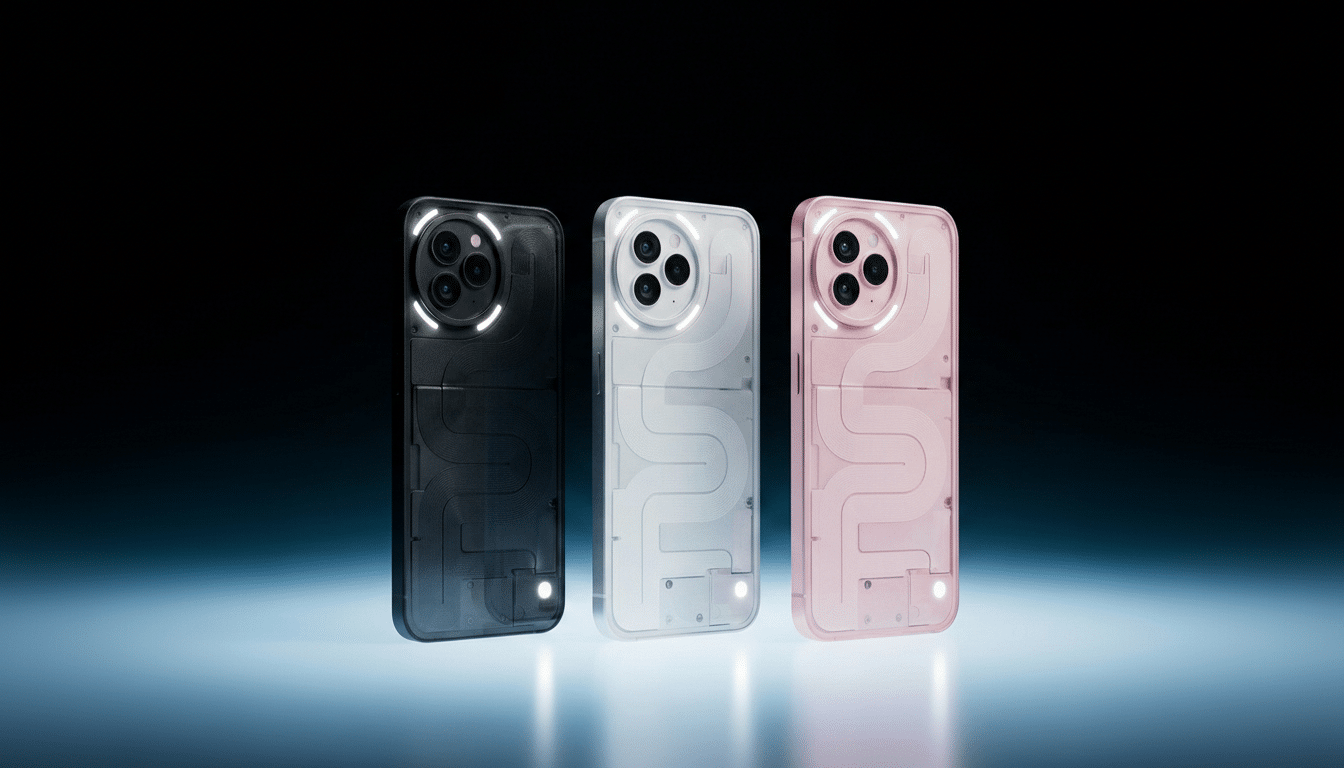
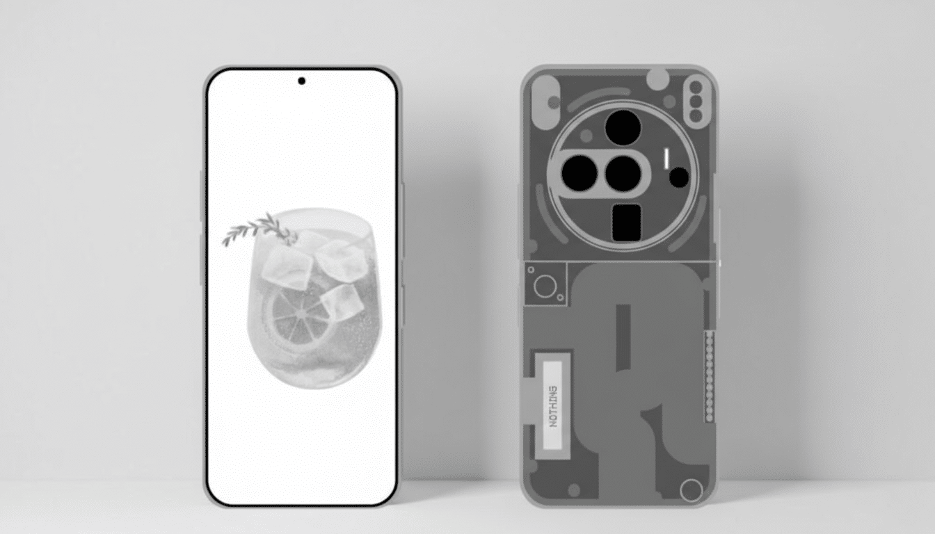
The five-color “(a)” motif maps neatly to potential SKUs: blue, yellow, pink for statement looks, plus white and black for brand purists. The open question is implementation. Nothing could tint the frame, accent the camera rings, or colorize components beneath its transparent backplate—approaches that preserve the brand’s signature aesthetic while delivering visible variety.
Don’t be surprised if availability varies by market. Nothing has tested region-led color plays before, and limited or channel-exclusive hues often generate outsized buzz in the mid-tier. Expect the company to tease execution details over multiple posts, maintaining momentum up to launch.
Key Specs to Expect From the 4a Series at Launch
While the teaser centers on color, leaks indicate familiar performance targets for the category. The Phone 4a family is expected to use Snapdragon 7s-class chipsets paired with up to 12GB of RAM and 256GB of storage, alongside a modest battery increase over prior a-series models. That setup points to efficiency-first performance, competent gaming headroom, and longer runtimes—key checkboxes for value-focused buyers.
The Pro variant is tipped to step up durability with an IP65 rating, which would mark a meaningful improvement for Nothing’s affordable tier by offering dust-tight sealing and resistance to low-pressure water jets. eSIM support has also been rumored, a practical quality-of-life upgrade as hundreds of carriers now support digital provisioning according to the GSMA.
Given Nothing’s marketing cadence, expect a slow drip of confirmations—camera details, display specs, and software features—across social channels before the reveal.
Pricing and competitive context for Nothing’s 4a series
Indicative pricing whispers place the Phone 4a around $475 and the 4a Pro about $540. That would position the duo squarely against heavy hitters like the Pixel 8a, Galaxy A55, and the latest Nord entries. If accurate, Nothing will be competing on design distinctiveness and user experience as much as raw spec-for-dollar math.
With no flagship planned this year, the 4a line becomes the anchor for Nothing’s smartphone momentum. A confident color story—backed by practical upgrades like higher ingress protection and eSIM—could broaden the brand’s reach without abandoning its see-through signature. In other words, a visual reset that still feels unmistakably Nothing.
All eyes now turn to the next teaser. If color is the hook, the follow-up act will likely be about how those hues interact with Nothing’s transparent design—and whether the Glyph interface gets any complementary twists to match.