A frontrunner has officially been declared in this round’s showdown of designs. In the reader poll, which saw over 6,500 responses cast, Material 3 Expressive romped home to victory with 78.7% of the vote compared to Apple’s Liquid Glass theme on 21.3% of the votes. The result sends a clear message about what users want to see on their phones after both Android and iOS received significant visual updates.
Quick read on poll results: Material 3 leads decisively
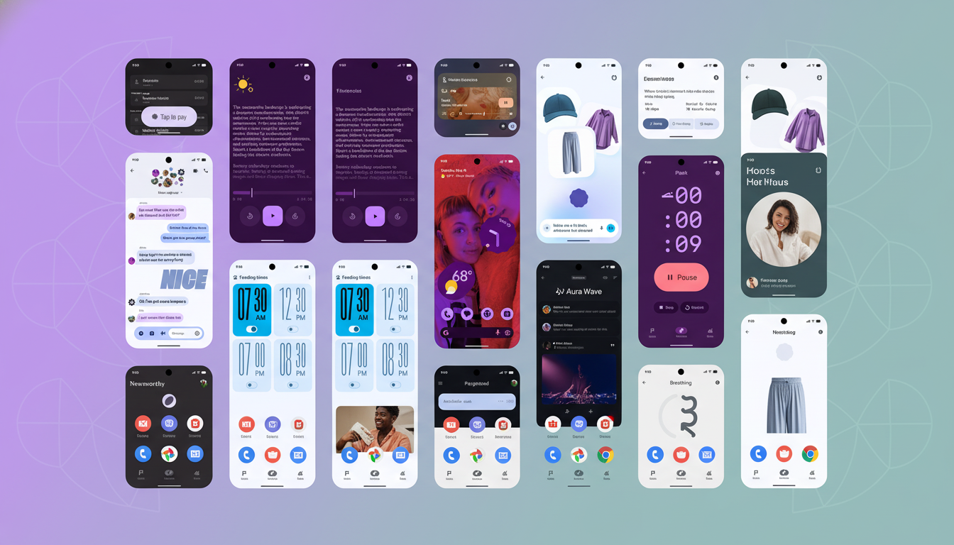
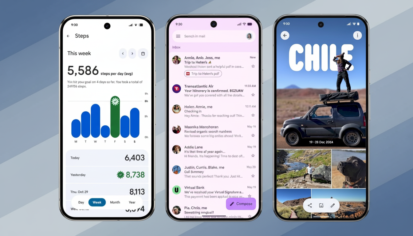
The numbers weren’t close. Almost four in every five voted in favor of Material 3 Expressive — the bolder, more playful iteration of Google’s design language that landed on Pixel devices as part of the Android 16 QPR1 update. “Liquid Glass” — the shiny, depth-focused aesthetic Apple introduced with iOS 26 — received a little more than one-fifth of the votes.
Comments underscored two recurring themes. To start, many Android users are skeptical of apps bringing Apple-forward visuals to Android, believing it leads to a muddied platform identity. Second, some readers also brought up an age-old Android fact: consistency is difficult when OEM skins like Samsung One UI, OxygenOS, and Pixel UI all handle system theming differently. That fragmentation complicates how widely any given style can be transmitted.
Why Material 3 Expressive clicks with readers in this poll
Material 3 Expressive feels very much “Android.” Based on dynamic color, shape systems, and lush movement — it has personality without compromising legibility. It’s a design philosophy that mirrors Material Design’s goal of creating flexible components with easily accessible contrast. This balance is well-documented in the span of Material Design guidelines, as well as usability studies conducted by entities such as the Nielsen Norman Group, which connects consistency and clarity to reduced levels of cognitive load.
There’s also the developer calculus. And even if some devs have been slow to make the Expressive version a priority, the Android toolkit is built for it. Material 3 uses color tokens, typography scales, and elevation systems in Jetpack Compose and View-based libraries that correspond directly to the new look. In reality, its use often takes the form of tightening up existing Material 3 setups rather than starting afresh — and given many teams have free work queues and release timelines, that’s no bad thing.
Apple’s Liquid Glass sparks debate over style and use
Apple’s Liquid Glass is bold, leaning into translucency and layered blurs and highlight effects to create a sense of depth. But the trade-offs don’t sit well with everyone. Style critics argued that there could be readability issues and that creating gloss as a visual priority is detracting from content. That pushback is also part of a larger trend seen in other design shifts: high visual drama can be polarizing when it comes to functionality, particularly on smaller screens or in various lighting situations.
What’s clear is that many of the folks who responded in comments matter-of-factly panned both new designs, claiming the refreshed visuals for either platform make no difference to day-to-day usability whatsoever. Against that minority argument, it’s a helpful reminder that the best design updates in fact improve tasks — scanning faster, better hierarchy, fewer errors — by some measure rather than just updating melamine surfaces.
What developers need to know from these poll results
If you’re in a hurry, here’s what we learned:
- Android users want Material 3 Expressive, and they want it consistently.
- For Google, that’s an invitation to double down with stronger samples, updated codelabs, and clear Play guidelines for Expressive-compliant UI.
- App makers can lean on Material 3 components, adopt dynamic color deliberately, and make sure motion and elevation communicate state rather than just tossing noise into the system.
From the OEM standpoint, design token strategies may help bridge differences in skins. With semantic color roles, typography tokens, and elevation semantics, we can make one codebase feel native on Pixel UI, One UI, and OxygenOS without bespoke forks. That way it maintains brand identity while still respecting the look of the platform that users have just voted for.
The bottom line: users favor an Android-native design
With 78.7% of the vote, Material 3 Expressive not only bested Liquid Glass, it smoked it out back by the garage in a stainless steel ashtray and made it beg for mercy. What this says to the Android ecosystem is clear: make Expressive a top priority, ship it right, and keep long-term use as an up-front consideration. Users have decided, and the design language that’s winning is the one that feels native, consistent, unmistakably Android.