Google Wallet is preparing a fresh home screen built around “favorite passes,” giving users faster access to the cards they actually use. Early glimpses show a grid of colorful tiles pinned to the top of the app, automatically starring a few key passes while letting you fine-tune the lineup with a simple tap.
The feature appears in testing and has not rolled out broadly. What’s clear from the interface is a shift in Wallet’s hierarchy: instead of scrolling a long list, your most important boarding passes, transit cards, and loyalty programs surface first, with everything else tucked away for when you need it.
How favorite passes work and what they do in Google Wallet
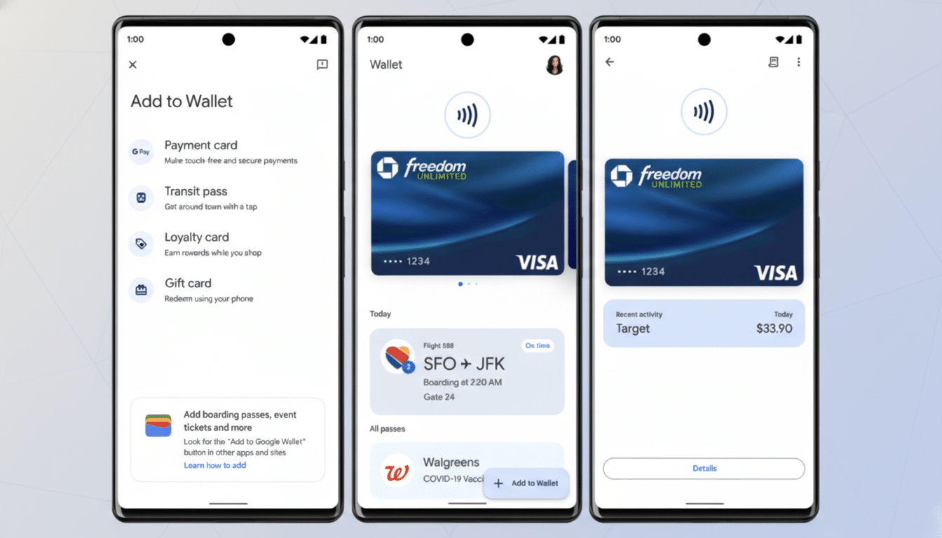
Favorite passes let you “star” items so they consistently appear on Wallet’s landing page. Google will auto-favorite the first four passes it detects for a user, and you can unstar any of them or add new favorites as your habits change. It’s a lightweight way to curate your Wallet without diving into deep settings or reordering screens.
Practical examples make the case: if you commute daily, you might star your transit card and a work badge; frequent flyers can pin an airline loyalty card and boarding passes; event-goers can elevate season tickets before heading to a stadium. The goal is to cut the number of taps between opening Wallet and presenting a scannable code.
A new grid-based Wallet home screen focused on favorites
Today’s Wallet home screen largely uses a list. The upcoming design swaps that for a grid of larger, color-forward tiles that are easier to spot at a glance. Visual density increases without feeling cluttered, and the bigger tap targets should reduce fumbles at checkout or a turnstile.
There’s also a split-style floating action button that cleanly separates key actions. One side highlights adding a new pass, while a “View more” option takes you beyond favorites to your full library. Because the main page is dedicated to starred items, this extra control becomes an efficient escape hatch when you need something less common.
If you star more than four items, the grid expands to fit. That flexibility matters for power users who juggle multiple airlines, transit systems, and store memberships. While the testing interface doesn’t confirm every interaction, the direction suggests Google is prioritizing fast retrieval over endless scrolling.
Why a favorites-first design in Wallet can speed up payments
Speed is the currency of mobile payments. According to the Worldpay Global Payments Report, digital wallets account for about 50% of global e-commerce spend and roughly 30% of in-store transactions. That level of usage raises the bar for design: shaving seconds off pass retrieval at a fare gate or checkout line improves the entire experience.
Favoriting also addresses a common pain point in wallets with large libraries. As users accumulate transit cards, gift cards, event tickets, and loyalty memberships, finding the right one becomes a hunt. A favorites-first layout applies a simple, human fix: put the most-used items front and center, and let everything else take a back seat until needed.
There’s a business upside, too. Research firms estimate digital wallet users will surpass 5 billion globally, and loyalty program operators consistently report higher redemption when offers are easier to access. Pinning a membership or coupon increases the odds it gets used, which benefits both customers and brands.
Availability timeline and signals to watch as testing continues
The favorite passes interface and its split floating action button are still in development and may arrive via a server-side switch once Google is ready. Staged rollouts are common for Wallet, so features can appear for some users before others.
Two signals to watch: tighter lock-screen surfacing of starred passes and deeper Wear OS integration. If favorites become the default entry point across phone and watch, it would further reduce friction in places where seconds matter—airport security, subway turnstiles, festival gates, and crowded retail counters.
For now, the takeaway is straightforward. Google is rethinking Wallet’s home screen around the cards you use most, with a grid that’s easier to scan, a clear way to add new items, and a simple path to your full library. When the rollout lands, most people won’t need a tutorial—just star a few essentials and go.