Google is piloting a redesigned attachment sheet for Gemini that aims to dial back feature overload and surface the tools people use most. Early evidence from the latest Google app build suggests a cleaner hierarchy: large, tap-friendly buttons for core actions up top, with secondary options tucked into a horizontally scrollable row. The same treatment is being prepared for Gemini’s overlay, which floats over other apps for quick tasks.
The shift is small on the surface but significant in intent. Gemini keeps gaining capabilities, and its current four-button layout has struggled to scale. By elevating essential inputs while demoting others to a carousel, Google appears to be rebalancing speed and discoverability—classic trade-offs in fast-evolving AI interfaces.
What Changes In The New Attachment Sheet
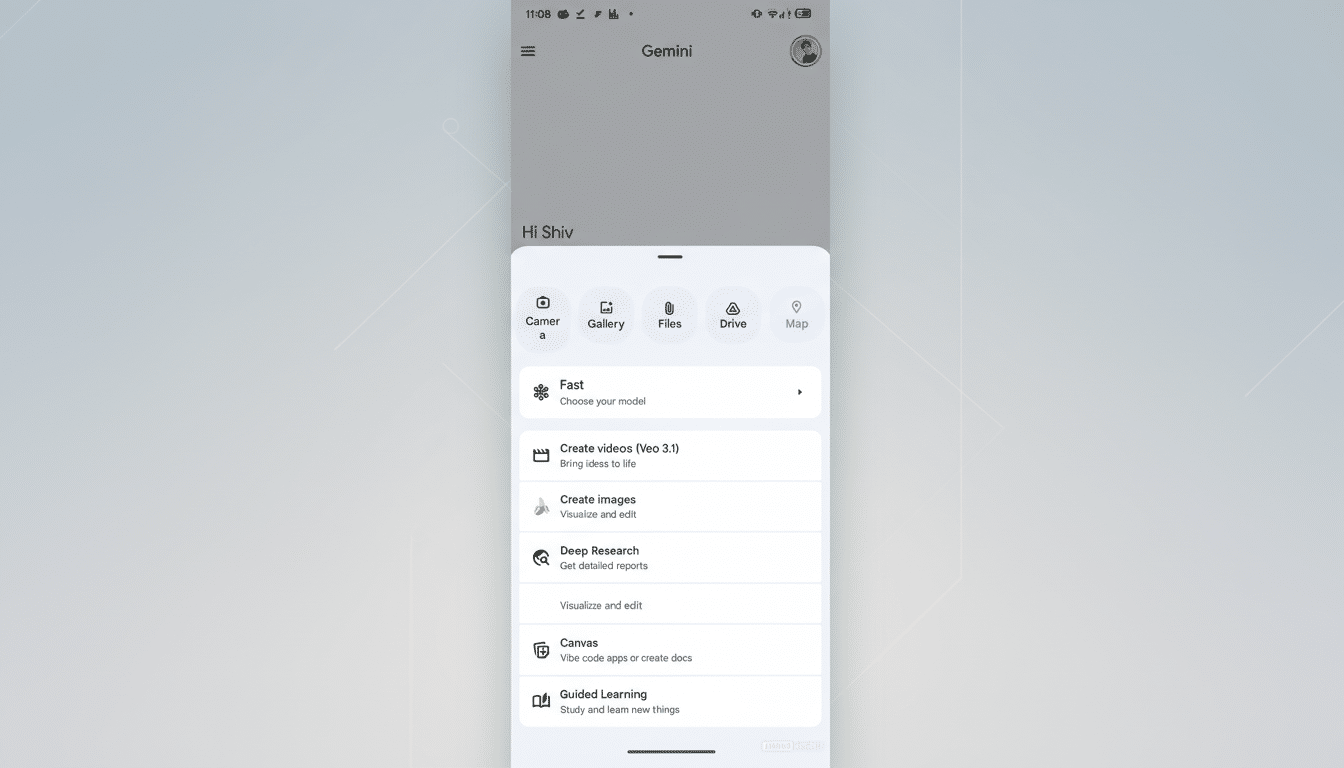
The in-testing UI centers on three primary buttons—Photos (replacing Gallery), Camera, and Files—rendered as larger icons with clear labels. A secondary, horizontally scrollable row holds Drive, NotebookLM, and Map. This structure gives first-class treatment to multimodal inputs while keeping more specialized extensions within reach but out of the initial line of fire.
Google is applying the same pattern to the Gemini overlay invoked on top of other apps. Tap the plus button, and you’ll see the same big targets for the most frequent actions, followed by the scrollable strip. That symmetry matters; users shouldn’t have to relearn tool placement when switching contexts.
The redesign follows earlier internal iterations that crammed too many icons into a single row, shrinking hit areas and wrapping text. By contrast, this version respects touch ergonomics. Material Design guidelines recommend minimum 48×48 dp touch targets to reduce errors and speed up interaction, and the new layout appears to align with that standard.
Why Google Is Reworking Gemini’s Tools Now
As Gemini adds capabilities—document uploads, image context, Drive pulls, research aides like NotebookLM—the interface risks the classic “more is less” spiral. Hick’s Law tells us that more choices increase decision time. In practice, that translates to slower prompts and abandoned tasks when the tools panel feels like a jumbled grid.
UX research from organizations such as Nielsen Norman Group has long shown that features hidden behind additional gestures, like horizontal scrolls or overflow menus, get less use than what’s visible by default. Google seems to be embracing this reality by placing the most common inputs front and center while accepting that advanced options will be discovered more gradually.
There’s also a multimodal imperative. Gemini’s strength is fusing text with images, screenshots, and files. Prioritizing Photos and Camera reduces friction in those flows. In day-to-day terms, it shortens the path to “explain this screenshot,” “summarize this PDF,” or “compare these two images,” scenarios that have become core to Gemini’s pitch.
How It Compares To Rivals In AI Interface Design
The direction echoes competitors. OpenAI consolidates tools and model selection in a single panel in ChatGPT, a pattern that keeps context bounded while avoiding too many parallel menus. Microsoft’s Copilot leans on a plugin rail to corral extensions. Apple’s share sheet, while not an AI tool drawer, popularized the idea of a primary row for top actions and a secondary, scrollable row for less frequent ones.
Gemini’s version walks a line between flexibility and control. By avoiding an all-in-one grid and instead using a prominent primary row plus a carousel, Google preserves room to grow without overwhelming the canvas. The risk, as with any horizontal scroller, is that some users simply won’t swipe—so placement and default ordering will matter more than ever.
What It Means For Users Of Gemini On Android
Expect quicker access to the actions people hit most, fewer mis-taps, and less visual noise. In the overlay—arguably where speed counts the most—the larger targets should make it easier to bring in a photo, capture the screen, or attach a file without diving into another app.
Advanced options like Drive import, NotebookLM, and Map aren’t going away; they’re just moving to a second tier. Power users may need a brief adjustment period, but the net effect should be less cognitive load for everyone else. If history is a guide, Google will likely reorder the second-row tools over time based on real usage, a common practice in feature-flagged rollouts.
What To Watch Next As Google Tests The New UI
The attachment sheet revamp has been spotted in recent Google app builds (notably v17.6.58) but has not broadly rolled out. Look for server-side A/B testing, potential integration with a unified model-and-tool picker, and tweaks to which apps occupy the second row. The measure of success will be simple: faster task starts, higher engagement with core inputs, and fewer users getting lost in a sea of buttons.