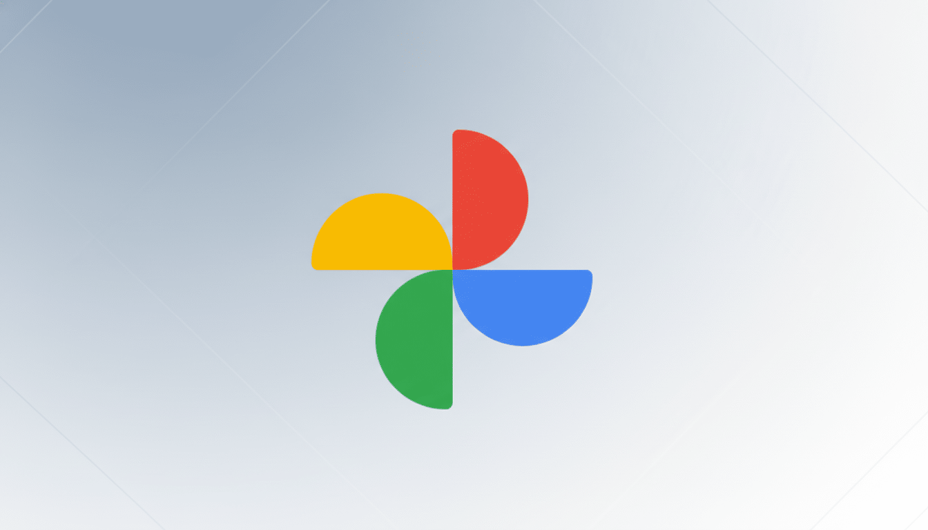
Google has been preparing refreshed app icons for Google Photos and Google Maps, continuing its AI-first visual identity. Images shared with 9to5Google reveal gradient-heavy designs, a style that has been updated for the ‘G’ and Home apps, indicating that there is a more widespread brand evolution in progress.
What is changing in the new Photos and Maps app icons
The new icons maintain Google’s four-color palette but replace hard separation lines with soft gradients. The Photos pinwheel keeps its general silhouette, and the Maps pin appears broader while the point is softer and more curved. The scene is, therefore, more fluid and dimensional while preserving the basic designs recognizable to users.
- What is changing in the new Photos and Maps app icons
- Why the refreshed icons matter for users and brand clarity
- How the redesign aligns with Material Design principles
- AI features advancing in Photos and Maps alongside icons
- Rollout timing across Android, iOS, web, and Chromebooks
- Visual differences to expect across screens and modes
- Context from Google’s 2020 icon unification and aftermath
- What this signals about Google’s AI-forward brand identity
This approach is similar to the previously modified Home and Google app icons, which use color diffusion and depth to create movement and adaptability in traditionally flat images, both of which are design standards that Google associates with AI competencies.
Why the refreshed icons matter for users and brand clarity
Icon shifts may appear to be insignificant, but changes have a significant impact on brand awareness, wayfinding on crowded home screens, and the impression of core apps’ modernity. Since Photos and Maps both serve around a billion people, even small alterations may alter daily duties or make a snap return to the camera roll more straightforward than a peek at a pin.
How the redesign aligns with Material Design principles
The redesign is also consistent with Material Design’s goals of gentler geometry and color usage for better legibility. Though it isn’t explicitly a Material You element, the change in gradient direction helps these icons feel comfortable on a variety of wallpapers, themes, and launcher styles.
AI features advancing in Photos and Maps alongside icons
Google presents these updates as part of an “evolution in the AI era.” Expect the icon update to serve as a precursor to other Gemini-powered features or to launch concurrently with them.
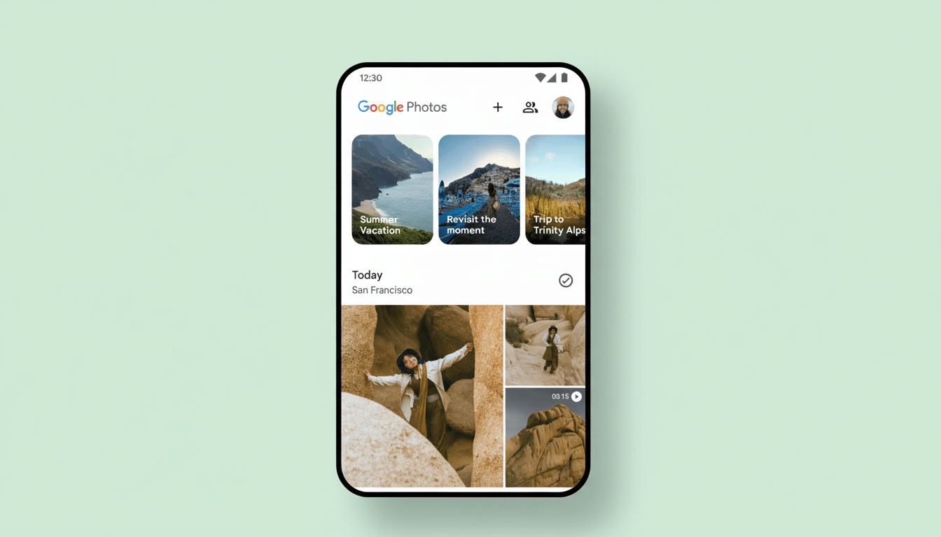
In Photos, Google has been enhancing Gemini automation with powerful new features such as Magic Editor and story-making suggestions, as well as experimenting with conversational search for memories and more intelligent classification.
Maps has also integrated AI more quickly, with millions of more informative search results, richer legends, and more immersive previews to name just a few. Gemini-type replies are right at home, along with easier summarizations of local opinions and contextually created paths.
It’s critical to set customers’ expectations by introducing this visually consistent range, indicating that their software is becoming more assertive and helpful.
Rollout timing across Android, iOS, web, and Chromebooks
These icons are not yet widely accessible. Typically, Google will not immediately apply to everyone, as it does with most other announcements. These improvements are often rolled out over several days or even weeks; while Android is usually the first to receive them, iOS versions are not far behind.
Web and Chromebook applications are often implemented later or in tandem, depending on the alignment of app and favicon updating.
Be aware of the arrival of new icons after app updates. If a device reboots without a connection, cached images may not refresh. These modifications may take longer to appear on enterprise-managed hardware based on the admin’s policies and version channels.
Visual differences to expect across screens and modes
Gradients will look different from screen to screen and throughout various dark mode settings, so you may see some small disparities in contrast or edge crispness. Still, the core silhouettes should remain, making the shapes themselves easy to scan and recognize, with the color blending applied as appropriate.
In busy places like home screens, folders, and car screens, this softening will reclaim some of the visual cues without the added noise it typically carries. The launcher icon packs and adaptive icon masks will continue to mess with our outline shapes, though the inner gradients should be consistent.
Context from Google’s 2020 icon unification and aftermath
Google’s last major icon rework in 2020 did quite the unification of its productivity and consumer app icon sets in four-color. It brought minimal feedback, as it took away some of the instant recognizability in favor of more monochromatic design.
The wave of a gradient looks like a retcon, preserving the shared palette while reintroducing details, making quick recognition far more straightforward. In case history repeats, other Google apps using the four-color system, like Drive, Calendar, or Pay, might receive similar treatments.
What this signals about Google’s AI-forward brand identity
At this moment, Photos and Maps are likely to bear the next stage in Google’s visual narrative. The message thus sent is that AI isn’t just a tool or feature – it’s part of Google’s identity.
In sum, we’ll see cleaner, more fluid icons, seeming smoother, for two of Google’s most recognizable apps. Thus, both the set and the design’s deeper synthesis should be powered by Gemini. It will make it easier to rediscover your pictures from ten years ago and more comfortable following your algorithm-led path.