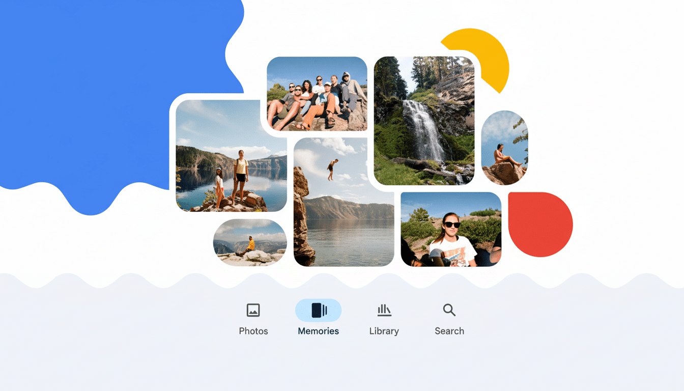
Open Google Photos and your Memories carousel may feel brand new. Google is rolling out a refreshed look that leans into bold color blocks, whimsical cutouts, and more expressive cards — a visual lift designed to make those resurfaced moments pop the instant you launch the app.
Early sightings suggest this is a wide server-side rollout with no update prompt required. Functionally, Memories still works the same. What’s changed is the presentation: brighter, louder, and unmistakably harder to miss at the top of your feed.
What Changed in the Carousel of Google Photos Memories
The most striking tweak appears in the “X years ago” cards. Instead of a simple rounded rectangle, the featured photo is now cropped into the actual number — imagine a vacation shot filling the silhouette of a big, bold “5” — set against a saturated background. Other Memory types, like “On this day” or themed groupings, now use abstract cutout shapes with varied color palettes, adding a playful rhythm as you swipe across.
It’s an evolution of Google’s earlier experiments with shape-forward previews. Previously, the app dabbled with uniform cutouts and pastel accents. This iteration doubles down on personality, echoing elements of Material You — Google’s design language that emphasizes color, motion, and adaptive shapes — without changing how you navigate or share Memories.
Practically speaking, photos remain tappable cards that expand into the familiar Memories viewer. The redesign is meant to catch your eye faster in a busy feed and give each Memory type a distinctive visual identity so you can tell what you’re about to open at a glance.
Who Is Getting the Update and How It Rolls Out
Reports indicate the redesign is appearing on both Android and iOS and across multiple regions. Because it’s likely a server-side switch, you might see the new carousel even if you haven’t updated the app recently. If your cards look unchanged, it’s probably just a staged rollout tied to your account rather than your device.
There’s no setting to toggle the new look on or off, and there’s no indication that Google is gating it behind any subscription tier. In other words, expect it to arrive for most users over time, similar to previous visual updates to collages and Cinematic Photos.
Why the Bolder Look Matters for Google Photos Memories
Memories has become a signature surface inside Google Photos since its launch in 2019, and Google has previously stated the service serves over a billion users. With that scale, even small design shifts can meaningfully influence engagement. Eye-tracking research from organizations like Nielsen Norman Group consistently shows that saturated colors and distinctive shapes increase visual salience, making key UI elements more likely to be noticed.
The numeric cutouts also do subtle UX work: they communicate context before you tap. Seeing a family photo inside a giant “7” instantly signals a seven-year lookback — a cognitive shortcut that helps users decide whether to dive in. It’s a small example of information scent, the design principle that previews content meaningfully rather than decoratively.
More broadly, the redesign aligns with a trend across photo and social apps: use expressive, glanceable surfaces to resurface archival content. Pinterest, Apple Photos, and Meta’s “On This Day” features all rely on visual cues to drive re-engagement without overwhelming users with notifications. Google’s approach is to turn the top of the library into a colorful invitation rather than a quiet banner.
Controls and Privacy Remain the Same for Memories
This refresh doesn’t change what Memories shows you or how the feature is created. You can still manage who and what appears by hiding specific people, pets, or dates from Memories in settings. You can also turn Memories off entirely if you prefer a minimal library view.
Importantly, there’s no indication of new data collection tied to the redesign. It’s a coat of paint on top of existing functionality, not a shift in how your photos are analyzed or surfaced.
What to Expect Next as the Visual Rollout Continues
Google often ships visual iterations in waves, so you may see additional polish — tweaks to animations, spacing, or color sets — as the company watches how users respond. If you rely on Memories to revisit old trips or milestones, you’ll likely find them easier to spot. If you’ve ignored the carousel in the past, the louder design may finally draw a tap.
If the redesign hasn’t reached your account yet, sit tight. Based on user reports and Google’s typical rollout cadence, it should land broadly without any action on your part. When it arrives, your photos don’t change — just the way they beckon you back.