Google Keep is getting ready to refresh its most important on-screen control, with signs pointing to a new Material 3 Expressive floating action button in the works. Evidence tucked into version 5.26.071.01 suggests the app will adopt the larger, circular FAB and updated motion cues that have already appeared in other Google apps, bringing Keep in line with the latest Material design direction.
This is more than a cosmetic polish. The FAB in Keep is the gateway to taking a note, snapping a photo, recording audio, or starting a checklist. Making it larger, round, and more prominent is a functional shift aimed at reducing friction for the primary action users perform hundreds of millions of times across devices.
What Is Changing in Keep’s Floating Action Button
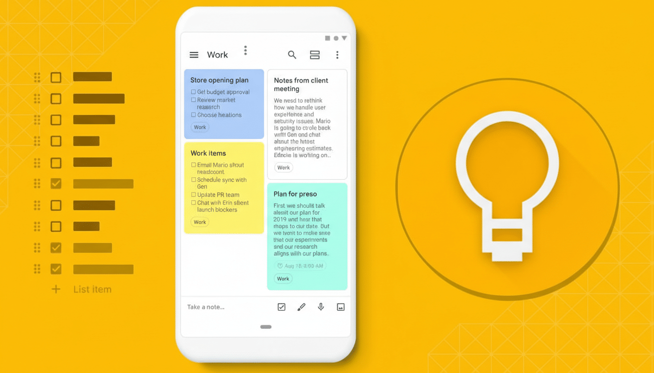
Today’s Keep build shows a smaller, rounded-square “squircle” that houses a multicolored plus. The in-development variant adopts a Material 3 Expressive circular FAB that’s visually bigger and cleaner, aligning with the look introduced in Drive and Docs. When you engage it, the familiar plus morphs into a close symbol, now set inside a circle rather than the older squircle, signaling the active state more clearly.
Under the hood, the app is preparing updated shape tokens and interaction states consistent with Google’s latest guidelines, which emphasize bolder geometry and motion. Expect a smoother expansion animation, stronger elevation cues, and color harmonization that plays nicely with system-wide themes—hallmarks of the Expressive flavor of Material 3.
Why Material 3’s Expressive style matters for Keep
Material 3, building on the personalization of Material You, leans on dynamic color, accessible contrast, and confident shapes to create apps that feel both modern and unmistakably Android. The Expressive track doubles down on visual personality: larger components, more fluid motion, and refined iconography that make primary actions unmissable.
From an ergonomics standpoint, a larger FAB isn’t just about style. Material Design guidelines call for generous touch targets, and the updated button should better support one-handed use on today’s taller displays. For a note-taking app where speed matters—capturing an idea before it disappears—this small change can translate into fewer mis-taps and faster entry.
Color is part of the story, too. With dynamic color, Keep’s FAB can harmonize with your wallpaper-derived palette while maintaining sufficient contrast for legibility. That balance of personality and function is a core Material 3 promise, and bringing it to Keep helps unify the visual language across Google’s productivity suite.
A deliberate rollout strategy for the new Keep FAB
Google rarely flips a universal switch for design changes. Instead, it seeds code paths and assets behind server-side flags, enabling features for small cohorts before broadening access. We saw that cadence with Drive and Docs last year, and it appears Keep is now on deck. Given Keep’s massive install base on the Play Store, cautious staging helps minimize regressions and gather feedback from real-world usage.
The current Keep build (5.26.071.01) doesn’t surface the redesigned FAB by default, but the groundwork is there. That means the company can activate it at any time—no additional download required—once validation is complete. Users should watch for a more prominent round button at the bottom right as the clearest sign the change has arrived.
What to watch for next as Keep’s FAB redesign rolls out
Expect the refreshed FAB to slot into Keep’s existing quick actions without disrupting muscle memory: tap to start a note, long-press for contextual options, and a clear close state when auxiliary UI is open. On tablets and foldables, the larger button should read better in multi-pane layouts, complementing Google’s broader push to optimize its apps for big screens.
Individually, a new button might feel minor, but together these iterative updates are steering Google’s apps toward a consistent, more accessible design system. Keep adopting the Material 3 Expressive FAB is the latest signal that the company intends to finish what it started—one thoughtful, user-facing detail at a time.