Google’s smart home hub has been out for more than a year now, and the company continues to improve it on the software side. A major Google Home redesign is slowly rolling out on iOS, unveiling a cleaner interface and an “Ask Home” bar that highlights Gemini’s assistant smarts front and center. The update is apparently rolling out to early adopters via server-side switch, not just an App Store version bump.
What’s new in the redesigned Google Home app interface
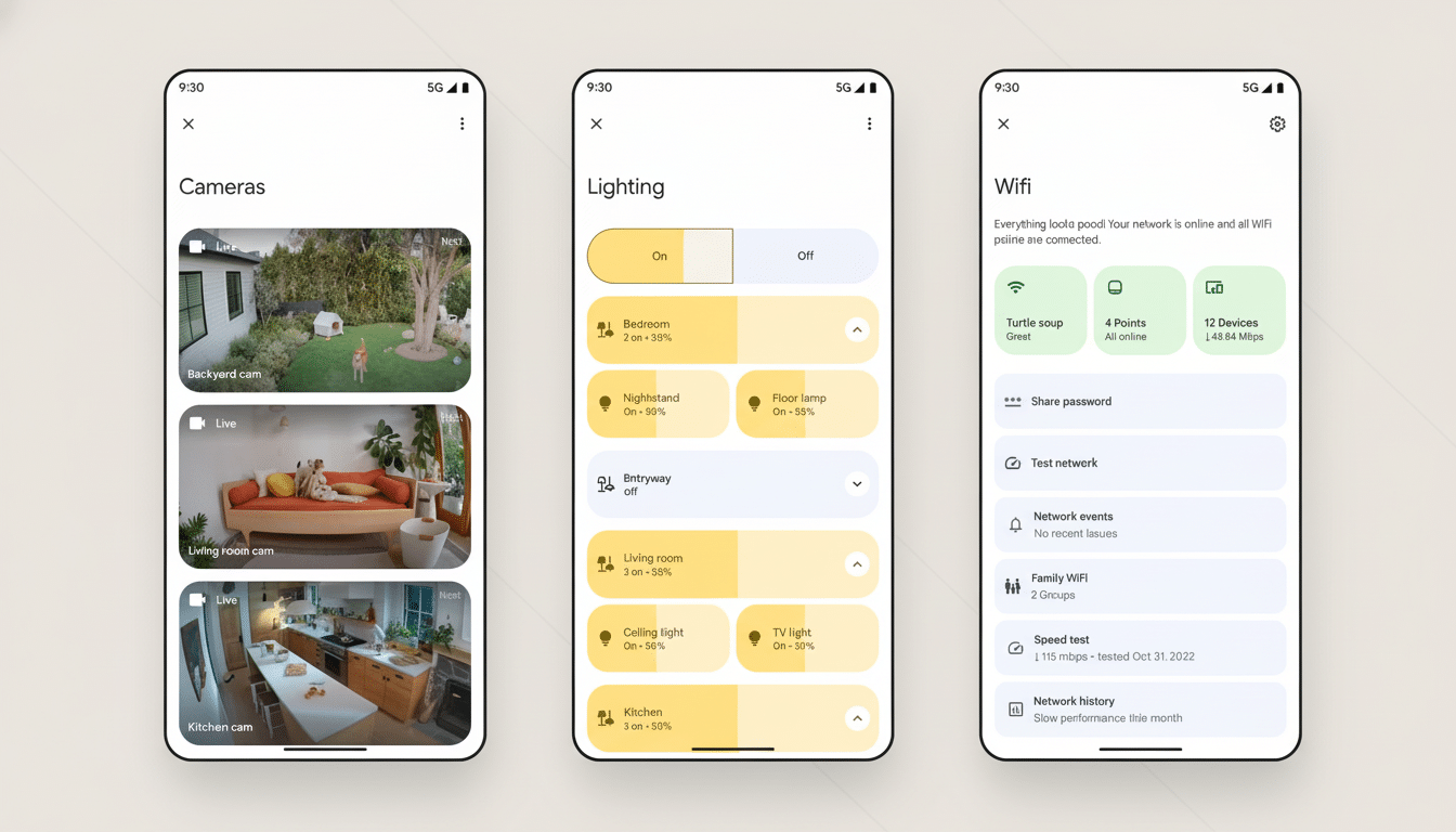
The navigation of the app has been streamlined for speed and clarity. The old Favorites tab has been renamed to just “Home,” which serves as the new default landing page for devices, routines, and tiles. There are no more dedicated Devices and Settings tabs (those controls are now in the main view and profile/overflow menus). The end result is you’ll be hopping between screens less and enjoying one-tap access to some of the things you use most.
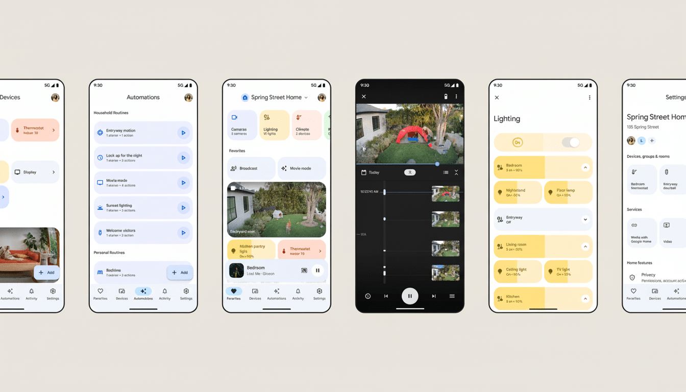
At the top of the interface, there is a large “Ask Home” box. Rather than search through cameras, speakers, plugs, and lights — one at a time — you can type or say out loud a request that applies to many types of devices. It’s like universal search plus automation: it’s designed to understand intent, check your home’s state, and then execute the correct sequence all in one go.
Early screenshots, which some people are sharing on Reddit, display polished tiles, cleaner typography, and more purposeful spacing. The visual language jibes with Google’s broader design principles while providing more context (what’s on, what’s idle, and what needs your attention) without suffocating you in nested lists.
How Ask Home and Gemini enable conversational control
“We’ve begun to integrate Gemini into Google Home, serving as the ‘Ask Home’ brain.”
This is more than just turning on a light by voice command. You can craft automations, ask for event history, and request activity summaries across your cameras and sensors in natural language. Examples include “If someone knocks, turn on the porch light and tell me on the kitchen speaker” or “Show me every time the garage opened while I was gone.”
Those who turn it on are asked to review new terms before they land in a dedicated conversation view. From there, Gemini can offer up routines, drill down on them with follow-up questions, and generate quick recaps of recent history. In concrete terms, that means fewer ventures into granular settings and more time using the system like how you speak about your home.
Privacy remains a focal point. Google has consistently maintained that smart home data follows user-selected privacy and history controls, and there’s no change in the need for transparency with Home adding Gemini. Look out for prompts that clarify what happens with activity history and camera clips when you opt in to things like AI summaries or searchable video history.
A staged rollout and what it means for Android users
iOS users are noting the redesign, but most Android users are reporting that the new Google Home build still defaults to the old layout. A few users on version 4.0.53.2 point out that the new UI can be unlocked via hidden flags, suggesting Google is gating it server-side. This type of rollout is typical for major app changes like this, giving the company time to validate performance, backend readiness, and feedback before flipping the switch more broadly.
If you are on Android, that probably means the new interface is coming this time without any more downloads if and when it becomes enabled for your account by Google. Look for an in-app prompt that will call out “Ask Home” and the updated navigation when it does.
Why this Google Home redesign matters for usability
For most households, the smart home is only as good as the app that connects it. Elaborate setups and the friction involved in getting systems up and running have consistently been identified as key impediments to adoption in industry surveys from organizations like the Consumer Technology Association. By combining search, control, and automation under an easy-to-use natural-language layer, Google is aiming to overcome the “too many taps” problem that discourages casual users from setting up more complex routines.
The timing also coincides with the remodeling of the ecosystem to become more interoperable. Under its new name Matter, the connectivity protocol has near-universal support from major smart home companies — it’s a real thing this time around — and the Connectivity Standards Alliance is touting steadily growing numbers of Matter-certified devices. And having one smart control surface that looks smarter, simpler, and easier to grasp helps those mixed-brand setups feel more cohesive. That’s a meaningful win for mainstream usability if Gemini can also do it consistently across devices (reducing dependence on vendor-specific APIs).
How to tell if the new Google Home interface is live
On an iPhone, download the update for the Google Home app and open it to look at the top of the main screen for, give or take, that “Ask Home” bar. The Home tab should consolidate all devices under one view, leaving Settings behind your profile icon. If you’re staring at the existing tab layout, then the server-side rollout hasn’t hit your account yet—be patient and don’t reinstall, unless you’re troubleshooting a different problem.
For Android, just make sure the app is up to date and look for the same UI cues. With the flag-based rollout, you may see the redesign on your next app launch. Meanwhile, your existing routines, devices, and camera history will continue to work as normal.
Bottom line: the Google Home makeover for iOS is more than skin deep. It adds a conversational layer, it clears away interface clutter, and it moves the smart home closer to “just tell me what you want” and further from “remember where that toggle is hiding.” If done right — and adopted quickly for Android — it’s the sort of improvement that would change the part of users’ day they notice every day.