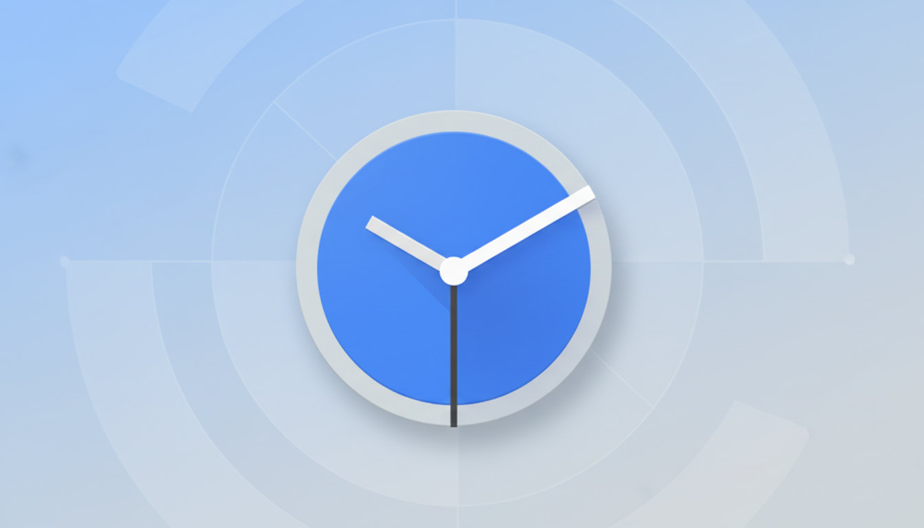
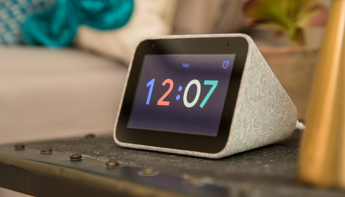
Google is backtracking from a flashy design tweak that made its Clock app’s alarm screen harder for some people to read. In version 8.3, the app discards wallpapers as alarm backgrounds and returns to a solid color background, preferring legibility over aesthetics (read: what you need when you’re squinting at your phone at 6 a.m.).
The change is part of a larger refresh to jibe with Material 3’s punchier visual language, but it also comes in response to user complaints that busy or weak-contrast wallpapers would leave time and alarm controls unreadable. For an app with 1B+ installs, these minor changes result in vast ripples.
Why Google Pulled the Plug on Wallpaper Alarms
When the alarm screen reflected the phone’s wallpaper, it looked good on some setups and somehow unreadable on others. Reports from the community called out a gray-on-gray or muted color scheme that obscured key data — the time, snooze, and dismiss on-screen prompts particularly looked lost in space when viewed in dim locations or moments after you wake up.
This isn’t just aesthetic nitpicking. Accessibility guidance from the World Wide Web Consortium recommends a minimum 4.5:1 contrast ratio for normal text, a bar that many wallpaper-color pairings don’t clear. Material Design itself reinforces that focus on color contrast and glanceability. In the rollback, there is an acknowledgment that alarms are a “glance-critical” moment — clarity outpaces personalization.
What’s New in Google Clock 8.3 for Alarm Clarity
The alarm interface again appears on a solid background, so contrast is consistent between devices and themes. It’s a pragmatic solution: fewer edge cases, fewer unreadable screens, and a screen you can depend on across wallpaper, themes, and ambient light.
If you were into the wallpaper-forward vibe, this may feel like a step backward. But for most people — especially anyone who needs alarms on a daily basis — predictable legibility is the superior default. Personalization is still in other parts of the OS where it is less likely to mess with usability.
Assistant Branding Quietly Slips to Routines
Another small change: The screen in settings that lets you trigger a pre-existing action after an alarm is now just called “Routines,” omitting the explicit Assistant branding. That all jibes with Google’s ongoing transition to Gemini-first experiences. The function is the same, but the name alludes to a service-agnostic architecture of tomorrow where AI can be changed out without constant UI rewrites.
Pulsing Time Animation in the Works for Clock App
In the guts, developers are getting ready to unleash a new “pulsing” effect for the clock numerals, with stroke weight that slightly thickens and thins. The move follows the animated lock screen time seen in more recent Android beta builds, and means that there’s a coherent-motion language across the system.
It’s not live yet, but the direction is obvious: movement that polishes without polluting or distracting from the task at hand. Alluring motion, cast as a soft attention cue, can also act like an alarm if it doesn’t compromise readability.
Accessibility and UX Take Priority in Alarm Design
And the alarm screen is a stress test for design systems: Users are frequently waking, light is inconsistent, and decisions — snooze or stop — must be quick. Studies in usability, including those by the usability experts at Nielsen Norman Group, have long shown that low-contrast text makes text harder to read and also slows reading, reduces the speed of visual search, and causes error rates to increase. Going back to an opaque background closes that loop.
It’s also a subtle reminder of a larger Android trend. Dynamic color and wallpaper theming (as introduced by Material You and Material 3) encourage self-expression, but there are critical surfaces — lock screens, alarms, quick settings — that require guardrails. Google’s tweak is a study in the balance between flash and function.
What to Expect Next as Google Clock 8.3 Rolls Out
As Google Clock 8.3 is now making its way to the Play Store, most people will get the solid night alarm screen from the outset and this “Routines” optimized name at scale. The time pulsing effect is a work in progress, and it may appear in a future release when testing passes.
The takeaway is simple: clarity wins out in times that call for it. So Google’s course correction may not make as much noise as a marquee feature, but it will save innumerable bleary-eyed mornings from suffering the same fate — and that makes it a smart improvement to have.