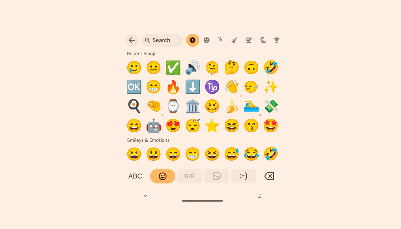
If your emoji panel is suddenly supersized, you’re not going crazy. Gboard also quietly moved its emoji picker from a nine-column grid to eight, which means that all of those little images should be showing up on your screen larger, even if you didn’t remember to install it. Controlled by a server-side setting, the change is rolling out widely, and accordingly, many people are noticing “giant” emojis around the same time.
What Changed in Gboard’s Emoji Grid and Layout
Instead of showing nine columns by default, the emoji grid in Gboard now shows eight. That single-column reduction makes each cell about 12.5% wider, in fact, resulting in substantially larger icons and tappier taps. But since the underlying layout remains unchanged, it still very much feels like the old emoji drawer — now with elbow room.

The switch is powered by a configuration flag Google added in October and gave the whimsical name “emoji_picker_columns.” That flag allows the company to remotely adjust the column count without rolling out a full app update. In practice, this means Google can A/B test different layouts, gather feedback, and tweak the experience in real time. The change was highlighted by several user communities, including Reddit and Telegram groups for Android enthusiasts, who noticed bigger emojis on their devices.
Why Google may want bigger emojis in Gboard
Bigger icons improve usability. 48dp is the recommended minimum touch target size since it helps prevent mis-taps (a very nice thing for dense pickers like emoji panels). By increasing the size of the individual grid cells, Gboard makes each emoji easier to hit with a thumb, which is essential on cramped screens and for users — like yours truly — who depend on accessibility features.
The shift also suits the way we chat. Emoji are the lifeblood of everyday messages, and usage continues to expand from appetite-shaming angry faces to wanderlusting road trips, with over 3,700 standardized characters and sequences available on different devices. And as the library grows, greater visual clarity can help individuals scan and select faster. Also, if you use a giant phone/foldable/tablet, Gboard adapts so emojis are going to be slightly larger to look nice and balanced.
There’s a scale argument, too. Gboard recently crossed 5B installs on Google Play, so even tiny changes make a difference at massive scale. Making the emojis bigger across all those people is a way to slowly cut down on that friction in day-to-day typing without overhauling the interface.
Is it being rolled out to everyone using Gboard
The rollout may not reach every device at once, because it’s governed by a server-side flag. Some of you will see eight columns right off, others may still be served nine based on device density, region, or test cohorts. You don’t need an update in the Play Store for it to show up, and you may even see it one day despite zero other changes in Gboard.

If you’re curious, open the emoji picker and count on the top row. Eight columns, and you’re on the new configuration. The revision applies to the standard emoji grid; other parts of the panel — Emoji Kitchen mashups, sticker suggestions — still hew to their own layouts.
Can you change it or revert the new emoji grid size
There is no user-facing toggle to choose the number of columns. Clearing cache, dark/light theme switch, or going in/out of the beta do not consistently override a server-side flag. Even sideloading an older APK probably won’t be a solution since the configuration is pushed remotely. So, persona non grata with the small emoji? If you really can’t stand them, your only real options are attempting to adapt if or until Google adjusts the setting again.
What this says about Google’s strategy for Gboard
This is classic today, how major apps evolve: feature flags, staged experiments, and quiet iterations. It is common for Google to leverage Remote Configuration throughout its apps in order to tweak UI density, try out new recommendations, or iterate layouts without pushing weighty builds. It enables faster learning cycles and reduced risk in changing something millions of users see every hour.
Expect that column count to continue to increase. Google can fall back to nine, attempt seven on tablets, or pare spacing per orientation and DPI. For now, if your emojis seem bigger, that is part of the design and intended to make tapping more accurate and clear visually with fewer departures from the way you’re used to typing.
Bottom line: those inflated “giant” emojis aren’t a bug or a gag. They are the product of a purposeful layout change that sacrifices a bit of density for comfort and speed — precisely the sort of small tweak that can have an outsized effect on day-to-day messaging.

