Google is quietly testing a refreshed set of Android Auto status icons that align with the visual language introduced on phones with Android 16, according to users on the latest beta. The most obvious changes appear in cellular indicators: rounder shapes replace sharp edges, individual bars supplant the old filled triangle, and clearer typography now labels network types at a glance.
What Changed on the Dash with Android Auto’s New Icons
Early testers report new icons that show cellular strength as discrete bars with a softer, more uniform silhouette. The look echoes the phone-side status bar, reducing the jarring mismatch drivers often notice when hopping between a handset and the car display. Labels such as 5G, LTE, and H appear with updated typography for better legibility on high-glare panels.
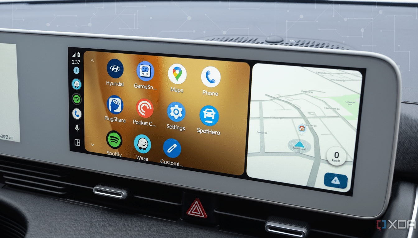
Not every glyph has made the jump yet. While the network icons appear new, the battery indicator remains in its older style in current tests, signaling a staged refresh. Test builds also include multiple colorways—deep blacks and light grays—hinting at broader day and night treatments as Google advances a long-in-development light theme for Android Auto.
Why Android Auto’s Status Icons Now Mirror Android 16
Bringing Android Auto’s micro-icons in line with Android 16 on phones isn’t just aesthetic tidying; it’s a usability assist. Consistency trims cognitive load, so drivers can decode signal and network state with less mental overhead. Human–machine interface research routinely links familiar iconography to faster recognition and shorter glance times, a core objective echoed in Google’s car app guidelines and in driver distraction guidance from safety regulators.
The redesign also leans into the Material You direction: simplified geometry, balanced negative space, and typography that scales cleanly. On dense car dashboards—where maps, media, and calls contend for attention—every pixel of clarity helps.
Why the Old Icon Look Stuck Around in Android Auto for Years
Android Auto bundles many of its interface assets inside the app itself, rather than borrowing status icons directly from the connected phone. This architecture improves compatibility across thousands of head units and countless device models, but it also meant Android Auto’s indicators lagged behind phone-side design updates. It’s why some owners of Samsung phones—whose system icons differ under One UI—already saw a mismatch, while Pixels and most other devices surfaced the older Auto set.
Unifying the iconography inside Android Auto should yield a more predictable experience regardless of the handset brand, cable vs wireless connection, or head unit vendor.
Light Theme Signals and Day–Night UX Considerations Ahead
The presence of light and dark icon variants strongly suggests continued work on a proper light theme. That matters: in bright daytime cabins, a high-key palette with crisp outlines can be easier to read than inverted dark UIs. Automakers commonly switch between day and night palettes to manage glare and contrast; applying the same principle to Android Auto’s status bar should improve visibility without sacrificing consistency.
Where the New Icons Are Showing Up and What to Watch Next
The refreshed icons are surfacing in Android Auto beta version 16.3.160744, with availability limited and server-side flags likely controlling who sees the changes. As with many interface tweaks from Google, there’s no firm rollout timeline, and features often graduate in waves after validation.
Keep an eye on the battery, Wi‑Fi, and Bluetooth indicators next—areas that typically follow once core connectivity icons land. Also watch for a broader light theme debut paired with adaptive day and night behavior in navigation and media drawers.
Android Auto remains a pillar in modern cabins, supported by major brands like Ford, Hyundai, and Volkswagen, even as some manufacturers experiment with embedded infotainment. With millions of compatible vehicles on the road and growing use of wireless connections, small visual refinements like these can deliver outsized benefits—faster recognition, fewer glances, and a more cohesive handoff between phone and dashboard.
Bottom line: this is a subtle but meaningful step toward a cleaner, more consistent car interface. If you’re on the beta track, the new look may appear soon; for everyone else, the update should arrive once Google finishes polishing the full set.