Google seems to be testing a move in the opposite direction of one of Android Auto’s most infamous recent changes, and it involves the return of album art–based backgrounds for the media player after an ill-fated period with Material You wallpaper hues. But, as we zoom out and analyze things just a little more, an APK teardown is revealing that another new issue with the overhauled interface might further compromise readability in multi-window cards.
The hints are in the latest version 15.2.653604, which has found discrete flags pointing to motion-based on an inactive blurred album art overlaid behind music controls.
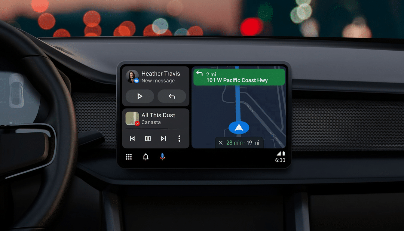
Other changes highlighted by early testers include minor UI tweaks like smaller icons, and a fair amount to do with the seek bar. Related to this, amidst the context of a music app being displayed alongside Maps in split-screen card view, some text on that layout doesn’t render particularly cleanly: I reckon it’s because there’s a light filter applied to album art which is at odds with white text.
What’s New in the Media Player
Android Auto has also recently embraced a cleaner Materal You look‘, pulling prominent colors from your phone’s wallpaper and drenching in them the media pane. The outcome, although in line with Android’s larger theming platform (Monet), got complaints for being so flat and one-dimensional — especially for people whose cars have neutral wallpaper choices that made the media area look flat.
The new test build reverses that script. Instead of palettes derived from wallpaper, the media player brings back a blurred version of the album art for the current track as the background. Indeed, it’s a move that many driver appreciated before the change — one that provides clear context for what’s playing without needing to grab extra attention. Action buttons such as play/pause and skip still seem to inherit Material You accent colors too, so it seems like there is at least some continuity with the rest of the interface.
The in-testing layout also shrinks icon sizes and moves the seek forward visually. That might open up a bit more space for metadata while strengthening the track position — small but logical adjustments for fast glances on the road.
Why the rollback would be popular
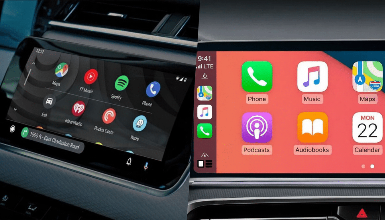
And personalization matters in the car, but legibility and context matter more. The album art backgrounds — blurred and scrimmed — equalize both. Apple’s CarPlay, Spotify’s in-car views and early Android Auto designs already rely on album art to be the visual anchor for the media area. It assists drivers in verifying the correct playlist or podcast at a glance, without having to look for tiny text.
Guided by feedback from users — including in developer-focused support forums and communities like r/AndroidAuto — developers of the Android Auto UI determined that the wallpaper-driven theme, while providing a “monotone” experience in some cases, could also be more difficult to parse when it was colored similarly to app brand colors or vehicle interiors.
Bringing back album art also fits in more closely with the way that passengers expect music apps to look and feel, which reduces any cognitive dissonance between phone and dashboard.
The new snag: Split-screen card text contrast
Testing the updated UI reveals another problem: text can be hard to read in the multi-window card interface (the sometimes very compact views that show both Maps and your media app running on deck). Apparently the issue is related to a slight tint that they apply over album art posted inside cards, which doesn’t work well with white text. In some combinations, the drivers are given low-contrast labels that do not pass the quick-glance test.
That’s not purely a blow for aesthetics: Human factors research from groups like AAA Foundation for Traffic Safety and NHTSA points out that those off-road looks of more than two seconds raise crash risk significantly. Poor contrast slows recognition. Guidelines designed to make the web accessible, such as WCAG 2.1, stipulate a minimum contrast ratio of 4.5:1 between text and its background—a benchmark easily missed when you’re designing with white fonts on bright artwork.
There are easy solutions Google could implement: dynamic text color that flips based on background luminance, darker scrims over artwork or edge-aware gradients that maintain logo and text clarity. Android already uses luminance-based adjustments in parts of system UI, so the plumbing is there.
Tracking the rollouts
None of this is final. It’s worth pointing out that the album art background and accompanying card tweaks are locked behind server-side flags and covert settings in Android Auto 15.2.653604 just like many of Google’s ongoing experiments. Features like this one typically make it to just a fraction of users initially in the beta channel before rolling out more broadly via staged rollouts.
If the album art return does stick, expect iterative polishing: contrast improvements for card text (the current background-gradient approach in 6.0 isn’t bulletproof), further tweaks to icon size and spacing, perhaps even an option in Display settings to toggle between “Wallpaper colors” and “Album art.” A toggle would be a realistic middle-ground that respects both Material You purity and driver preference.
The broader scope for in-car UI
Ever since the Coolwalk redesign, Android Auto has been heading towards a consistent language that will work on phones, tablets and dashboards. The problem is that cars are not phones. Glanceable interfaces, expected color behavior, and reduced distraction outweigh aesthetics. The album art test recognizes that fact — and the card text bug is a reminder of just how shaky the balance can be.
For the time being, drivers should not expect overnight changes to their cars. But the signal is clear: more context-rich media visuals, balanced with safety-led readability. If Google can get contrast right and stop the UI from feeling clinically dead, Android Auto might find a style as expressive — yet perfectly serviceable on the road.