Android 16’s quarterly platform release is here, gracing the Pixel Launcher with a popular quality-of-life improvement. All it takes is a speedy long-press, two taps, and suddenly every app on your home screen has a unified Material You look — no waiting around for developers to play along with themed icons, no half-stale grid of mixed-and-matched colors. It’s the most visually striking update Google has shipped to Pixels in a while, and it arrives alongside the return of system-wide icon shape controls.
What’s new in Android 16 for icons and Pixel Launcher
Two components make this feel fresh. Firstly, the Pixel Launcher now allows you to select icon shapes — something that went away with Material You’s introduction. You can choose a circle, a rounded square, two playful “cookie” takes, and a bold arch. Folder bubbles change as well, going from square to round depending on your choice.
- What’s new in Android 16 for icons and Pixel Launcher
- How to theme every icon on your Pixel in two taps
- Why It Matters For Android’s Look And Feel
- Early impressions and caveats after forced icon theming
- Pro tips for dialing in your Android 16 icon setup
- The bottom line on Android 16’s icon theming update
Second, Google has done away with non-themed icons all around. Formerly, the “Themed icons” toggle used to apply to apps where developers provided monochrome assets. That led to gaps: There was no official Amazon app, nor one for Adobe Lightroom, the AllTrails trail-finding service, dozens of smart home apps, and even some Google properties — like Analytics — that didn’t match up. Android 16 gives you a monochrome icon that matches your wallpaper-based color burst and whatever shape you go for on those last stubborn holdouts. App shortcuts — such as Now Playing or Passwords — are handled the same way.
The result is a home screen that feels curated as opposed to a hodgepodge of branded badges. It’s a substantial upgrade for users who care about visual consistency, which previously came only by way of third-party launchers or custom icon packs.
How to theme every icon on your Pixel in two taps
Begin on a compatible Pixel device running Android 16 QPR2 firmware. That includes Pixel 6 and up. And to see for yourself, go into Settings and About phone, scroll down to the Build number — QPR2 will lead with a string starting with BP4A.251205.006. If you are not on it, go to Settings, System, Software updates and Check for update, then install.
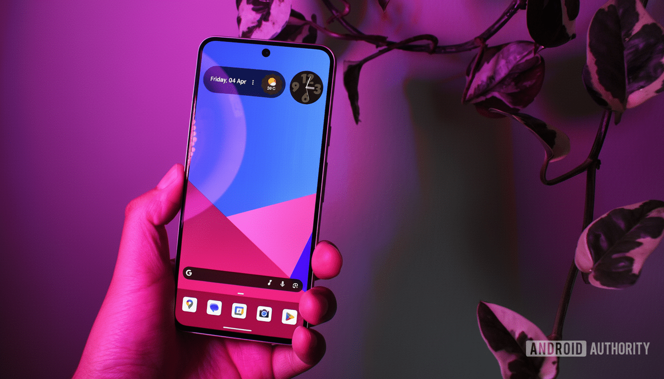
On the Home screen, press and hold any empty space and tap Wallpaper & Style, then tap Icons. From there, it’s quite literally two taps: choose an icon shape, and flick the switch for Themed icons. Although still considered a “Beta” feature, the toggle now themes each icon on your home screen and in folders with a uniform palette and shape that should match your current Material You colors pulled from your wallpaper.
If you were to change your wallpaper at a later date, Android would inexplicably recolor the entire grid as well.
If you miss the original colors, you can also return instantly by disabling Themed icons — no harm in experimenting around.
Why It Matters For Android’s Look And Feel
The big promise of Material You is a personal, unified interface. Themed icons simply were ineffective in the past because all participation was optional. The result is that forced theming narrows the delta here and gives Pixels something more akin to what power users have been able to do with launchers like Nova or Niagara without as much setup overhead.
Consistency isn’t just a courtesy of design. Studies from usability firms like Nielsen Norman Group have long linked standardized iconography with quicker visual scanning and improved recognition. Some 70% of the world’s population, according to StatCounter, can benefit from these clean baseline images and use them as inspiration, tryouts, or encouragement for developers to ship correct monochrome assets that are defined in Android’s adaptive icon and monochrome guidelines provided by the Android Developers team.
Early impressions and caveats after forced icon theming
- The auto-generated icons are eerily consistent.
- The translated icons (image source) look like they were designed, not decoded; it’s hard for me to get my head around it.
- Some brands are known simply by color; as a result, a black-and-white glyph can seem somewhat generic.
- You will occasionally notice misaligned or oversimplified marks.
That is the trade-off for uniformity, which is why the toggle still has Beta written on it.
Performance is still speedy in every sense of the word. There’s no perceivable overhead versus alternative third-party icon overlays when managing your theming pipeline. Power users who want a rainbow of brand colors can just toggle it off, select a shape, and still have access to the new shape controls.
Pro tips for dialing in your Android 16 icon setup
For the cleanest presentation, pick a high-contrast wallpaper to ensure that dynamic colors maintain sufficient visual separation between icons. Although they’re not very far from the box, the square and seven-sided cookie shapes are closer to achieving that elusive density-and-personality balance without feeling like chaos. If you’re the type to keep folders on your first page, make sure that the new folder shape matches your widget edges and search bar radius for a consistent grid.
The bottom line on Android 16’s icon theming update
Forced icon theming in Android 16 and the return of shape controls help the Pixel home screen feel complete. A couple of taps within the Icons panel, and every app becomes uniform; wallpaper-aware even — no icon pack necessary. It’s a minute update with monumental visual payoff — and an easy win you can get in seconds.