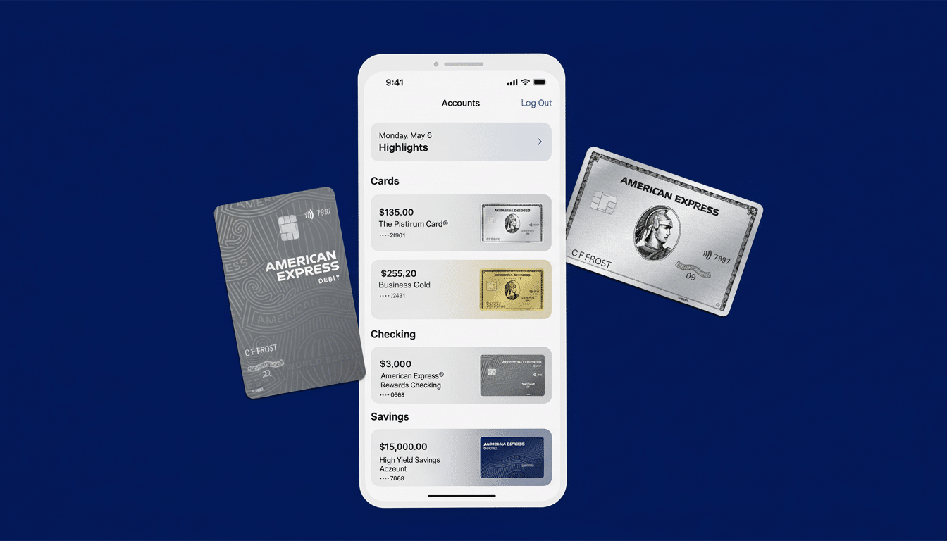
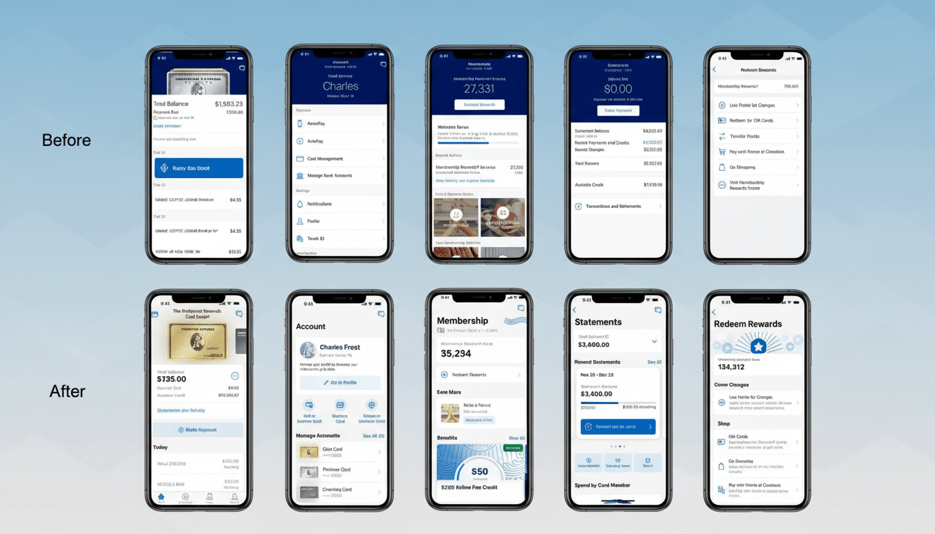
I’m effectively paying almost $900 a year for dark mode palettes of a darker shade. It’s a reality now that American Express raised its Platinum card fee and hid a “Premium” dark mode in the Android app behind that high-annual-fee wall.
“Plat tax,” as the Platinum fee is known, rose to $895, and along with a replenishment of credits, some users found a new app switch in their menu bars: a pitch-black interface featuring an uppercase label “Premium.” It’s a small touch with an oversized symbolism — especially when the app (in regular form) already had a dark theme, not the true black that AMOLED fans lust for, but still pretty much the same idea.

The optics are unmistakable. In a year when so many top cards are vying to justify ballooning fees, one of the most superficial “perks” that you’ll get day in and day out is on your UI — the literal theme — that 99% of banks never charge for to begin with.
What Is Premium Dark Mode Actually Changing?
Dark mode in the Amex app is your standard dark theme using deep blues and grays.
One level of dark mode is premium dark mode, in which things go full black — the background blends into the bezels on OLED screens. It is undeniably slick-looking and can reduce perceived glare and boost contrast on some displays for text-heavy screens.
There is a practical consideration as well. True black pixels consume less power on OLED panels, Google’s Android Dev Summit engineers demonstrated, suggesting that app interfaces exhibit significant power savings at high brightness. That’s real, measurable efficiency — though it does depend on the device, level of brightness, and how you use it.
That said, this is an incremental quality-of-life tweak, not a game-changer. Most of the largest issuers, such as Chase, Capital One, and Citi, make dark themes available to all customers systemwide. No loyalty tiers. No paywall.
A Luxury Card That Treats a UI Theme as a Perk
Why gate a theme? Since the app is the product you click on every day. To behavioral economists, this would be called a nudge: a persistent reminder that you are in the top class, conveyed through glossy graphics and brand-faith exclusivity.
It’s loyalty engineering. Bain & Company has long written that small increases in retention rates can lead to big increases in profitability. It goes to create a premium-only interface, even where that’s trivial in isolation, by making the card feel indispensable — especially after a fee raise.

Intuitive, polished apps have consistently been one of the best predictors of satisfied customers in research from J.D. Power’s U.S. Credit Card Mobile App Satisfaction Study. Issuers understand that digital experience impacts churn. It’s a sensible (if head-scratching) decision to dress up the daily cringe.
The Value Math for Cardholders: Credits Versus Fees
Cardholders don’t plunk down four figures for hex codes, after all; they do so for travel utility and rewards. The Platinum playbook is all too familiar: airport lounge access, high earn rates on flights, focus on hotel status tie-ins, and a handful of lifestyle credits. Recent messaging has highlighted new credits tied to dining platforms such as Resy and wellness-adjacent perks, with Amex positioning those as offsets to the higher annual fee.
Whether those credits are user-friendly is the real test. Sojourners eye breakage, redemption friction, and category alignment with their own buying. Given the credits, the math on the card can work. If they’re not attracted, a darker interface won’t change their mind.
When A Design Decision Turns Into A Precedent
As evidenced by the gaming skins and paid app icons for themes, the consumer internet has become increasingly comfortable viewing themes as paid cosmetics, but banking has mostly kept design choices of this sort universal. Dark mode is more than just an aesthetic choice; for some users, it reduces eyestrain and improves legibility in low light.
It seems to be out of line with convention, and even with some accessibility advice that recommends contrast or color options that can be adapted by every user.
As mobile banking evolves to be the primary branch, essentials such as theme controls should be table stakes.
The Takeaway On Spending For Pitch Black
The premium dark mode is gorgeous, and on OLED devices it can save a bit of battery life. But it’s window dressing at best. No cardholder is going to renew on a color palette. The math circles around lounge networks, credits you will spend money on anyway, redemption flexibility, and customer service — the fundamental benefits that competitors assail daily.
The irony is rich: the most conspicuous new “benefit” is a UI flourish that makes it clear how easily perks can become part of the theater. If the point is to foster loyalty, then make the generous stuff simple to use and keep the basics universal. Provide every cardholder with a dark mode that they can use, and then win them over with value that actually adds up once they step off the plane, not just when they open their app.

