After many years with Galaxy flagships, I switched to a Pixel earlier this year hoping for something simpler and more streamlined in terms of an Android experience. I got that — and some neat imaging and AI flourishes — but I also had to walk away from a rather hefty list of thoughtful touches baked into Samsung’s software. The contrast between One UI and what Google thinks Android should look like on a phone winds up emphasizing how differently the two companies value features and polish.
Here are seven Samsung conveniences that I genuinely miss on the Pixel, and why they’re worth missing even as Android itself gets better.
- A smarter Clock app that actually scales?
- Good Lock’s deep-dive customization across One UI
- One Hand Operation+ and thumb-first navigation
- Modes and Routines, the automations that do everything
- Clean home screen with stacked and swipeable widgets
- The Now Bar and the richest Live Updates experience
- Edge Panel for quick access to tools and apps anywhere
- Genuine pop-up windows for desktop-style multitasking

A smarter Clock app that actually scales?
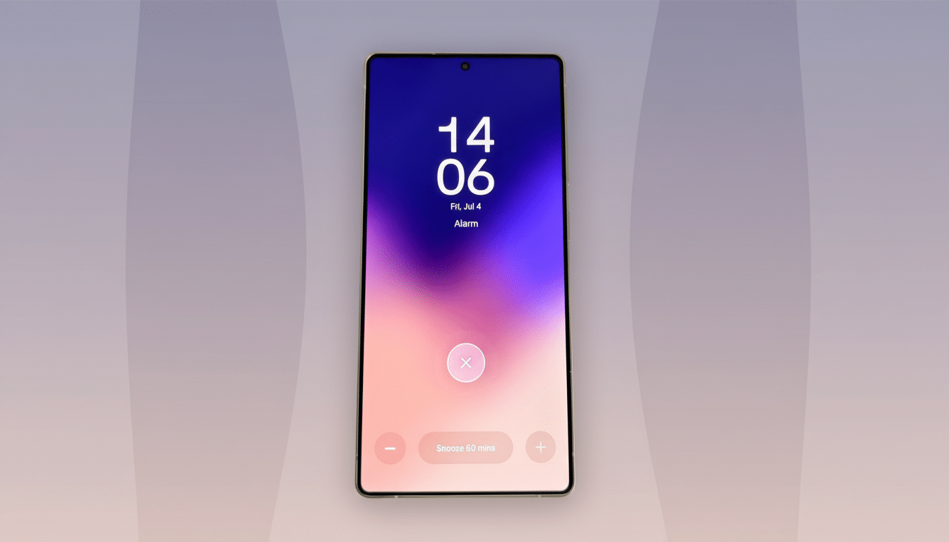
Samsung’s Clock is deceptively powerful. Alarm groups allow you to corral multiple alarms together in neat folders, and toggle them en masse. If you juggle early morning workouts, school runs and international calls, grouping them together saves time and taps. On Pixel, the system Clock is pursuing an emotive Material aesthetic, but it is less effective at scale; dealing with many alarms becomes scrolling and micro-toggling. Google has telegraphed design tweaks along the way, but it’s functional features like group-level controls that resonate most with time-pressed users.
Good Lock’s deep-dive customization across One UI
And Good Lock is like the Swiss Army knife of One UI. In Theme Park, you can create full-on icon packs and apply them system-wide — which is more than most Pixel icon packs can say, as they rely on launcher-level jiggery-pokery and don’t consistently touch the multitasking view. Sound Assistant sprinkles on some useful features, too, like remapping long-presses of volume keys to act as track skip when the screen is off—great for those who turn off earbud taps at night. It’s the sort of quiet utility that reduces friction hundreds of times a week.
One Hand Operation+ and thumb-first navigation
But unlike other apps in the Good Lock suite, One Hand Operation+ doesn’t get enough love.
The real unsung hero in the Good Lock suite is One Hand Operation+. It allows you to assign different actions for swiping straight or up and diagonally down from the edge of the screen. On a tall phone, where the back, home and overview have been mapped to comfortable side gestures, your thumb will never need to stretch downward to that bottom bar. Pixels offer refined standard navigation, but they miss out on that triple-gesture flexibility that becomes second nature to power users over time.
Modes and Routines, the automations that do everything
Samsung Modes and Routines is a little deeper than Apple Shortcuts, covering settings on devices, apps or connected wearables and triggers like time, location, accessories or even an alarm going off. That last one is especially strong: an “appointment” alarm can switch your ringer’s volume all the way up so you don’t miss a call, then back down once it passes. Another: a migraine routine that adjusts the screen, adds a blue light filter and silences the audio with one tap. Pixels have basic routines with system rules and third-party automation, but Samsung’s native breadth — especially when paired tightly with earbuds and watches — decreases the app-juggling.

Clean home screen with stacked and swipeable widgets
Stackable widgets are something that sounds unimportant until you’ve lived without them. On Samsung, you can stack same-size widgets — Calendar with TickTick, Weather with a world clock — and swipe through them in place. It does so while keeping your home screen clutter-free but not lacking in quick glance data. It provides beefy widgets, but the lack of a stacking strategy means that you either spread across screens or shrink everything until it’s hard to read. One little distinction, one big everyday payoff.
The Now Bar and the richest Live Updates experience
Android’s Live Updates framework is intended to bring ongoing activities —navigation, sports, deliveries—directly into a persistent area. Samsung’s version, the Now Bar, actively cooperates with more of the company’s core apps (like Maps) and even controls media in that persistent UI. Live Updates support remains inconsistent across apps on the Pixel, and system-level media controls have not wholeheartedly adopted this format. There’s Google’s own developer guidance favoring app-by-app adoption to help explain that gap, but the end outcome is clear: Samsung’s feels done while Pixel’s can feel like a work in progress.
Edge Panel for quick access to tools and apps anywhere
Edge Panel is one of those love-it-or-hate-it ideas that once you start using it, you wonder how you got along without. A small protruding handle calls up new panels that you can customize: favorite apps, tools (a ruler, a compass), clipboard and so forth. It’s also a quicker, more reliable way to get around than slogging through recent apps or swiping across multiple home screens. There are third-party solutions on the Pixel but they’re rarely as smooth, animated and system-hooked-in as Samsung’s native approach.
Genuine pop-up windows for desktop-style multitasking
Split screen is table stakes in Android, and Pixel doesn’t do anything terrible with it. What I do miss are Samsung’s freeform pop-up windows. Floating a messaging app, resizing it or moving it while you’re watching video or browsing also eliminates the friction of frequent app-switching. Android’s Chat Bubbles are an attempt to solve that for conversations, but they only work with single threads and messaging apps —and can be invasive when turned on by default. (The pop-up windows work for any app, and act like actual windows, too, which is a big deal on large displays.)
None of this is to say that the Pixel is a worse phone — only that it’s yet another example of the two companies’ different philosophies. Google tends toward simplicity and opinionated design; Samsung leans into power-user control. IDC and Counterpoint have long noted that Android buyers range from the casual to tech tinkerers, and these two flagships rather neatly represent those poles. For now, I’m happy focusing on Pixel’s strengths. But if Google pulled in even just a couple of these One UI head-turners, most notably widget stacks, deeper Live Updates options and richer gestures, it would make things a lot more difficult for anyone on the fence to choose.

