Google has silently removed the Daily Hub public preview from the Pixel 10 phones and confirmed to 9to5Google that it is pausing the rollout to work on the Black Friday experience. It’s the right call. The idea — a centralized, glanceable summary of your day — was better than the reality, and launching a half-baked feed would have risked alienating users to the idea of a tool that, irrespective of its flaws, some people might find genuinely useful if developed properly.
What Daily Hub aspired to be
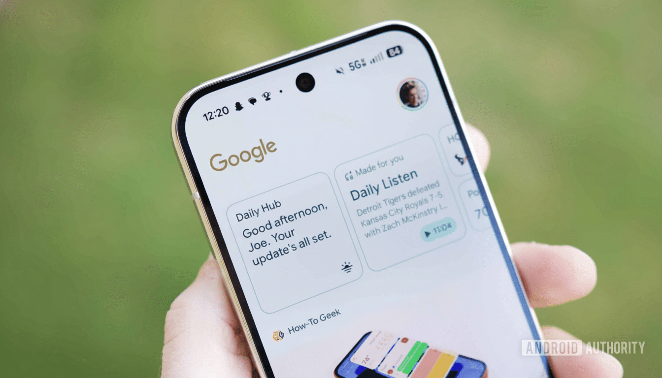
Daily Hub was conceived as a single-stop destination to grab a weather readout, consult a calendar, see reminders and get recommendations for content. In the abstract, it also felt like the spiritual (modern) heir to Assistant Snapshot and a half-baked alternative to At a Glance — a thing you would only go to once and then just know what to do next.
Its positioning and depth proved problematic in practice. It lived in the top of the Discover feed for some people, and only showed up at times as a thin line in At a Glance, which is to say, it was both difficult to find and easy to miss. A daily brief that is buried behind a swipe is the opposite of what makes “glanceable” information useful in the first place.
The fundamentals: Visibility and control
A daily briefing should be right where you are: lock screen, home screen or a readily pulled-up panel. Competing implementations — from Apple’s Smart Stack and StandBy to Samsung’s lock screen and Edge Panel summaries — value immediacy over all. The fact that Daily Hub depended on the Discover feed made it bumpy and unnecessarily optional as a feature rather than feeling it was critical to the experience.
The second problem was agency. Sections could not be reordered by users nor could sources. Weather cards typically showed only the present conditions, and calendars brought up just upcoming events; there was no easy way, for instance, to customize the brief for travel, commute, tasks or health data. Recommendations (YouTube videos, articles) land once in a while, but they are not strong enough to hold down the utility of something designed to help you wake up in the morning.
Design research backs this up. How Nielsen Norman Group advises design of dashboards focuses on personalized, task-driven layouts, and stresses the role of actionable content rather than decorative widgets. And McKinsey’s research on personalization has discovered that most consumers now demand tailored experiences — and feel personal affront when companies fail to deliver. A daily hive with no true customization makes no sense.
What a good Daily Hub will offer
Google doesn’t have to reinvent the wheel here; it just has to finish the damn thing. A relaunch would feature a first-run setup wherein users can pick modules — weather, commute from Maps, multiple calendars (work, personal), Google Tasks/Reminders, package tracking, flights, fitness via Health Connect, home (Google) alerts from Home app, and so on — and adjust their priority and density.
It’s where they’re placed as much as the content. Daily Hub should appear directly in the lock screen and home screen, with a gesture or an Edge-style panel to easily bring it up. The bar is “glanceable, actionable, dismissible”: one tap to open a calendar event, or snooze a reminder, to start navigation, or to acknowledge a home alert. At a Glance is excellent for alerts; Daily Hub could be the deeper level that supports it by not duplicating it.
Richer summaries would help, too. Weather forecasts and advisories should be displayed. Calender needs a functional horizon (the next 24-48 hours – not the next slot). Commute should factor live traffic. And if recommendations do persist, they should be secondary to utility — say, buried as a final card that can be turned off.
Why Pausing Beats Iterating In Public
Releasing an unfinished assistant isn’t a recipe for confidence, especially on a flagship series. It draws back the curtain and gives you something else to focus on but it also sets your expectations in a clean slate; you can’t judge Daily Hub by the worst version of itself. It also allows Google to tie the feature into its wider ecosystem — Gemian strategies for summarization, Calendar and Tasks for planning, Maps for commutes, and Health Connect for wellness — without overwhelming users with a mishmash of overlapping cards.
Google has been here before. Assistant Snapshot was killed off as the company invested more in surfaces such as At a Glance and proactive notifications. The lesson: opinionated, focused utilities win when they respect context and control. So long as a slick Daily Hub could stand in that lineage, so long as it surfaces the right information at the right time, and only that information.
What to watch next
Scour for more explicit positioning on lock and home screens, more granular toggles during setup and more impactful third‑party hooks. If Google were to open these standardised slots for calendars, tasks, and fitness through existing Android frameworks, Daily Hub might become a useful morning ritual rather than a feed to scroll past.
In the meantime, Pixel 10 owners are wise to depend on At a Glance, Calendar, Maps, and standalone widgets. Pausing the Daily Hub wasn’t simply a good idea — it was the only way to make the actual execution worthy of the concept.