Android 16 marks the biggest visual update to the platform since Material You as it introduces a new “Material 3 Expressive” look to Pixel phones. It’s bolder and rounder, and intentionally more colorful, with new icons and resizable Quick Settings tiles that change the way you engage with core controls. Like it or not, that’s a message from Google — and we want to hear from you.
What is Material 3 Expressive?
Think of Expressive as a more assertive Material 3, updated. It further embraces the dynamic color and shape language: beefier corner radii, higher-contrast interface surfaces and iconography with stronger silhouettes. The Material Design team has been blathering for the past few years about “expressiveness through color and motion” and meaning having to do with “physicality,” and this update applies that approach to system-level UI elements that you look at several dozen times a day.

Beneath the hood, dynamic color mapping still samples hues from your wallpaper, but shades lean toward higher chroma and contrast remains more consistent whether running in light or dark mode. That should tone down the washed-out pastels that some users found to be a bit too limp in early Material You iterations, while further aligning with accessibility guidance from the WCAG on minimum contrast.
What’s changed in everyday use
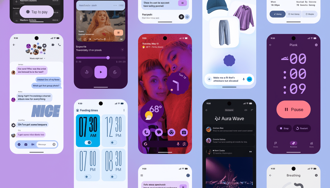
The Quick Settings shade is The Show. Tiles are also resizable, so you can promote essentials—Wi‑Fi or Bluetooth to larger targets, say—at the same time as narrowing less-used toggles. The grid has been opened up a bit more and the brightness slider and header card have a more pronounced visual hierarchy, with the most important actions placed where your thumb will naturally fall.
System icons such as battery, Wi‑Fi, and connectivity adopt a filled, high-contrast look. Fans will argue that these are easier to read at a glance; critics will say they’re a bit too iOS. Regardless, they are significantly easier to parse in bright light and are better for quick scanning, and that matters if you often jump back and forth between the home screen and the notification shade.
Animations also feel more intentional. Applaunch and lock shade transitions are smoother and timing is preciser which decreases visible jittering. It’s the type of change that you’re more likely to notice when you roll back to an older build and something doesn’t quite “feel” right.
And while the focus is on look and feel, the update also brings with it some functional benefits, including early desktop mode improvements and Auracast support for recent Pixels. Those features aren’t in Expressive per se but it shows just how much of the platform’s refinement is happening in these quarterly drops.
Design intent and usability
On the UX side, the larger touch targets and the better exposed layering are wins. Fitts’s Law teaches us that larger, nearer targets are faster to hit, and the redesigned tiles reflect that. The raised cards and drop shadows aid in the distinction between interactive elements and background chrome, a legacy Material principle which cuts down on accidental taps.
Color is working harder as well. Google’s Material guidance indicates that the new dynamic color system also favors tone pairs that maintain at least a 4.5:1 contrast ratio for body content and higher-contrast parentheses for “key” icons. Realistically: Text on tiles and key toggles should be more readable across wallpapers, not just Google’s curated ones.
How apps and skins could change
For those using the Material 3 libraries, Expressive should come mostly “for free” once dependencies are updated thanks to new tokens and defaults. Apps with more extensive custom theming might also need to re-evaluate icon weight, elevation and colour roles to prevent conflicts with the system’s more pronounced shapes.
OEMs will be faced with decisions. Interfaces such as One UI and HyperOS already stack on top of Material conventions; adopting Expressive’s iconography and tile behavior could improve coherence, but anticipate manufacturers maintaining their signature twists. The test will be whether those third-party tiles and widgets hop on the resizable train, and do so promptly enough that users have a consistent experience.
Early reactions: divided but engaged
Early community response has been mixed in the best way: engaged, specific and obsessed with details. Many on forums and social channels appreciate the resizable tiles for reducing friction — but some feel the the heavier icon set veers a little too close to competing platforms. The UX research community, including at places like Nielsen Norman Group, have known for ages that wayfinding benefits from recognizable, high-contrast icons — Expressive plays up that fact whether you like it or not, even if the result ends up looking a bit like marmite scented.
Have your say
So what side of Material 3 Expressive are you on in Android 16 — a breath of fresh air and modern, or a stray step too far? Vote in our poll, and tell us why. And if you’ve already lived with the update on a Pixel, we’re especially interested in how the new Quick Settings, icon set and dynamic color work for you. How you think we should cover the rollout, and what tweaks Google should make next.