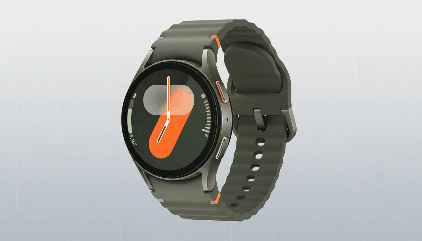
Spotify is quietly trialing a striking new “Now Playing” experience on Wear OS that ditches on-screen controls in favor of full-bleed album art and simple gestures. Early sightings on a Galaxy Watch 7 suggest the redesign is a limited server-side test, pointing to a possible broader rollout if feedback lands well.
The experiment underscores Spotify’s ongoing push to streamline listening across devices. It also arrives on the heels of recent additions like Page Match and About the Song, indicating the company is tuning both discovery and playback with equal intensity.
What changes on the wrist with Spotify’s new Wear OS player
The test interface surfaces edge-to-edge cover art and basic track details while removing the traditional play, pause, and skip buttons. Rather than tapping tiny targets on a 1.2–1.5-inch display, the entire screen becomes an interaction surface. This is a deliberate, watch-first interpretation of a “glanceable” player: you see more art, fewer controls, and rely on muscle memory instead of on-screen icons.
Importantly, the standard Now Playing screen with large control buttons still exists. Testers report you can swipe up from the minimalist view to reach the familiar controls, suggesting Spotify is layering experiences instead of replacing them outright.
Gesture-first controls explained for Spotify’s Wear OS update
In the new layout, a single tap anywhere pauses or resumes playback. A double-tap on the right advances to the next track, while a double-tap on the left goes back. The approach mirrors common patterns in headphone touchpads and media apps, reducing the need for visual precision during workouts or commutes.
This scheme aims to cut accidental mis-taps and keep eyes-up interaction brief. On-wrist, shaving even a second off a task matters; watch UX research consistently shows that minimizing time-to-action improves satisfaction and reduces errors on small screens. By leaning on gestures, Spotify is essentially making the cover art itself the biggest button in the room.
Why Spotify is rethinking Wear OS playback on smartwatches
Wear OS has steadily moved toward bolder visuals and simplified interactions, from Tiles to redesigned system notifications. For music apps, the trade-off is stark: clarity versus control density. Spotify appears to be testing whether most on-wrist interactions are binary—play, pause, next, previous—and whether advanced actions should live just one swipe away rather than crowding the primary canvas.
There’s precedent. YouTube Music on Wear OS already emphasizes large artwork with fewer buttons, and Apple Watch’s default player relies on prominent art with oversized controls. Spotify’s twist is going further, prioritizing gestures to reduce visual clutter while keeping a safety net for users who prefer buttons.
The timing also fits Spotify’s broader platform cadence. After bringing offline downloads to Wear OS in 2021 and iterating on watch controls, the company has shifted energy toward richer metadata (About the Song) and smarter recommendations (Page Match). A cleaner Now Playing could be the playback counterpart to those content updates, aligning the watch with Spotify’s “less friction, more context” mantra.
Availability of the test and how to try it on Wear OS
The redesign appears to be a server-side A/B test. One early tester reported the new view on a Galaxy Watch 7 running the latest One UI Watch build with Spotify version 9.1.20.1442 on the paired phone. Others with similar setups may not see it, underscoring that eligibility is controlled by Spotify’s servers rather than just app version.
If you’re curious, update Spotify on both phone and watch, force close the watch app, and reboot the watch. That won’t guarantee access, but it removes obvious blockers. If activated on your device, you’ll land on the minimalist cover art view; swipe up to verify the classic control screen still resides beneath.
What to watch next as Spotify refines its Wear OS experience
Two questions will shape whether this sticks: does gesture-first control reduce errors during motion, and can it satisfy users who rely on scrubbing, shuffling, or changing outputs from the wrist? Because the classic screen remains a swipe away, Spotify may ultimately turn this into a user-selectable layout in settings or keep it as the default with an easy escape hatch.
For Wear OS, even modest UX wins can compound. Smartwatch sessions are short, and every tap counts. If Spotify’s experiment proves faster and more reliable for the majority of quick actions, expect wider deployment—potentially alongside refinements like clearer haptic cues or on-screen hints—once testing wraps.