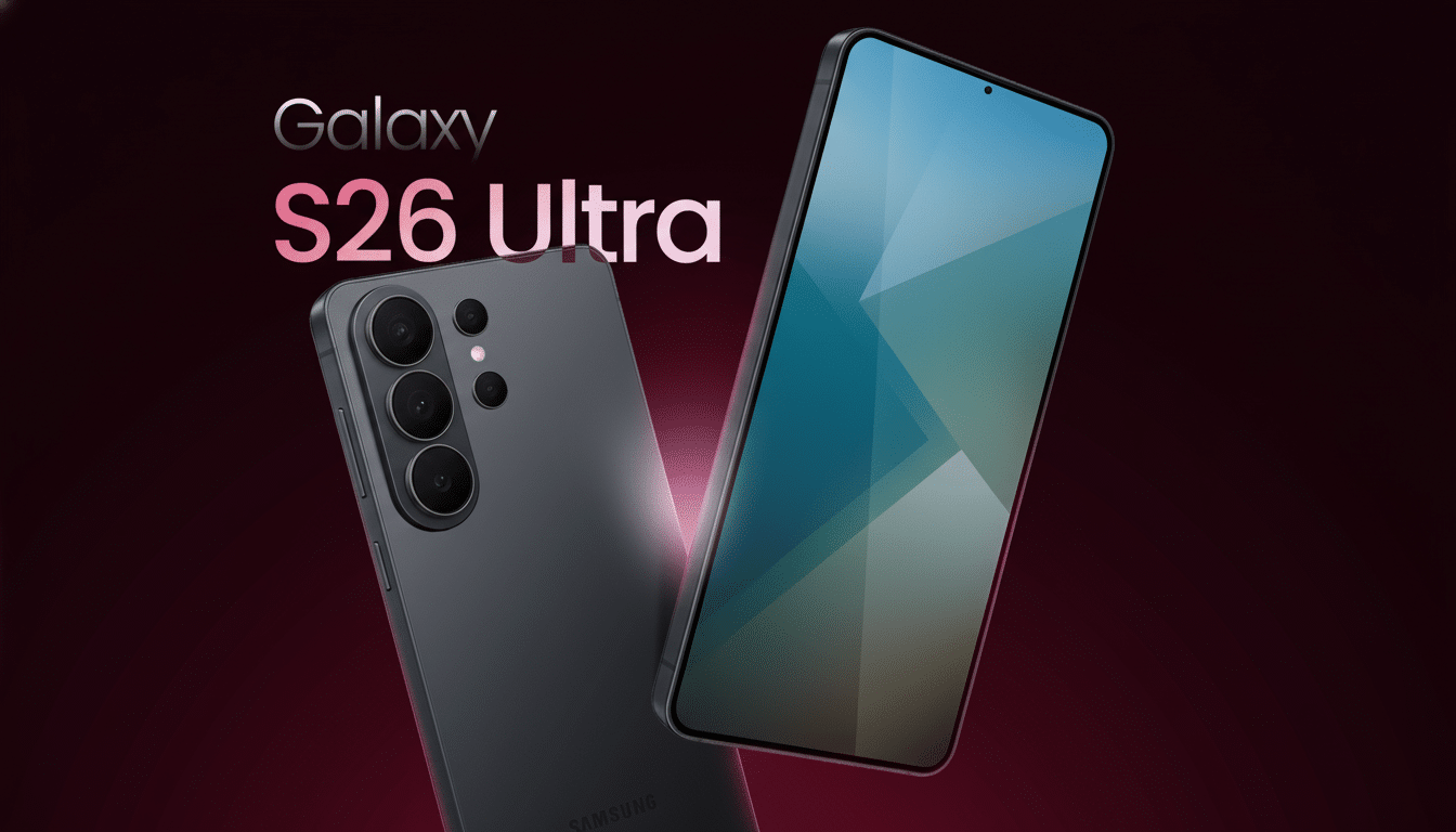
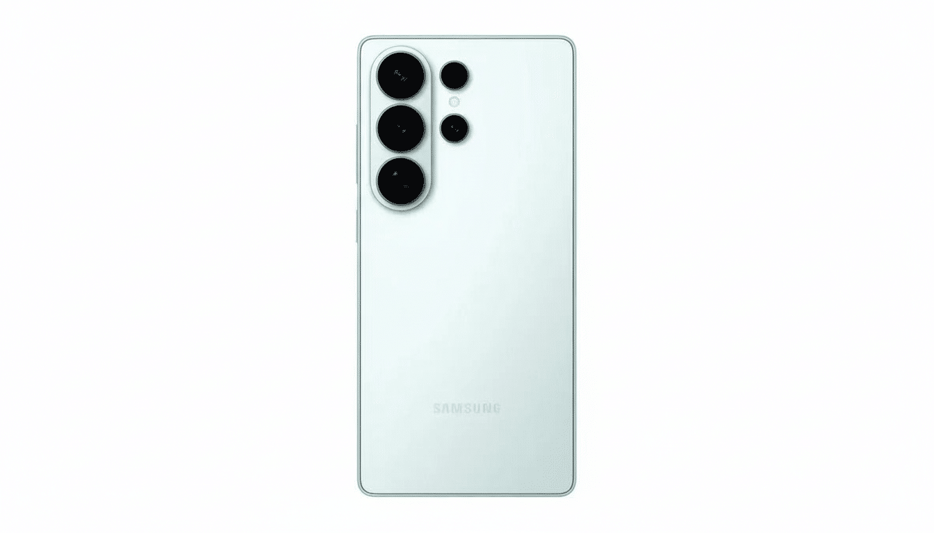
A murky new leak suggests that Samsung’s Galaxy S26 Ultra might come in an incredibly bright orange, and the immediate reaction is anything but a warm embrace. The purported dummy unit, circulated on social media by an account with no credible track record, set the comments section alight with accusations of copycat styling and brought to mind one of our most popular dining table topics: When do striking colorways feel exciting and when do they veer straight to try-hard?
A dubious dummy and an overly loud orange shade
Accessory dummies frequently appear months before launch, originating from case makers and supply-chain CADs. Colors at this stage are notoriously unreliable. Dummies can preview dimensions and camera positions, but that’s it. Here, the orange is turned up to near-neon, with a gloss and high-chroma finish that is liable (sadly) not to make it into Samsung’s normally muted flagship palette. This isn’t corroborated by trusted leakers or certifications, so it’s wise to view this as a test mule rather than a finished decision — or even take the render as a fan mockup.
Still, perception matters. The comment threads on Reddit and X are running sharply negative, with users describing the tone as “toy-like” and “try-hard.” Sure, that seems like a natural reaction: In the premium tier, luxury signals come in matte tones and muted metallic ones. A loud orange could easily read like novelty rather than status, particularly in a thousand-dollar-plus device.
Color wars and Apple comparisons over a bold orange option
Some of the blowback likely stems from rumors that Apple is considering an extremely orange iPhone 17 Pro. And when two competitors pursue the same flash-in-the-pan color, fans can sniff out imitation. But context matters. Orange is not a completely new color for Samsung; the company previously offered online-exclusive softer shades for versions of its Galaxy Z4 series and warm finishes in previous “Bespoke” and custom orders. The issue here is one of severity: this leaked shade looks more safety kit than fashion-forward titanium.
The industry has a problem of convergence as well. Chiseled edges, understated camera rings and titanium marketing mashups blur brand signatures, so color becomes a ready differentiator. That’s one reason both companies frequently experiment with new finishes in small quantities or limited editions. It’s also why Samsung put the more ruggedized Galaxy Watch Ultra on side-eye notice for hewing to Apple’s playbook; enthusiasts are hyper-aware of overlaps, even if they’re engineered with what feels like coincidental or material purpose.
What Sales Data Reveals About Bold Colors
Analysts have long noticed that neutrals dominate sales of the flagship. Companies that track carrier inventory and retail sell-through, like Wave7 Research, note black, gray and muted metallics as consuming the majority of shelf space and volume. Brights stand out in marketing shots, but they rarely dominate sales.
Consumer preference research supports this. YouGov’s surveys in multiple countries find blue is by far the world’s most popular color among adults, while orange barely manages to rise out of single-digit percentages. For premium devices, however, both Counterpoint Research and IDC have observed that conservative finishes significantly outsell bold colors in the $600+ segment — a rollover impact on enterprise and carrier channels. That’s not to say orange can’t work; it just tends to work best as an accent or an online-exclusive one-off rather than a mainstream hero color.
There’s also nuance by region. Historically, in markets like India and Southeast Asia, bright phones tend to get more traction in the midrange tiers where younger buyers value visibility and affordability. Flagships, though, are doing a different psychological job: they form part of the workaday tech purchase and fashion signal. Matte titaniums, navy blues and smoked greens still give an aura of sophistication; high-gloss orange can come across as season-bound or niche.
Why Samsung Would Be Testing A Noisy Prototype
And even if this dummy is authentic, it could just be a color experiment rather than a commitment. Manufacturers frequently test out-there finishes with accessory partners in order to match coatings, materials and camera ring contrasts. Public “leaks” can also be accidental — dummies pass through many hands — or a helpful barometer of taste. And if the mood goes south, brands will simply slip into a less ostentatious finish, or else leave the loud option as an online-only variant in small numbers.
There are also broader design currents to keep in mind. Exhibit: Pantone’s Color of the Year, Peach Fuzz, steered fashion and consumer tech toward warm, soft oranges, not factory neon. If Samsung is looking to ride that wave without hitting any negative vibes, a more muted, premium-leaning apricot or bronze-tinged orange with matte glass would fit the bill better than the fire-alarm shade in this leak.
The bottom line on the orange outrage for S26 Ultra
Until a more reliable source confirms the leak, take it as a placeholder or perhaps as a trial balloon. The outcry does reflect a real tension: in a hardware-converging world, color is one of the last levers left for identity signaling. If Samsung does take the plunge with an orange S26 Ultra, expect it to be tempered — matte, more subdued in shade and likely only available to online channels or limited regions. And if it doesn’t, the early antipathy sends a clear message: premium buyers want personality, not high-visibility gear.