Opera’s latest update, Opera One R3, lands with a suite of features laser-focused on organization, focus, and built-in intelligence — and they’re strong enough to make even entrenched Chrome and Safari users rethink their setup.
Context matters: Chrome still commands roughly 65% of global desktop browser share, Safari hovers near 20%, and Opera sits around 3%, according to StatCounter. That imbalance exists not because alternatives lack good ideas, but because switching is hard unless the gains are obvious. R3 makes those gains obvious.
Here are the five standout reasons this release can replace your default browser without looking back.
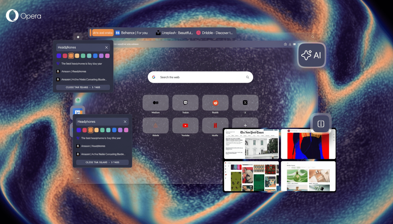
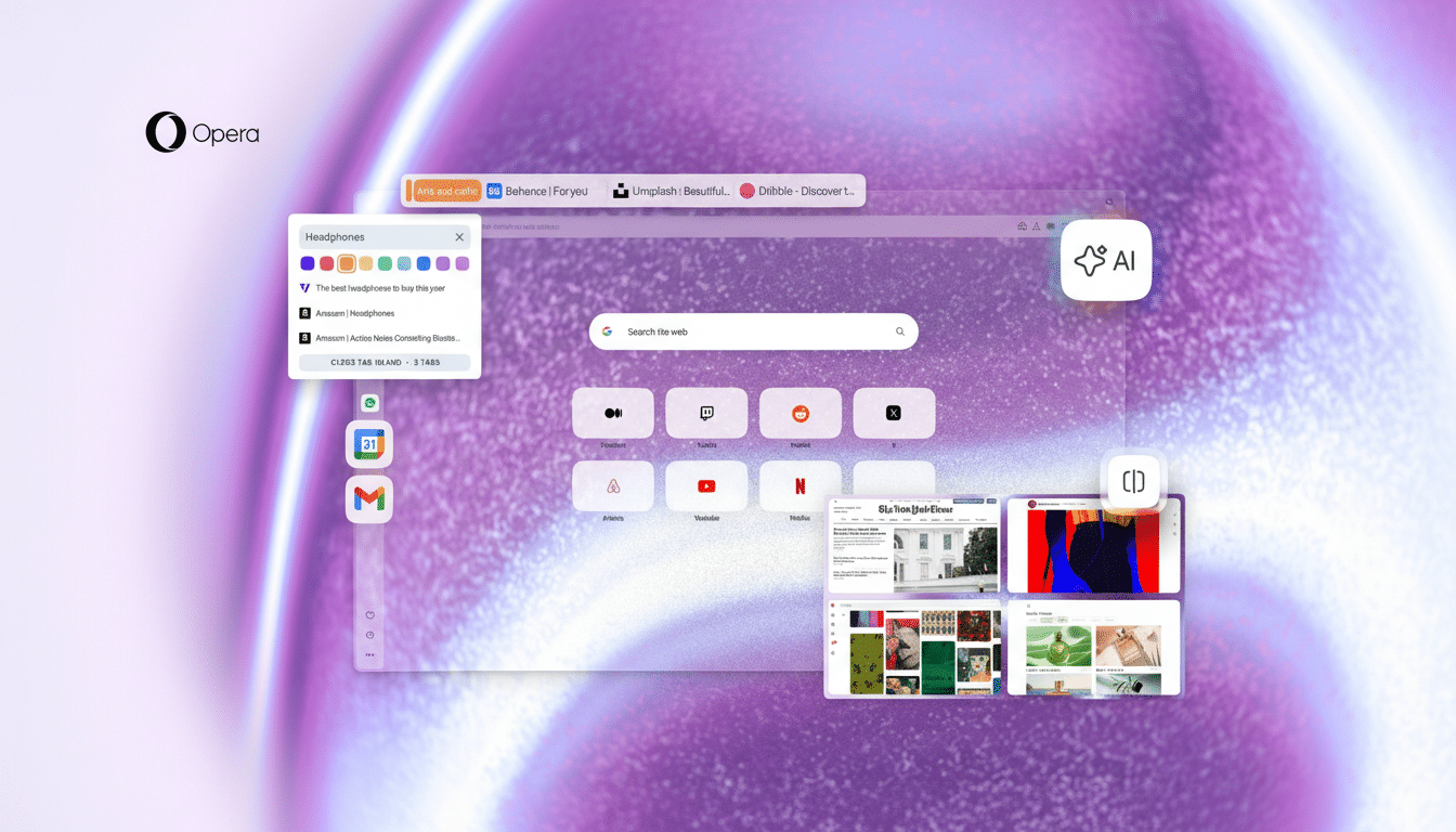
Smarter Tab Islands and Workspaces for Focus
Opera’s Workspaces and Tab Islands already separated projects into tidy, color-coded clusters. R3 sharpens that experience with clearer grouping and faster controls so you can collect related tabs in seconds and collapse them when you need to focus. For research-heavy tasks — say, a grant proposal with multiple sources, a draft doc, and data dashboards — the islands approach reduces mental juggling that plagues traditional tab bars.
Usability experts at Nielsen Norman Group have long noted how chunking related items reduces cognitive load. That’s what Tab Islands do. Chrome and Safari offer tab groups, but they still feel like labels on the same cluttered shelf; Opera’s islands behave like self-contained mini workspaces you can manipulate as a unit.
Aria AI That Understands Your Tab Islands
Aria, Opera’s built-in AI, now works at the level of a whole tab island — not just the page you’re on. That means you can ask Aria to summarize all open sources in an island, compare two product pages, draft an email based on a research cluster, or pull out key dates across several articles. Opera says Aria’s Composer engine can tap multiple models and live web data, which helps it stay context-aware without copy-pasting between tabs.
Neither Chrome nor Safari offers a native AI that treats a group of tabs as a single workspace with memory. Edge’s Copilot is powerful per page, but Opera’s island-level context changes the workflow: your AI doesn’t just read; it understands how your tabs relate.
Split Screen Built For Real Multitasking
R3 refines Opera’s native split view so you can tile up to four tabs in one window with independent scrolling and controls. On an ultrawide display, this means a document, a reference PDF, a project tracker, and a video call can coexist without juggling windows or relying on OS-level tiling. It’s the difference between managing windows and doing the work in front of you.
Chrome and Safari lean on the operating system for this; Opera bakes it into the browser. The result is a workstation feel, not a tab strip with pretensions.
Sidebar Shortcuts to Gmail and Google Calendar
Opera’s sidebar isn’t just for messaging apps; R3 gives first-class, always-on shortcuts to Gmail and Google Calendar. The benefit is subtle but real: you peek at your inbox or check availability without switching workspaces or digging through pinned tabs. For teams living in Google Workspace, this trims micro-interruptions that, according to the American Psychological Association, add measurable friction through task switching.
Chrome users can simulate this with extensions or pinned tabs, but the sidebar approach keeps critical utilities a single click away without crowding your main canvas. Safari’s side panel doesn’t offer comparable Gmail or Calendar integration.
Dynamic Themes and a Music-Reactive Mode Option
Personalization isn’t fluff when you’re in a browser all day. R3 expands Opera’s theme engine with richer customization and a music-reactive option that shifts the browser’s ambiance in real time. It’s a small delight that makes long sessions feel less sterile, and it’s faster to set up than heavyweight theming extensions.
Consumer studies from Adobe and Deloitte have repeatedly tied personalization to higher satisfaction and engagement. While Chrome has introduced generative themes and Safari offers system-level aesthetics, Opera’s live, reactive approach adds a different layer of presence — your workspace feels alive, not just skinned.
The Bottom Line: Why Opera One R3 Is Worth Switching
R3 doesn’t just add features; it connects them. Tab Islands reduce clutter, Aria understands context across those islands, split screen keeps the right tabs visible, the sidebar trims app-switching, and dynamic themes make the whole experience more personal. For anyone managing research, content, or client work, that coherence is the upgrade that finally justifies a switch.
Opera won’t topple market share overnight, but this release makes a practical case for changing defaults: less friction, more focus, and tools that work the way modern workflows actually look. If your browser has started to feel like overhead, R3 is the rare update that gives you time back.