New leaks from an unreleased One UI 8.5 build indicate that Samsung is working on a wide design revamp that embraces more rounded, pill-shaped controls and denser layouts—changes that watchers say look more and more like the visual direction typically referred to as “iOS 26” in leak circles.
The tweak seems to provide a consistent adjustment across all of the system apps, such as file sharing and calling, as well as the main settings menu.
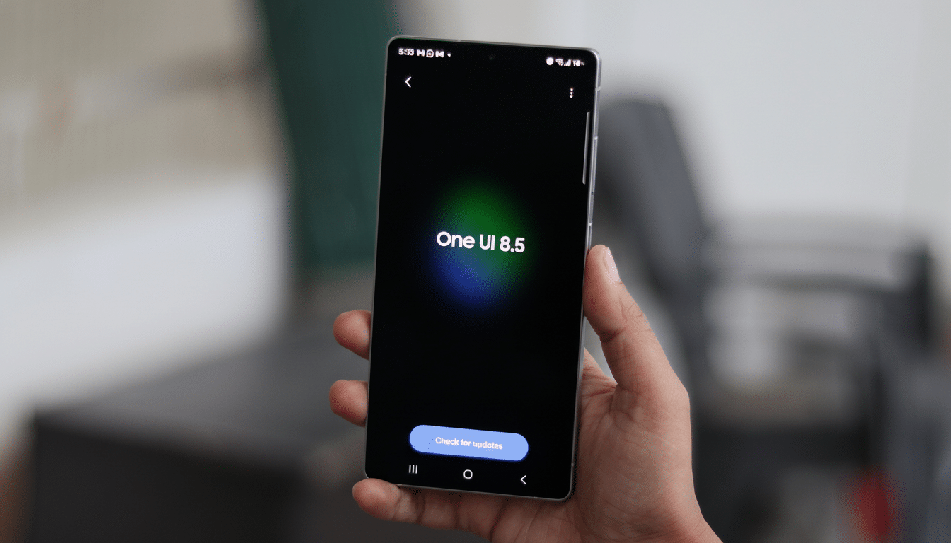
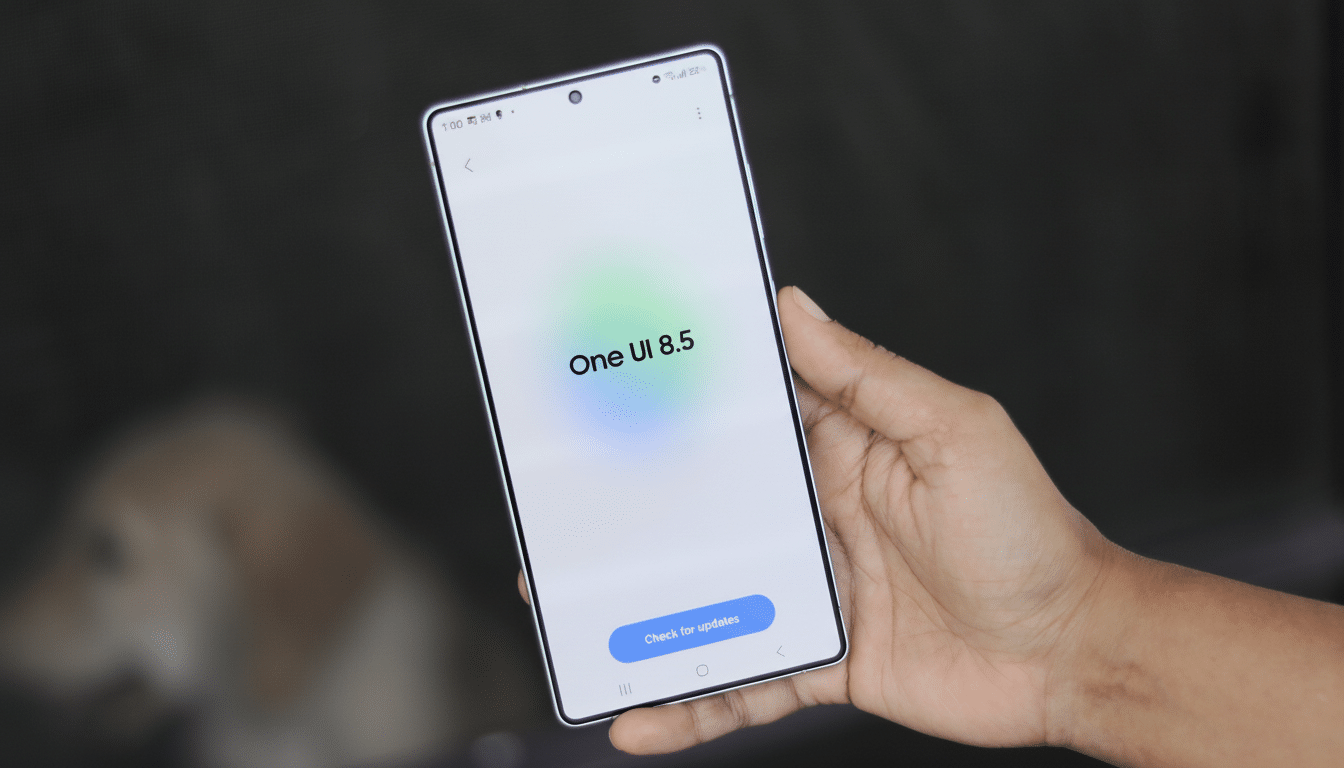
What the leaked One UI 8.5 build actually reveals
Firmware trackers such as SammyGuru suggest One UI 8.5 improves the reworked Quick Share interface, which debuted on the Galaxy S25 range with One UI 8. The floating bar containing Send and Receive is transitioning away from a wide, rectangular rail to a tighter, pill-shaped control with more negative space and less room between elements. The shift looks cleaner and more natural to hit with a thumb, especially on big screens.
It’s not just a pill-forward strategy for aesthetics. With Quick Share more focused on NFC tap-to-share and local discovery, the simple bar cuts down on peripheral UI chrome to expedite the handoff when sharing with other devices nearby.
Dialer and calling screen get a new look
And the Phone app seems to think so, too. The floating switcher for Dial, History, and Contacts will be replaced with a small pill instead of individual, larger cards. In calls, the single semi-transparent action bar is gone in favor of smaller squircle buttons—mute, speaker, keypad, and so on now appear on distinct islands. Another thing that’s changed is the shape of the keys on the in-call keypad, which have been replaced with soft-square buttons instead of circles.
Functionally, the separated buttons enhance hit targets and remove confusion between activated and deactivated states. On super-tall phones, this separation also aids with muscle memory: you can flick a thumb to the fixed positions without visually scanning down a muddled bar each time.
Settings and Device Care shift to compact designs
Outside of individual apps, Settings looks more compact in the build that testers saw. Device Care, for instance, trades the spacious cards for tight bubbles with soft shadows and a smaller typeface. A treatment similar to that of Phone pages is visible in the battery pages, so I guess this compact style will be used on several panes.
The result is a greater information density without losing legibility—something that’s often requested by our power users. More compact designs on and above high-res panels mean less scrolling and more controls in the viewport; you can see what’s most important more quickly through a sense of soft elevation even with a full layout.
Why the iOS comparison question won’t go away
The likeness isn’t of any single icon or color; it’s more a juxtaposition of patterns. Pill-shaped toggles, segmented controls, and squircle action buttons have long been tools in Apple’s human interface playbook. Samsung’s newest adjustments also include those same corner radii, softer shadows, and more transparent layers that help to flatten visual noise—changes that apparently mimic recent iOS design language, as explained by industry observers.
That’s not to say Samsung is turning against itself. One UI’s materials remain coated with its own type style, spacing, and feature-first design philosophy. If anything, the change is indicative of the more general homogenization in mobile UI: tappable things are clearer, visual clutter is minimized, and page layouts scale from small phones to foldables. It’s the same logic that prompted Samsung and Google to streamline wireless sharing under the Quick Share banner.
Timing, availability, and caveats before public release
Historically, Samsung’s “.5” debuts alongside a new flagship or two before coming to existing devices, and leakers anticipate much of the same here with the next Galaxy S-series. As always, the things you see in test firmware could change prior to the public release, and regional builds and carrier versions may exclude some tweaks.
Samsung has not officially announced a redesign. Yet, the clarity of Quick Share, Phone, and Settings suggests a system-wide push rather than mere isolated tinkering. For a company that shipped about one-fifth of the world’s smartphones last year, according to IDC estimates, relatively small visual tweaks are outsized in real-world effect.
What it means for Galaxy owners considering One UI 8.5
Assuming the leaked build is true, One UI 8.5 seems like it will be moving in that direction, becoming more fluid and approachable without taking away what power users enjoy about Samsung’s skin. Look for faster one-handed interactions, more compact menus, and controls that are easier to make out at a glance. The iOS comparisons will run and run, but the real story is more prosaic: a UI that’s growing up and trying to focus instead on speed, reachability, and coherence across the system.
Remember, this is pre-release software. Nonetheless, the trend is clear—and it indicates that One UI is shifting from maximal customization to judicious refinement, with a visual sheen that looks destined to filter through every Galaxy system app.