The debate over the best way to use a smartwatch often comes down to four touchpoints: tiles, complications, apps, and notifications. While each has its champions, a clear pattern is emerging across platforms and users alike—quick notification triage is the interaction most people rely on first, with tiles and complications serving as fast access lanes to deeper context.
This shift isn’t accidental. Apple, Google, Samsung, Garmin, and Fitbit have all redesigned watch software around “glanceability,” cutting the path to information to a few seconds. The result is a hierarchy of interactions: notifications to decide what matters now, complications to anchor daily data, tiles for swipeable context, and full apps when you truly need tools.
- Glanceable Design Is Redefining Smartwatch Use
- Complications Versus Tiles Versus Apps on Your Watch
- Notifications Lead Daily Interactions on Smartwatches
- When Tiles Shine And When They Do Not on Wearables
- Voice Gestures And Payments Find Their Niche
- Battery Life Shapes Behavior Across Smartwatch Use
- Pro Tips To Optimize Your Go-To Interaction
Glanceable Design Is Redefining Smartwatch Use
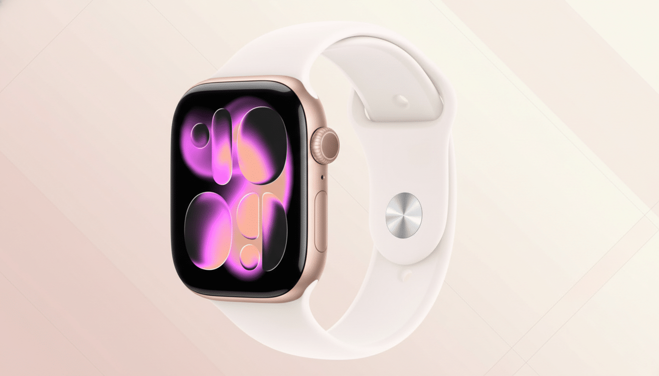
Wearables are built for micro-moments. Platform guidelines from Apple and Google encourage sub‑five‑second interactions, and recent updates reflect that philosophy. watchOS introduced the Smart Stack for widget-style swipes, while Wear OS doubled down on Tiles, giving health stats, timers, and transit info a single swipe from the watch face. Garmin’s widget glances serve a similar purpose, surfacing metrics without digging into menus.
Market context reinforces this direction. Counterpoint Research continues to rank Apple as the top smartwatch vendor, with Samsung and Huawei rounding out the leaders. As platforms converge on quick-access designs, the primary user journey has become consistent regardless of brand: glance, decide, and move on.
Complications Versus Tiles Versus Apps on Your Watch
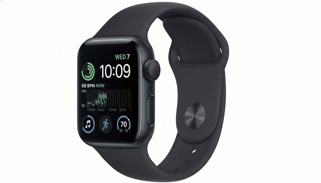
Complications are your always-on dashboard. Weather, heart rate, next calendar event, or a shortcut to workouts sit right on the face for zero-friction access. Power users often configure a “weekday face” packed with productivity and a “weekend face” tuned for fitness and outdoors—an approach echoed by trainers and UX designers who optimize time-to-info on the wrist.
Tiles and stacks add depth without opening apps. Swipe to see a sleep score, start a timer, or check a to-do list. They shine when information is transient or periodic—think hydration reminders, sunset times, or boarding passes. Full apps are still essential for maps, payments, music, and detailed workout controls, but most people treat them as tools rather than destinations.
Notifications Lead Daily Interactions on Smartwatches
Across consumer surveys from firms like YouGov, Deloitte, and NPD Connected Intelligence, notifications consistently rank at or near the top of smartwatch activities. It’s easy to see why: wrist alerts let you screen messages, decide whether to reply, and keep the phone in your pocket. Quick replies, voice dictation, and emoji responses reduce friction, while Focus and Do Not Disturb modes help prevent alert fatigue.
In real-world workflows, this triage is invaluable. Nurses glance at shift updates without breaking sterile protocols. Cyclists rely on haptics to preview turn-by-turn prompts without staring at a screen. During meetings, subtle vibration patterns distinguish a calendar change from a group chat. The watch becomes a filter, not a feed.
When Tiles Shine And When They Do Not on Wearables
Tiles excel when you need a rotating set of contexts through the day. Morning: sleep and readiness. Midday: timers and messages. Evening: activity rings and recovery. On Wear OS and watchOS, pinning the most-used tiles near the top reduces swipes and cognitive load. However, if the data is critical all day—heart rate zones for runners, glucose trends for diabetics with supported accessories—promote it to a complication on the face instead.
The biggest mistake is redundancy. If a complication already surfaces the information, a tile may just add friction. Reserve tiles for secondary tasks and time-bound info; keep the face for primary signals you check multiple times per hour.
Voice Gestures And Payments Find Their Niche
Voice assistants are ideal for timers, messages, and reminders, but reliability varies with noise and connectivity. Gestures are improving: watchOS introduced double tap for one-handed control, while Wear OS supports wrist gestures to scroll or accept calls. Contactless payments continue to be a top-5 use case across vendor reports, especially for transit and quick purchases, though adoption depends on regional support from banks and transport networks.
For athletes, offline features remain king. Downloaded playlists, on-device GNSS, and safety features like incident detection turn the watch into a phone-free companion during workouts—an area where Garmin, Apple, and Samsung have steadily expanded capabilities.
Battery Life Shapes Behavior Across Smartwatch Use
On watches that last a day or two, users gravitate to ultra-brief interactions: fewer screen-on seconds, more reliance on haptics, complications, and the Smart Stack. On endurance devices that run a week or more, people are more likely to browse widgets, dig into training readiness, or explore maps. Battery constraints don’t just limit use; they script it.
Pro Tips To Optimize Your Go-To Interaction
Tune notifications at the source. Disable nonessential app alerts on your phone so only high-signal messages hit your wrist. Promote your top three data points to complications and arrange them by glance priority. Pin two or three tiles you’ll actually use daily, and remove the rest. Map a hardware shortcut to your most frequent action—workout, timer, or payments—to bypass menus entirely.
The bottom line: notifications may lead, but the best smartwatch experience blends fast triage with a thoughtfully curated face and a few high-impact tiles. The less you swipe, the more your watch works the way it was intended—quietly, quickly, and only when you need it.