Marques Brownlee has presented Apple fans with the black iPhone 17 Pro they’ve been requesting in video form, anyway. The tech creator’s brief snippet on X renders the Pro model in a dark, matte black and reignites the age-old “argument” over Apple’s color approach with its top‑rung phones.
A clean look and pent-up demand for true black
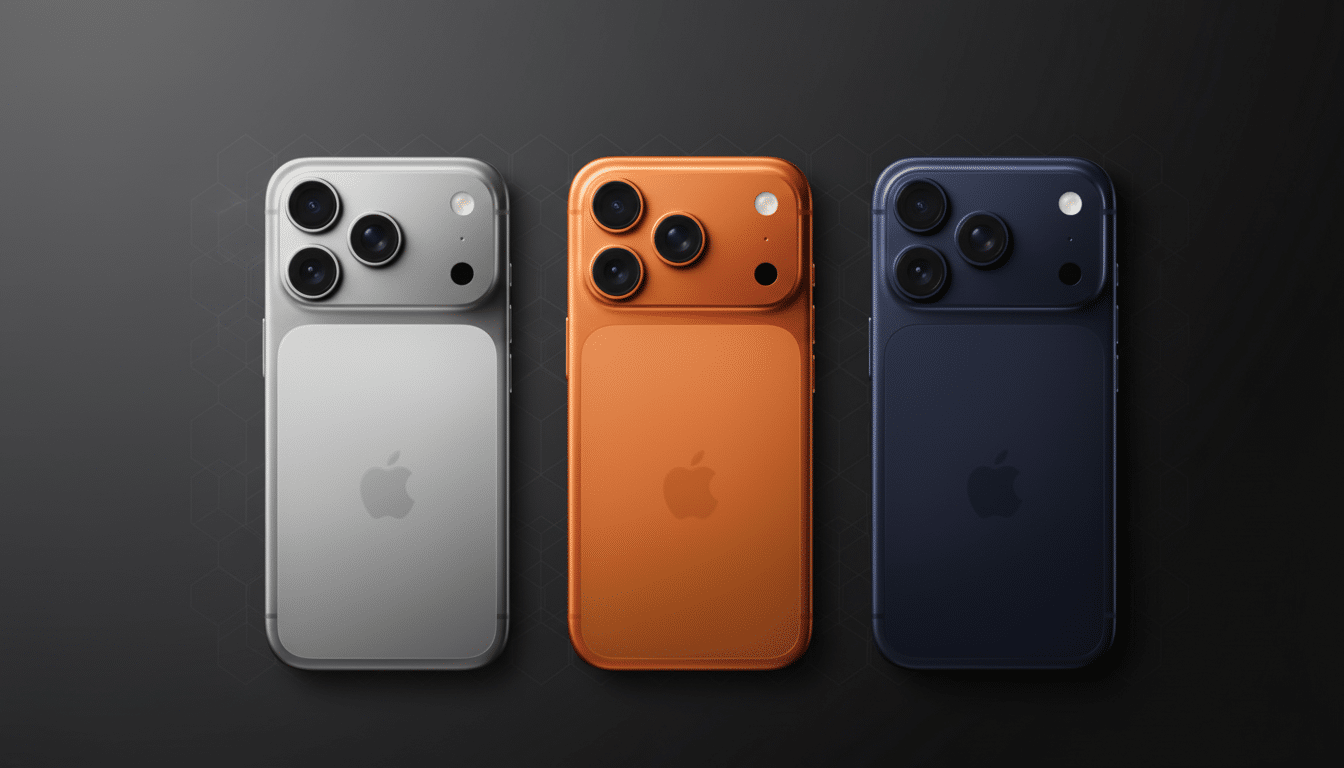
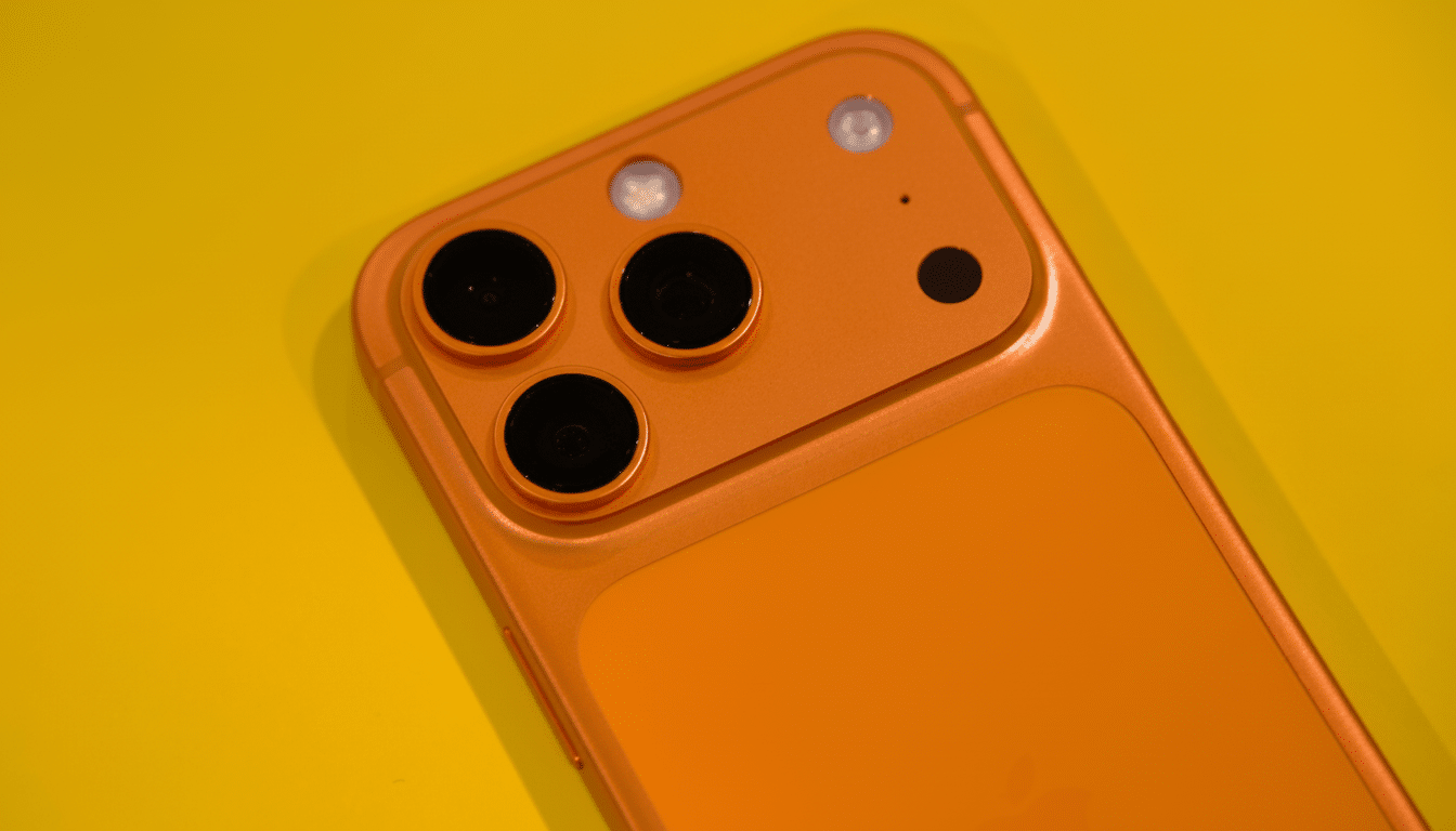
Apple’s existing Pro palette lacks a true black or graphite, opting instead for metallic silver, dark blue slate, and a Spaceman orange. Brownlee’s idea is weighted in the other direction: low‑key, stealthy, and timeless. In the video you’re seeing, it looks a bit more uniform black than in real life, but is intentionally limited in sheen and on the low‑pulse side of minimum glare; with high contrast around the lenses, it feels pretty much like titanium (low oil gloss) all over without shouting that too loudly.
Fan reaction was immediate. Replies lauded the understated look, with some calling it the “obvious” color that was missing from its lineup. A vocal minority sounded a familiar warning: ultra‑dark finishes could be prone to showing early signs of wear, particularly on edges and high‑contact surfaces. That trade‑off has always hovered over the darker Pro finishes, from stainless steel “Space Black” smudges to a useful‑for‑half‑a‑second titanium sheen that scuffed when you even thought about touching it before wiping clean.
Why black still makes sense for the Pro tier
There’s a reason black or graphite is usually the most‑wished‑for color. Third‑party marketplaces like SellCell have similarly found that dark colors are at or near the top of the list for iPhone buyers, and you’ll see a similar trend reflected in premium Android handsets. In a category where consumers frequently hold on to the device for longer and opt for subtlety over splash, black is safe — and a good resale‑friendly color.
For creators and power users — the Pro’s core audience — black has practical advantages as well. It reflects less light on camera, mixes into rigs a little more organically, and works with cases or skins without causing mounds of visual discord. That’s part of what makes Brownlee’s mock‑up feel right: it looks like a tool designed to vanish into pro workflows.
The wrinkle for the manufacturing process: titanium and deep coatings
So why skip black? The materials and production are probably to blame. Since Apple moved its Pro chassis to titanium, finish choices have reflected the limitations of coatings and durability. Deep, even blacks on titanium usually require methods such as PVD or DLC that are often too difficult to scale in an affordable manner. Micro‑abrasions are more visible on darker hues and, with a tight yield rate, production can be delayed or costs can climb.
Apple has already recognized cosmetic oddities around titanium in its support guidance, though with the qualifier that temporary discoloration from skin oils can be wiped away. That’s not a deal‑breaker on black, but it does illustrate how much engineering effort went into any finish that met Apple’s bar for consistency, scratch resistance, and longevity. Opting for bolder or paler hues serves as insurance against signs of wear.
What Brownlee’s video implies about Apple’s choices
Brownlee’s idea doesn’t indicate anything Apple might be planning, but it does make clear the design language could hold subdued black down without becoming sullen. The camera bump gets a lift from the high contrast (that titanium strip, and all its rounded elegance), and the soft glow of titanium feels premium rather than glossy, while the silhouette is tauter and more coherent. It’s the type of finish that, alongside silver and deep blue, could become a crowd‑pleasing staple.
And there is a precedent for a corrective course. Apple has rolled out new finishes mid‑cycle in the past — most notably the Alpine Green for a previous Pro series — which means there’s potential that we see a darker Pro color further down the line if supply chain constraints lessen or demand indicators improve.
Influence, feedback, and next steps for Apple
When a creator of Brownlee’s reach — tens of millions across platforms — spotlights a design gap, the feedback loop is hard to ignore. His yearly camera tests have helped force software updates; his broader observations tend to reverberate throughout enthusiast forums and even investor notes. A quick, enthusiastic reaction to a black iPhone 17 Pro concept is another piece of data that Apple’s design and operations teams must be monitoring.
The larger lesson is a simple one: On a Pro device, restraint signals luxury. A bold black option would please purists who appreciate the simplicity and ruggedness without diluting the cachet of the existing color array. Whether Apple brings black back in an upcoming batch or waits until the next cycle, Brownlee’s video is a compelling argument that the most obvious Pro color is still the one that isn’t found anywhere in your box.