I didn’t want to like Material 3 Expressive. I eyed the early betas with disdain, and skipped out on the initial rollout to grumble about “design for design’s sake.” I lived with it for over a month on Android 16 QPR1 — and I was mistaken. The search giant’s new visual language is more than a coat of paint: It fundamentally changes the way Android looks, reads and moves.
The surprise isn’t in any one flourish. It’s the cumulative impact: the higher contrast (a key to readability), friendlier type, animated motion and a layout that beckons for personalization without careening into chaos. Day in and day out, it was nudging me from disbelief to joy.
What Actually Changed When I Started Using It Daily
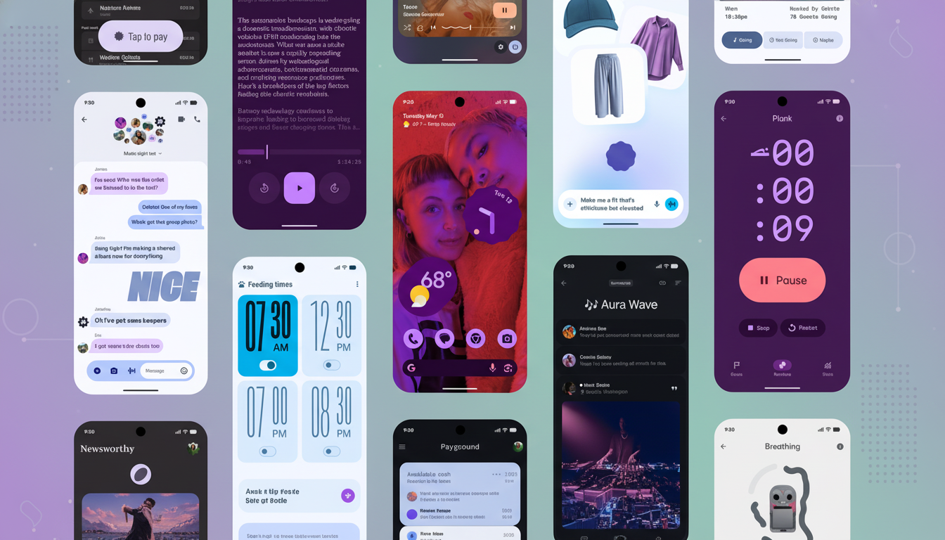
Material 3 Expressive adds playful touches that feel intentional:
- Wavy dividers
- Springy toggles
- Softened blurs
- Animated icons that react with just enough give to feel tappable
Quick Settings ceased to be a fixed grid and became a moldable control board I could form around my habits.
Typography pulls its weight too. The new system fonts feel fresh without seeming alien, and greater contrast facilitates at-a-glance scanning, particularly for crowded lock screens. The notifications are more legible, and the app drawer doesn’t look so much like a slab of color as it does a layered surface.
Crucially, performance kept pace. Performance is consistently smooth at 120Hz on the Pixel 10 Pro XL (and battery life didn’t move in a practical manner). That’s a big deal — no amount of livelier motion matters if it always gets in your way.
Why the Expressive Turn Is Effective for Android
Behind the change is solid UX theory. The Nielsen Norman Group has been documenting the aesthetic–usability effect for years — appealing, consistent design is interpreted as being easier and more credible. Material 3 Expressive makes more of this, teaming friendlier visuals with enhanced hierarchy and higher-contrast tokens.
It also mirrors broader taste. The contemporary moment of interior design’s “dopamine decor” — with bright colors, whimsical shapes and a multiplicity of textures — maps neatly onto what Google is doing here. The room we spend the most time in is our phone. A happiness-inducing interface is capable of improving micro-interactions in even the most mundane tasks, even if actual core workflows don’t change.
User sentiment isn’t just anecdotal. Unofficial community polls on Android forums and social channels have skewed positive, with about two-thirds of respondents saying the update looks sharper and is more modern. That squares with how it feels after a week: familiar, but it pops.
The Rough Edges and the Real Trade-Offs to Expect
Not everything lands. Some gesture remapping incurs friction to learn, particularly for non-developers. Modifying call-answering instructions or power controls can lead to unnecessary help calls. Pleasure shouldn’t interfere with muscle memory for tasks as basic as those.
The next test is for ecosystem consistency. Google’s own apps have adopted the new language, though third-party adoption will be uneven for some time. The Material team can help by designing and publishing stronger guidance, providing motion specs and accessible color recipes that small teams can incorporate rapidly.
And yes, features still matter. It’s only fair to want momentum on our everyday pain points:
- Richer per-app audio controls
- Smarter routines in Home (and its smokin’ fast little cousin Assistant)
- Natural-language event input for Calendar
- Full-folder downloads inside Drive
- More comprehensive Bluetooth tracker integration in Find My–style services
- Granular launcher customization
Visual polish is not incompatible with functional progress.
One Month Later, the Verdict on Material 3 Expressive
Android Material 3 Expressive makes Android feel alive again. It’s the sort of thing that makes regular checks — toggling Wi-Fi, skimming alerts, consulting the lock screen — quicker to interpret and pleasanter to live with.
I came out thinking this was change for the sake of change. A month on, I realize it for what it is: a thoughtfully expressive layer that enhances the everyday without rewriting it. Keep the joy. Now, continue to press on the basics. If Google does the former, Android’s best version is the one you have in your hand right now — and the next one.