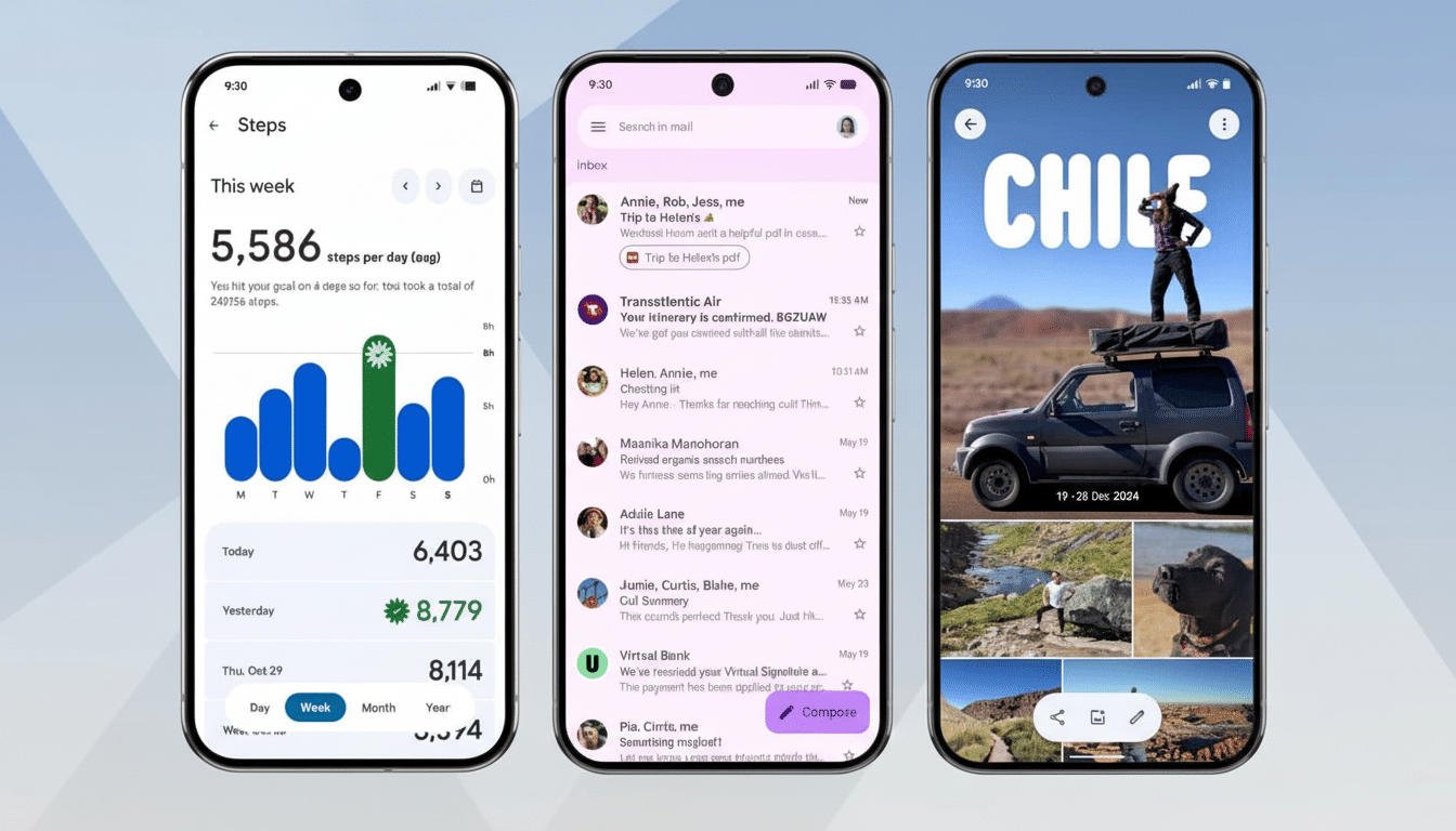
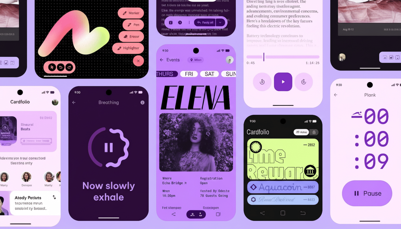
And Google’s Material 3 Expressive refresh on Pixel phones brings plenty of modernity to the interface: bolder typography, clearer toggles, smoother animations, and a more flexible Quick Settings layout. But the most significant improvement isn’t so flashy. It’s the unassuming comeback of a plain-Jane power feature, one that was sorely missed by many power users: a real Bluetooth toggle.
For anyone with earbuds, tablets, laptops, or a handheld console on the go somewhere about themselves and struggling to keep them together at all times (which is everyone), shaving a tap off an action that you want to perform time-wise feels like a revelation.

The new behavior brings back the muscle memory Android users accrued over the years, and it nixes the small — but always there — friction that had come to exist with its previous implementation.
Why the Bluetooth Tile Became a Headache
Newer Android versions also moved the Bluetooth Quick Settings tile away from a direct toggle and into its own pop-up panel. Tap once, and then tap again to really turn the radio on or off. On paper, that sounded all fine and dandy, but in reality it added extra steps to daily life (especially for those of us who regularly pass audio back and forth between devices or are fans of completely turning off the radio when not in use).
Developer community response on beta forums and Google’s own issue trackers made clear that the two-step model introduced delay and uncertainty for what should be an immediate task. It also shattered cherished expectations — Android has historically taken Quick Settings tiles to be literal toggles, long-press being reserved for deeper-level settings buried within the Settings app.
UX research is unambiguous here. Less means less cognitive burden and predictable equals trust. This was a textbook example of a micro-interaction that “looked good” in the design comps, but didn’t map to any actual use case patterns in the real world.
One Tap Is Back With a New Release Tagged Expressive
Material 3 Expressive on Pixel returns the anticipated flow. Connect and disconnect are now a single tap on the Bluetooth tile for instant toggling of your connection. Long-press shows the predictable pop-up panel that lets you opt for devices or fiddle with options. It is easy for the simple case, and powerful for the advanced one.
The tile is smarter, as well. If you enlarge the tiles with the new Quick Settings customization, tapping on Bluetooth takes you to flip the radio and tapping around it opens up the device panel. That separation of touch zones reduces the number of accidental toggles and is compatible with how thumbs naturally tap on larger screens.
There are also nice touches beyond the toggle. The tile can show your secondary accessory’s name and battery percentage, details that many Android skins keep tucked away in a status bar glyph or some 20 taps down. Out of the large tile, a long press sends you straight to Connected Devices in Settings for full control.
Design Justification and Usability Gains
Material 3 Expressive leans into clarity: bigger type, bold contrast, and crisper states on toggles. Those changes aren’t only aesthetic. Larger targets, crisper affordances, and tighter haptics encourage one-handed use and reduce mis-taps — particularly important on today’s larger phones.

And restoring the one-tap gesture also conforms to well-understood UX heuristics. As the Nielsen Norman Group frequently says: systems should reflect users’ mental models, and frequent actions should be fast. Quick Settings is all about speed, and Bluetooth follows only Wi‑Fi in the list for most used radios.
Accessibility benefits follow. End users with motor or visual disabilities benefit from having fewer steps and more explicit state feedback. The refreshed animations help understanding of state changes without feeling tacky — a tightrope Google’s Material Design team has been walking on platform iterations.
How Pixel Now Stacks Up Against Its Rivals
Different ecosystems have followed different trajectories. In the iOS Control Center, turning off Bluetooth will disable all accessories but still leave the radio active for the system to use (even though users think they’re doing a hard “off”). Many Android skins are mix-and-match hybrids: a tap for lists of devices on some, no such option in others. Pixel’s new method finds a happy middle: responsiveness now, more thorough control later.
The increased accessory battery visibility inside the tile itself is an ever-so-slight benefit. It saves a journey into Settings or the vagaries of an often-uninformative status icon — especially for those times when you’re about to walk out the door and just want a quick confidence check on how much battery remains.
A Tiny Move That Leaves a Surprisingly Big Impression
Bluetooth is ubiquitous. Updates from the Bluetooth SIG show there are more than five billion Bluetooth devices shipping a year, and it’s normal for households to have multiple. When you’re swapping audio sources between phone, laptop, tablet, and handheld game console all in the same evening, additional taps to turn Bluetooth on or off aren’t theoretical; they are literal.
Ever heard of a two-tap requirement? It asks you to complete the process all over again, and multiplying a two-tap requirement by even just 10 toggles in a day is thousands of additional interactions in the span of a year. Adding back in that one tap shaves several seconds, avoids breaking concentration, and eliminates a little irritation that builds over time into fatigue. It’s the kind of polish that users sense more than they can articulate.
What Google Needs to Address Next in Quick Settings
The Bluetooth patch demonstrates Google is apparently paying attention. Reconciling the combined Internet tile would be a reasonable next step. And separate Wi‑Fi and mobile data toggles would be more in step with how a lot of people handle connectivity day to day, especially if they live in places with spottier coverage or restrictive data plans. The victory is the same: fast matters should take no time.
At least, for now, Material 3 Expressive hits the spot. While it’s nice to have the visual and surface-level changes, regaining the one-tap Bluetooth toggle is what makes Pixel feel snappier, more respectful of your time, and better in tune with what Quick Settings should’ve always been.

