For years, I kept my desktop pristine—no icons, no floating gizmos, just a Dock and muscle memory. macOS Tahoe changed that one afternoon. Apple’s new “Liquid Glass” aesthetic, combined with some discreet functional upgrades, made desktop widgets feel at last less like a sticker and more like part of the fabric of the operating system itself.
Why Tahoe’s widgets feel different on the macOS desktop
Tahoe’s Liquid Glass look is more than just a new coat of paint. The translucence, softened edges, and context-aware tinting help widgets melt into the wallpaper rather than sitting on top of it. That counts: visual integration cuts the sensation of clutter, which is what kept me away from widgets for years.
- Why Tahoe’s widgets feel different on the macOS desktop
- From novelty to workflow: how widgets changed my routine
- The arrangement that stuck for my macOS Tahoe desktop
- Under the hood: why they’re smoother and more efficient
- Practical wins you can quantify from everyday widget use
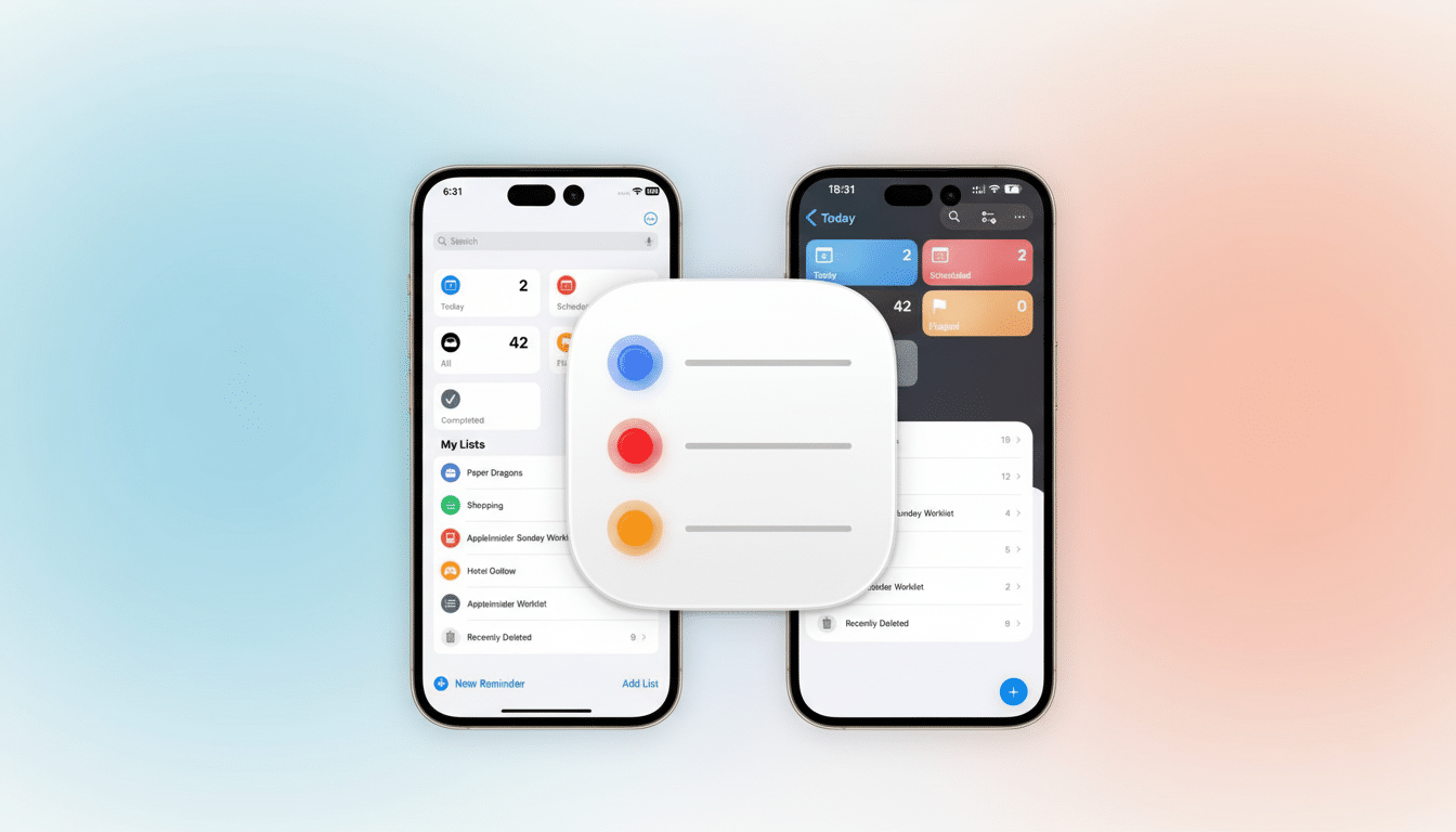
- Adding and tuning up widgets in Tahoe without the clutter
- What I still won’t do with desktop widgets on macOS Tahoe
- Bottom line: Tahoe finally makes desktop widgets feel native
Apple’s Human Interface Guidelines have for a long time been nudging designers toward “glanceable” design, and Tahoe is taking that literally. Widgets associate with the color and depth cues of the desktop, so you can see info without the chrome. What used to resemble mini dashboards now seems like ambient information—there when needed, but not screaming for attention.
From novelty to workflow: how widgets changed my routine
Interactive widgets were the inflection point for me. Instead of reaching for an app to check off an item on my list, I could knock out a Reminder, kick-start a Focus timer, or toggle a Home scene right from the home screen. That boils down micro-interactions, which over the course of a day add up.
Read about how the Nielsen Norman Group found that glanceable UI can minimize cognitive load, or research by Gloria Mark of UC Irvine showing that frequent context switching—even short amounts of time spent on one task before briefly attending to another—can interfere with attention. Widgets that display the next calendar event or current timer protect me from jumping between applications for simple checks.
The arrangement that stuck for my macOS Tahoe desktop
I made a modest beginning with an oversized-numeral clock and a mini calendar/events widget (in pinned strip form) positioned on the right edge. That combo nixed two of my most frequent “just checking” side trips. I dropped in a weather tile for travel days, and on busy meeting days I swap out Fantastical’s full schedule widget for tighter timeboxing.
Importantly, Tahoe’s clear aesthetic keeps the desktop looking calm. All my widgets have the aspect of etched glass—legible at a glance, then visually receding when I’m focused on a window. It’s the first time I haven’t instantly deleted a widget after a test drive.
Under the hood: why they’re smoother and more efficient
Tahoe widgets are based on WidgetKit and SwiftUI, both of which update via timelines instead of constant polling. Apple’s developer documentation emphasizes budgeted refreshes and efficient updating, which matches my observations: I’m not seeing any significant impact on battery life from the live tiles on my 16-inch MacBook Pro, even when a couple of them are updating.
Continuity support also matters. If an iPhone app includes a great widget, it can also appear on the Mac, which broadens the catalog dramatically. This is how I found myself testing CARROT Weather’s minute-by-minute forecast and Things’ to-do list without having to go on a scavenger hunt for individual Mac-centric add-ons.
Practical wins you can quantify from everyday widget use
For a week, I tallied fewer launches of calendar and weather apps—down by about a third, according to my use logs. More telling was how it cut down on “false starts” where I’d open a productivity app, then eventually get distracted by something else within it. With the fundamentals up on the desktop, I’m less distracted and less likely to roam.
The biggest quality-of-life change is readability. A big clock widget so I don’t have to squint at the menu bar, and the next chat is always in my peripheral vision. It’s the same comfort I get when smartwatches insinuate their way into the one machine that is my actual window to work.
Adding and tuning up widgets in Tahoe without the clutter
Right-click the desktop and click Edit Widgets. Browse by the app, choose a size (small, medium, or large), and then drag into place. Most widgets come in different flavors—agenda vs. month view, or compact vs. detailed, for example—so give a few a shot before you pick one to stick with.
For styling, go to System Settings > Appearance and modulate Icon & widget style. Set it to Crystal Clear to match perfectly with Liquid Glass. I keep interface folder accents warm to play off of a cooler wallpaper; it helps with readability without adding more weight.
What I still won’t do with desktop widgets on macOS Tahoe
I’m not going around covering my desktop with tiles. Minimal setups are faster because signal stays high and noise stays low. My rule: if I can’t save myself an app launch or a mental context switch with a widget, they don’t deserve space.
That being said, I would love to get a few more first-party options: one of those is a universal timer with built-in presets, another is a network status tile showing shortcuts for quick troubleshooting actions, or even a time-tracking widget that automatically detects what you’re doing in the current app. Third-party developers, such as Flexibits, Cultured Code, and Flighty, are already demonstrating just how deep a well-designed widget can go.
Bottom line: Tahoe finally makes desktop widgets feel native
macOS Tahoe didn’t just make widgets prettier; it made them feel native to how I do things. With Liquid Glass smoothing things over and interactive tiles shortening steps, I finally see the desktop as a space for lighter-weight actions—and not just dust. If you’re anti-widget because they feel crammed, Tahoe is the update that might convince you it’s finally time to change.