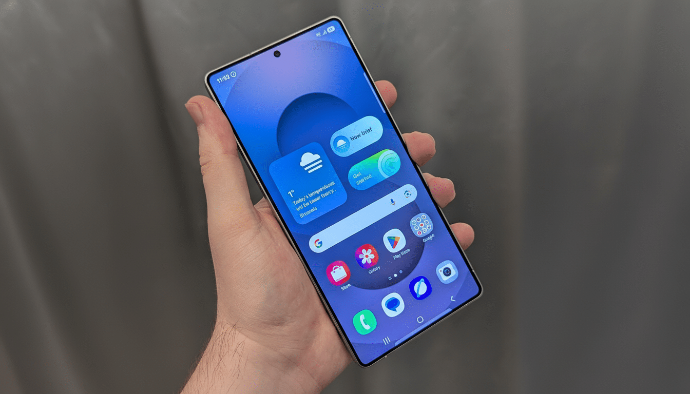
On the other hand, a big-time leak suggests it’s been overhauled in One UI 8.5, which could be the most significant usability change Samsung has pushed to devices since … I dunno, a very long time ago.
According to a screenshot on 9to5Mac, beneath the shiny surface — cartoon rainbow squirrel GIFs notwithstanding — there are allegedly now little tiles you can adjust individually for size, layout, and spacing — yet another case of turning that stagnant grid into something bendy and usable by thumbs. That matters, as it goes right to the heart of speed, reachability, and accessibility — three determinants that define how quickly you can do what you need on a phone that you use dozens of times every day.
What the leak actually shows about One UI 8.5
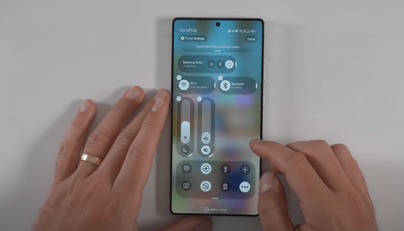
Test builds suggest One UI 8.5 will let users resize individual toggles, stack tiles using mixed dimensions, and even leave a deliberate gap within the Quick Settings surface, according to reporting from reputable Android snoops such as Mishaal Rahman and Tarun Vats. Shelf-like container “shelves” that contain toggles would be optional, not obligatory. Brightness and volume adjustment functions should be able to be switched to vertical sliders, it’s claimed. Or, in other words, Samsung seems to be running with that whole Android 16-inspired Quick Settings system and taking it a step further to the realm of embracing whitespace and genuinely freeform positioning.
Tile resizing is coming to stock Android, but you’re still cramped for space. The leaked Samsung approach would allow a hotspot tile that spans two columns, pin a one-column flashlight at the lower-right corner, and tuck in a skinny brightness slider beside it — all snapped to a grid but unencumbered by boxy rows. It’s a minor tweak on paper that adds up to a quicker, more personal control center.
Why this is a big deal in real-world practice
Most people don’t clutch their phones like a CAD workstation. According to the frequently referenced mobile ergonomics study by Steven Hoober, 49% of users use phones one-handed, and the larger the device is, the more important “thumb zone” usage becomes. With the average smartphone display currently hovering around 6.4 inches, per numerous industry trackers, it’s akin to flipping your phone into hard mode.
A modular Quick Settings panel corrects that. You can put hotspot, screen record, torch, extra dim, and sleep mode toggles in the easy-reach zone and let other less urgent toggles sit higher or extend to fill left-side dead space. Pair that with vertical brightness/volume sliders conveniently located near your dominant thumb and you’re shaving seconds — and inaccurate taps! The guidelines in Google’s Material Design call for touch areas to be at least 48dp; bigger, resizable tiles can help ensure we consistently adhere to it.
Accessibility also improves. Larger tiles are friendlier for low-vision users and those with motor disabilities, better matching Google’s own touch target guidance as well as advice from accessibility groups. And this isn’t a one-size-fits-all compromise, as with hard-coded layouts; power users can go dense, while the rest of us can go spacious without losing functionality.
Foldables, tablets, and on-the-go scenarios
What makes this even more relevant is Samsung’s portfolio. On a Galaxy Z Fold, for example, you get a freeform Quick Settings grid that lets you stack all of the controls on the right half when the device is unfolded or keep everything bottom-heavy in phone mode. On tablets, where the taskbar shades across a wide canvas, mixed-size tiles avoid wasted space and reduce travel time between actions.
There’s a safety story here, too. In a car mount, the addition of several ultra-large tiles near the bottom edge can reduce glance time and mis-scans. For travel, putting a shelf-like grouping of controls on top and loose primary toggles below, instead, brings not resistance but order. This is the small-surface UX improvement that matters day to day, not just in screenshots.
How it compares to today’s Quick Settings options
Until now, Samsung’s Quick Settings have favored consistency over flexibility — tidy N-section 4xN rows including a big brightness slider, and optional containers. But that predictability is consistent in an inefficient kind of one-handed way. (Making sense of Android 16’s direction, which supports several tile sizes: if the leaks are accurate, Samsung is leading by allowing blank space as well as an option to have containers.) It allows ergonomics to guide design, as opposed to the other way around.
It’s also a step back to Android’s origins. Customization had been a platform pillar from the get-go, despite security changes that constricted the sidelines for deep mods. A first-party, shiny path to customize the control shade is a signal that customization and reliability/speed are not at odds.
The caveats, and what to watch for before release
Keep in mind that, like all pre-release software, nothing here is guaranteed. Features exposed in internal builds can be excised — or pushed back — between now and when it’s rolled out. Expect uniformity across devices, including the company’s midrange handsets; expect Samsung to offer sane defaults so that first-time users aren’t greeted by an empty grid. Power users are likely going to want exportable layouts and might appreciate per-mode presets — perhaps a “work” layout versus “travel,” for instance — but that’s not something we’ve seen a whiff of just yet.
However, if Samsung does ship what we’ve seen, the Quick Settings redesign isn’t only a cosmetic rewrite. And it’s a quantifiable step up in terms of range, startup, and accessibility that builds on Android 16’s foundation and surpasses it. For a control panel you tap dozens of times a day, that sort of upgrade makes a big difference.