The online jury has returned a rapid, unflattering verdict on Apple’s latest flagship: a significant number of users think the iPhone 17 Pro is basically an ugly looking phone. Within hours of the reveal, timelines were made up of memes, side-by-side mockups and unforgiving hot takes — quite a change for a company that set the gold standard when it came to consumer tech aesthetics.
Why the backlash erupted
What’s behind the negativity is not just change fatigue; it’s a specific visual shift. The new Pro seems to focus on a bigger camera area and a blockier, more industrial look. On social media, users likened the look of the back to everything from stovetops to attachments for action cameras. Social listening companies like Brandwatch flagged an early inundation of negative sentiment following the reveal, indicating that the perception is not limited to a narrow sector of people.
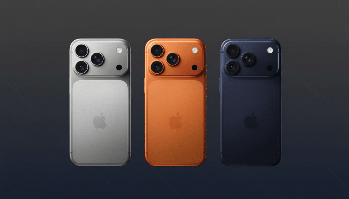
Part of the criticism involves what is deemed balance. Apple’s high-end phones, meanwhile, have slowly bulked up those camera stacks to make room for larger sensors, improved stabilization and longer optical ranges. That engineering reality translates to visual mass at the top of the phone, and the iPhone 17 Pro doesn’t shy away from it; it leans in. For a label that has become synonymous with minimalism, that’s an about-face.
Colors are the lightning rod
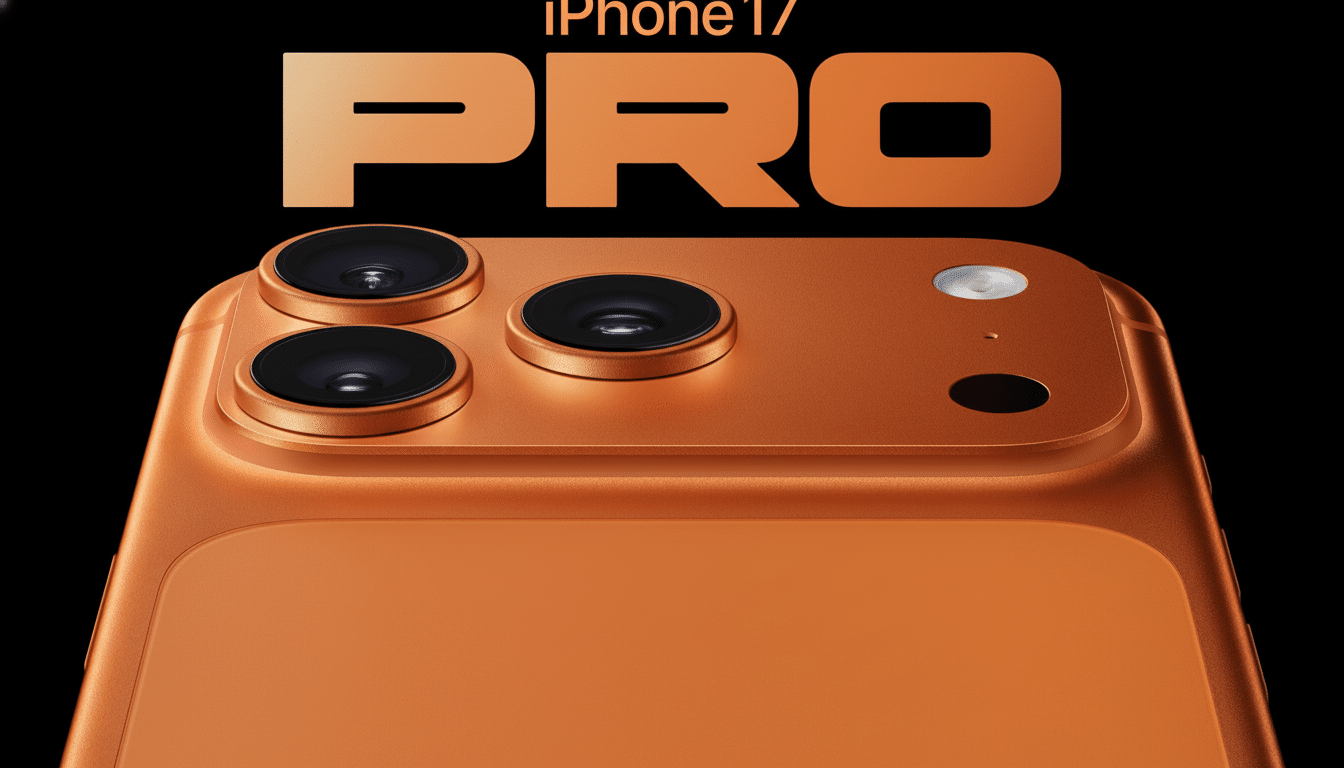
Then there are the finishes. The iPhone 17 Pro comes in deep blue, cosmic orange and silver—options that immediately divide opinion. The bold orange, in particular, has emerged as the meme magnet. The colorists will tell you orange is a high-risk, high-reward hue: bright onstage, divisive in patches. It has a sporty, rather than luxe, feel; some may prefer the Pro line’s decidedly toned-down palette. Responses to the deep blue and silver are more subdued, though.
Apple has navigated this before. Unorthodox finishes can often gain a fanbase over time — see Midnight Green on the iPhone 11 Pro — or be kept as a limited-run statement. But at the beginning, loudly finishes can overshadow the conversation, particularly when early product photography overemphasizes saturation compared to the way devices catch the sun.
Design trade-offs behind the look
There’s a pragmatic story beneath the look. Analysts such as Ming-Chi Kuo and reporting from outlets who follow Apple’s supply chain have consistently referred to the space and thermal budgets necessitated by larger camera sensors, periscope-style lenses, and next-gen processors. A flatter, broader camera island could provide a steadier base on a table; it could also allow for better quality optics and better heat dissipation — less pretty to some, but nonetheless important things.
Apple’s industrial design team, now overseen on the hardware side by Richard Howarth under design czar Jeff Williams, hasn’t been afraid to prioritize functional reëngineering even when it complicates the silhouette. That’s not a radical departure from past performance — Jony Ive’s age there made some very hard choices in service of performance — but it does produce designs that photograph more matter-of-factly than the rounded profiles of years past.
Will “ugly” hurt sales?
Perhaps not as much as those memes would lead you to believe. Exclusive: iPhone install base remains incredibly sturdy: Counterpoint Research follows up on its survey data to outline Apple’s high-end dominance in the smartphone segment, and Piper Sandler’s teen surveys continue to highlight overwhelming U.S. iPhone ownership and purchase intent. (Back when the iPhone One came out, CIRP did.) Meanwhile, CIRP has also spotted longer replacement cycles, which means that users are upgrading when the benefits start to feel materially better — battery life, cameras, connectivity — than when new features are more purely cosmetic.
There’s also the case factor. Cases have long been among the top-selling phone accessories according to retail trackers like NPD Group. When many — perhaps most — buyers wrap their phones immediately, the perception of naked ugliness matters less than durability and weight, and how the design affects the quality of your photographs. And no wonder people roast a product’s looks only to at the same time plan to buy it and blanket the thing minutes after unboxing.
We’ve seen this movie before
Many of Apple’s more controversial design moments become normal with time. The iPhone X notch was ridiculed mercilessly until it merged into the tapestry of modern phones. Jokes were made about the iPhone 11’s triple-camera “stove top” design, and then every other phone maker in the world copied it. AirPods were memed for months and then proceeded to define their category. Even the square-jawed Apple Watch Ultra met with skeptics at first before endurance athletes and mere mortals found simple joy in its clarity and extra time off the charger.
That’s not to say that the iPhone 17 Pro will be universally loved. But the story often gets reshaped by hands-on time, real-world photography, and battery life more than studio renders do. The people saying it was ugly today might be the same ones advising it for its camera and longevity in a few weeks.
Bottom line
The internet’s reaction to the iPhone 17 Pro is severe: It’s too blocky, too loud, too divergent from the sleek Pro image most have in mind. But it’s also a design that conveys a series of trade-offs — bigger sensors, better thermals, bolder finishes — very few of which appear to age as well as launch-day tweets. If history is a guide, it will be performance that determines the legacy. Looks may hold the headlines, but it’s utility that generally writes the last review.