Liquid Glass is Apple’s most daring visual change in years: a frosted, depth-rich layer that makes the desktop feel like one unified surface instead of a stack of windows. It’s not so easy to tune properly, though, and when it is well adjusted, it can be subtle and active. Here’s how to configure it so you have a Mac that looks like no one else’s without compromising clarity or performance.
What Liquid Glass changes, and does not change
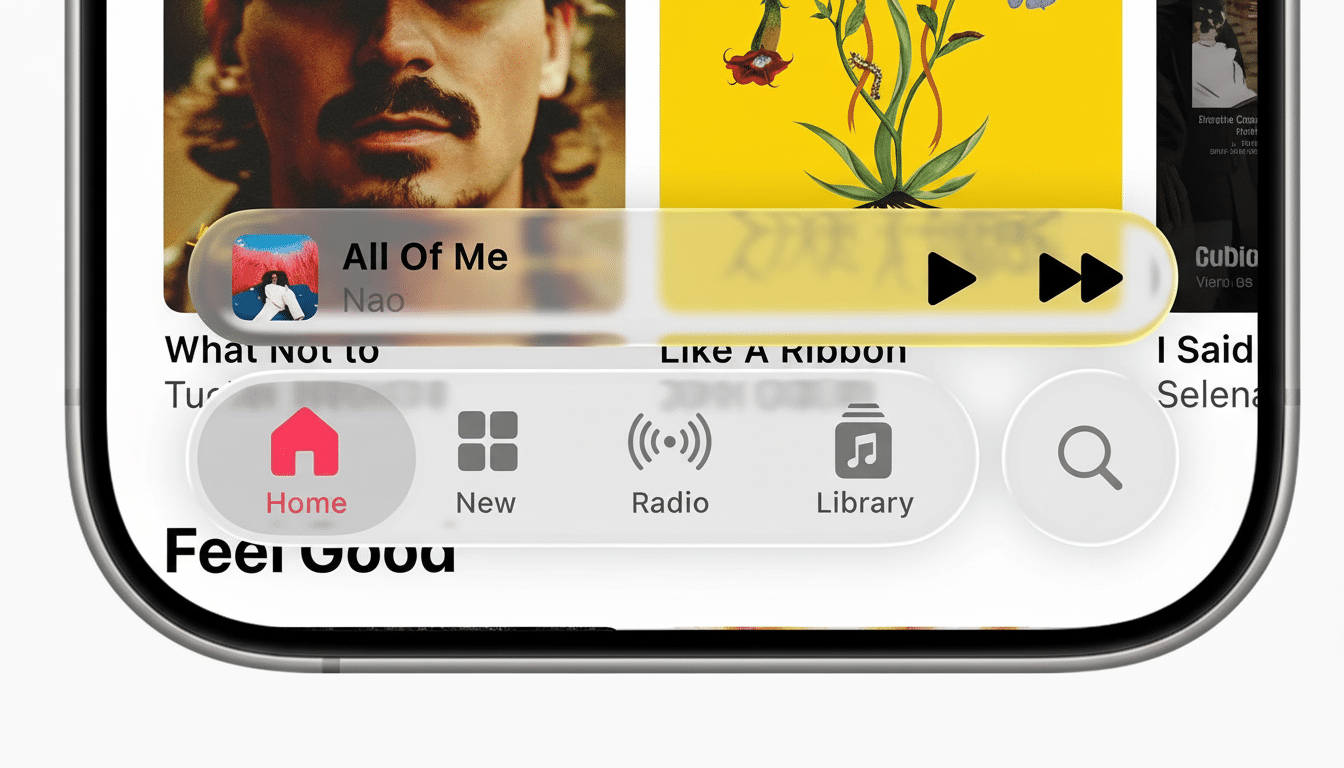
Liquid Glass does system surfaces—things like the Menu Bar, sidebars, sheets, Control Center and widgets—with material translucency (with most of the app content put in opaque areas so you can actually read it). Apple refers to this “vibrancy” as a sampling of color from behind the surface, and applies blur and tint. It’s more than transparency, it’s a dynamic material that responds to your wallpaper, accent color and light/dark mode.
- What Liquid Glass changes, and does not change
- Begin at Appearance: The core levers to adjust
- Make the Menu Bar and Control Center sing
- Tune translucency for everyday readability
- The Wallpapers to complement Liquid Glass
- Dock, folders, and matching sidebars for cohesion
- Desktop widgets that complement the translucent look
- Performance and practical guardrails for smooth use
- A neat, coordinated setup to experiment with
Begin at Appearance: The core levers to adjust
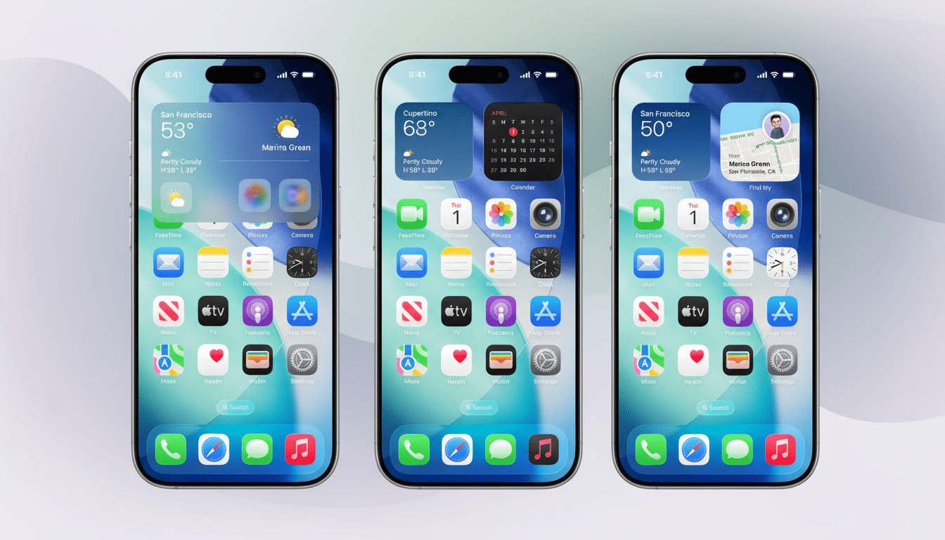
Finally, open System Settings and go to Appearance. You will also want to set the color mode first—Light or Dark (we recommend Auto mode)—as Liquid Glass has different patterns and shading adjustments between modes. Toggle the Accent and Highlight colors to ones that work best with your wallpaper (saturated accents make glass edges truer, neutrals feel calmer and more pane-like).
Change the Icon & Widget style if your launcher supports it. One stylish “Clear” leans into the glass effect by taking some of the visual weight off around glyphs, and another “Vivid” may shoot up contrast if your background is busy. If you have enclosure color as an option, choose a tone that does not conflict with your accent (in the end, coherence across Finder and the Dock and widgets is what sells the effect).
Make the Menu Bar and Control Center sing
Navigate to System Settings > Menu Bar. Turn transparency on to let Liquid Glass peek through; there isn’t a fine-grained slider, so it’s all-or-nothing. Limit your horizon line to only what’s crucially necessary, hiding the rest in Control Center for a cleaner look. With minimalist iconography, the glass is allowed to breathe and visual noise is minimized.
If you want more granular control, third-party utilities like Bartender or Hidden Bar can tuck away additional icons while preserving some space. Optional extras are not obligatory, but useful tools to ensure those “floating” top bar looks with emphasis on the translucency while still being able to quickly reference the controls you use most.
Tune translucency for everyday readability
Go to System Settings > Accessibility > Display. Reduce transparency replaces see-through materials with solid fills, which may increase legibility on patterned backgrounds or on outdoor displays in direct sunlight. Higher contrast also makes dividers and the buttons’ borders more muscular. Research at Nielsen Norman Group has documented for some time how transparency can affect legibility when backgrounds become too detailed—these toggles really are your Siamese twins when form meets function head-on.
For everyday balance, leave Reduce transparency and Increase contrast off, turning them on only for presentations, travel or HDR video work where backgrounds shift radically.
The Wallpapers to complement Liquid Glass
The choice of wallpaper is so powerful in part because the material picks up color and luminance from everything behind it. Try to get some soft-focus photographs, gradient fields or just interesting smoothed-out shapes. Harsh, high-frequency textures can support refraction on burlap panels. The dynamic wallpapers that follow Light/Dark mode both make your glass tint the same all day and also prevent sudden-contrast-shift surprises.
If you’re a fan of busy images, do some blurring (20–40 pixels) to a copy in Preview or your editor and use that as your desktop. It keeps the palette you want but tames back all that detail which would be in conflict with the UI.
Dock, folders, and matching sidebars for cohesion
Open System Settings > Desktop & Dock, then shrink the size a bit and use light magnification. Auto-hide means less distraction and more “floating glass” optical illusion. Have the Dock either clash fiercely with the Menu Bar by positioning it at the bottom, or nuzzle up to an app’s sidebars from another edge of your screen if you’re going for that sexy transparent look.
Set the folder color to whatever you like and then organize them in Appearance again with Sidebar set to Medium for labels that are still readable but not glaring against a frosted background. Repeating the glass effect throughout Finder and system panels makes it seem like more than just a decorative element.
Desktop widgets that complement the translucent look
Right-click on the desktop and select Edit Widgets. I prefer small and medium widgets that snap to a loose grid and call out your accent color. Put all your data-dense widgets (calendar, tasks) close to the top-left where your eyes lead off scanning; in the opposite corner put visual or lower-priority widgets. Certain widget styles may adopt the translucent background, so try placing it over your wallpaper to see if there’s a high enough contrast for text.
Performance and practical guardrails for smooth use
Liquid Glass is GPU-accelerated using Core Animation and Metal, with low overhead on modern Apple silicon. That said, if you’re unplugged and pushing heavy loads, try toggling on Low Power Mode or turning on Reduce transparency momentarily to pass the rendering buck. Vibrancy and blur are real-time effects, according to Apple’s developer documentation; toning them down should help smooth scrolling on group screens and eke out a little extra time unplugged.
A neat, coordinated setup to experiment with
Choose Auto appearance, a tempered accent such as graphite or navy blue, Menus and pop-up window background in Clear; have a transparent Menu Bar with only needed items visible, ensure the Dock remains tiny with auto-hide enabled and pick a gentle gradient-themed wallpaper that matches your accent.
The net effect is a glass-first macOS that’s lightweight, readable, and unmistakably yours.
Liquid Glass seems to reward coherence: the more your accents, wallpaper and layout support the material, the system looks designed rather than just shiny. Begin with these controls, and iterate—two or three thoughtful tweaks are often better than a dozen scattered ones.