Google Translate appears to be preparing a set of new Android widgets that look more puzzling than powerful. Hidden in version 10.5.41.867546197.0-release of the app, the widgets function more like oversized shortcuts than true at-a-glance tools, suggesting this is an early experiment rather than a polished rollout.
Early behavior points to a work in progress: each widget opens a specific Translate function, yet occupies a large 2×2 tile while showing a tiny, single-purpose icon. For users accustomed to Android’s increasingly rich, glanceable widgets, this feels like a step backward.
What the New Google Translate Widgets Actually Do
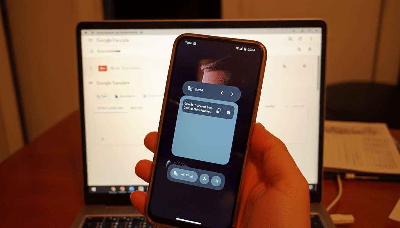
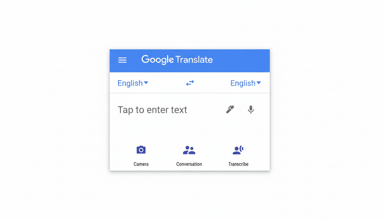
Translate already offers two widgets today: a general launcher for text, speech, conversation, and image translation, plus a history widget for recent translations. The new batch adds five more, each a direct lane into an individual feature. Examples observed include camera access for instant image translation, a “live” translation entry point, and a practice tool.
Functionally, these mimic actions users can already reach by long-pressing the app icon and pinning shortcuts to the home screen. The overlap is striking. Where a widget typically surfaces live information or interactive controls, these appear to be static launch buttons dressed as widgets, with no extra utility and an awkward footprint.
Compounding the oddity, all five occupy a 2×2 grid but render minimal UI—essentially a small glyph floating in a sea of empty space. That’s the opposite of what Android’s modern widget system encourages.
Why This Google Translate Widget Design Feels Off
Since Android 7.1, app shortcuts have offered deep links to key actions from a long press on the launcher icon, with the option to pin them as icons. Google’s own developer guidance differentiates those lightweight shortcuts from widgets, which are meant to be glanceable, resizable, and content-forward.
Translate’s new “widgets” blur that line but don’t gain any of the advantages of a widget. There’s no live text preview, no quick language swap, no clipboard listen-and-translate, no offline status indicator—just a tap-through. It’s also at odds with Material You best practices, which favor meaningful use of space, color, and interactivity to surface context rather than mere navigation.
What Power Users Actually Need From Translate Widgets
A compelling Translate widget would solve common, high-friction tasks at a glance. Think a compact panel with one-tap language swap, a live clipboard monitor that instantly converts copied text, and a microphone button that auto-detects the input language. Add a quick toggle for offline packs with status badges—critical for travelers who cannot rely on roaming data.
There’s also a branding clarity issue. “Live Translate” is now a system feature on Pixel phones for on-device translations of captions and calls, while the app’s conversation and transcribe modes serve similar aims. Widgets should clearly signal what you’ll get when you tap, and ideally show a snippet of last activity or pinned language pairs to remove guesswork.
A Work in Progress With Room to Grow on Android
It’s important to stress that these widgets are not publicly enabled. Their presence in the app package likely reflects internal testing or staged development. Google often seeds UI components behind flags to gather telemetry, test layouts across OEM launchers, and iterate before release. The current awkward sizing and duplication of shortcuts could simply be scaffolding for richer capabilities.
Translate’s scale raises the stakes. The service surpassed a billion installs on the Play Store and, according to Google, expanded by 110 languages in its largest-ever update, using AI models to widen coverage dramatically. With Android powering well over 70% of smartphones globally by StatCounter estimates, the home screen is prime real estate. Any new widget should reduce taps for the most frequent jobs, not replicate shortcuts with extra friction.
Bottom Line on Google Translate’s Experimental Android Widgets
Google Translate’s incoming widgets, as they stand, are more confusing than helpful—large tiles that act like small shortcuts. The good news is that this looks early and malleable. If Google leans into glanceable info, smart actions, and clear labeling, Translate could finally get the home screen tools power users have been asking for. Until then, your best bet remains the existing multi-action widget and pinned app shortcuts.