After widespread complaints that the new Remix button is distracting and too easy to accidentally hit, Google has been experimenting with a less invasive location for it in Messages. The early changes noticed in the public beta push Remix out of the middle of photos and into less prominent corners and menus, indicating that the company is rethinking just how aggressively its feature should appear. Remix 3D still cannot be disabled.
What’s New in the Latest Beta for Messages Remix Placement
Test builds suggest Google is testing the placement of multiple UIs depending on where you interact with a picture. In a chat, you can now long-press an image to bring up Remix as an item in the context menu (rather than a giant button on top of the photo). The control to add media goes near the caption field (not in the preview). And in the full-screen viewer, the button is tucked discreetly into the lower-left as opposed to floating obtrusively over content.

There are still changes between screens, so you know this is a live test behind some kind of server-side flag rather than a final redesign. Functionality-wise, Remix is still around throughout the image workflow, so if you’re a person who didn’t like how in-your-face the feature was, at least it’s slightly less visual noise even though there isn’t really a way to fully opt out.
Why the Remix button in Google Messages sparked pushback
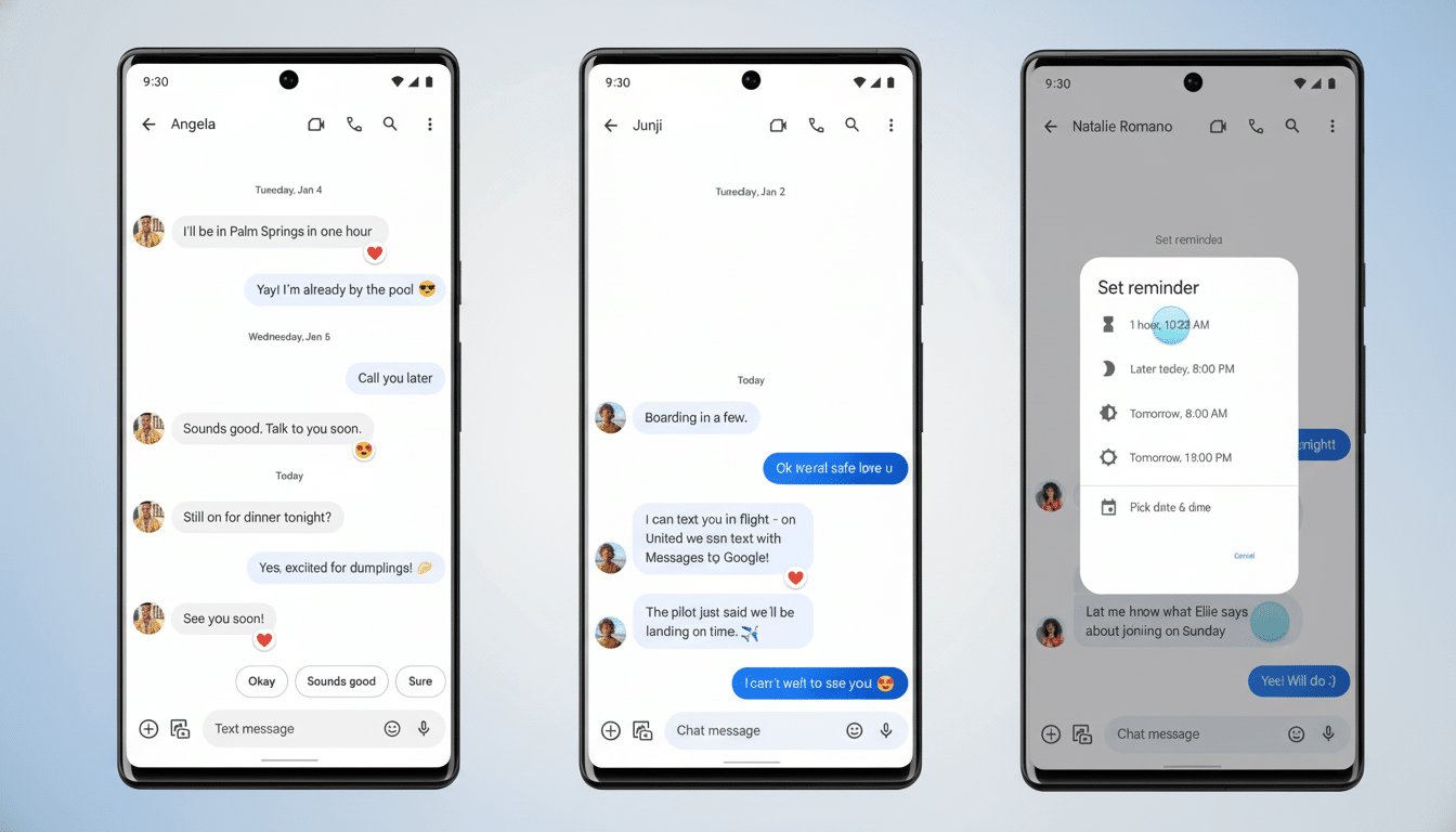
Remix is an in-thread photo editing shortcut that allows you to annotate, doodle, and tweak images all from within the conversation. The concept is familiar to how people share media, but the initial attempt placed an enormous button on top of images that many users claimed obscured details, got in the way of pinch-to-zoom, and brought more potential for accidental taps. Accessibility experts also raised the issue that on-image overlays can confuse focus order and screen reader clues when not implemented thoughtfully.
Scale magnifies the stakes. Beyond just pinging the protocol for verifying your eligibility, Google says that RCS now has more than 1 billion monthly active users, and Messages is also the default texting app on many Android phones. And with Android running on an estimated 70% of smartphones worldwide, according to StatCounter, a single UI faux pas can create friction for hundreds of millions. Feedback threads on Reddit’s r/GoogleMessages and Play Store reviews made it clear the overlay was not hitting right.
A familiar course correction after bold interface rollout
Google commonly ships bold interfaces and then trims them after watching real-world usage. Android’s chat bubbles were toned down after some early confusion, Chrome constantly iterates on address bar labels and gestures, while Gboard has rotated through toolbar positions based on usage telemetry. The most recent Remix adjustments seem to conform to that pattern: keep the feature, lessen the interruption, see how engagement is affected before making bigger calls, like offering a way to hide it.
What to watch next as Google tests Remix changes in beta
Three open questions remain.
- Will Google provide an option to disable Remix completely or for certain views?
- Will the company unify the button’s design and positioning across chat, attachment, and viewer screens for consistency?
- How far and fast will this roll out of beta — if at all?
APK teardowns and staged rollouts are never guarantees; Google may change or cancel these features before they reach stable builds.
The takeaway at the moment is rather straightforward: Google seems to be paying attention. Placing the Remix button out of the way in menus and at edges means Messages is no longer reacting to taps that happen by accident, returning focus to the photo. That might be just enough to mollify the backlash while keeping an aspect of the feature meant to make sharing a bit more playful. Hiding or demoting Remix would be the next logical step if negative sentiment persists.