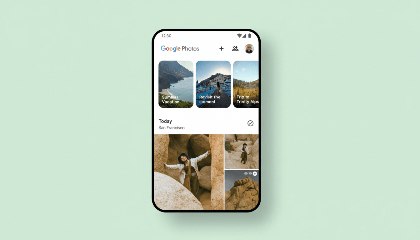
Google Photos is getting a notable interface overhaul on iOS, trading its long-standing bottom navigation bar for a pill-shaped floating toolbar that hovers above your images. Early users report that the redesign consolidates Photos, Collections, and Create into a compact control surface, with a dedicated floating action button on the right for Search or the new Ask experience.
The change, live for some users on iOS version 7.63, reflects a broader shift in Google’s design language toward more content-forward layouts. By lifting navigation off the extreme bottom edge, Photos shows a touch more of your grid and keeps controls within view as you scroll, reducing the sense that the interface is getting in the way of your library.
Why a Floating Toolbar in Google Photos, and Why Now
This move aligns with Google’s Material 3 principles, which favor expressive, context-aware components over rigid, always-docked chrome. Many of Google’s apps have gradually shortened or simplified bottom bars in recent years; Photos had been a holdout. A floating toolbar balances familiarity with a layout that prioritizes imagery, which is the core of the app.
There’s also a practical angle on modern phones. With larger displays and iOS’s home indicator occupying the very bottom edge, a lifted control bar can reduce conflict with system gestures, while giving the UI more spatial breathing room. It’s a small change, but in a photo grid that users scroll through thousands of times, those pixels count.
What Changes in Daily Use with the New Photos Toolbar
The new toolbar bundles the primary tabs—Photos, Collections, and Create—into a single pill that remains visible as you browse. The floating action button on the right launches traditional Search or the newer Ask option, which taps into Google’s AI to help you find or understand what’s in your library.
Because the bar sits higher on the screen, you’ll see a taller slice of your timeline in the same view, which is especially noticeable in dense grids. The behavior feels closer to “tools follow content” than “content surrounds tools.” According to reports surfaced by 9to5Google, the change appears to be a server-side rollout on iOS, with no confirmed timeline for Android yet.
For now, this is an iOS-first rollout. Google often tests interface tweaks on one platform before bringing them to the other, and with Photos serving well over 1B users globally, the company tends to stage UI changes to reduce disruption.
Ergonomics and Trade-Offs of a Raised Navigation Bar
Raising navigation slightly has pros and cons. It clears the bottom edge for full-screen photos and system gestures, but it also moves primary controls a bit further from the thumb when using larger devices one-handed. Human–computer interaction research, such as Steven Hoober’s “thumb zone” studies, shows that placement matters: interfaces feel faster when common actions land in easy-to-reach areas. Google’s bet here is that persistent visibility and a simpler, single bar will offset the extra millimeters of reach.
From a precision standpoint, the pill shape and larger touch targets should improve hit rates, consistent with Fitts’s Law, which correlates larger, closer targets with faster, more accurate taps. The design also reduces visual fragmentation by grouping navigation and the primary action in one cohesive element.
The AI Angle with Ask Photos and Its Prominent Button
The prominent action button isn’t just for classic search. It’s a gateway to Ask Photos, the Gemini-powered feature Google previewed to help you find moments with natural language queries or get context like when a warranty expires in a screenshot. Placing this capability within a thumb’s reach signals Google’s intent: search—and increasingly, semantic understanding—sits at the heart of the Photos experience.
In practical terms, that could mean quicker pivots from browsing to asking questions like “Show me our hikes in 2022” or “Find receipts from the camera store,” without diving into nested menus. Elevating this action via a floating button suggests Google expects it to become a primary behavior rather than a niche tool.
Rollout Details and What to Watch for in This Update
iOS users on version 7.63 are seeing the interface today, likely through a phased server-side enablement. There’s no confirmed Android date, but given Google’s cross-platform design push, parity usually follows after testing and telemetry validate engagement and error rates.
Watch for refinements typical of Google’s design iterations: subtle haptic confirmation on tab changes, context-aware morphing of the action button, and polish to transitions as the toolbar hides against full-screen media. If usage metrics improve—more successful searches, higher tab engagement, fewer accidental system swipes—expect the floating toolbar to become the new standard across platforms.