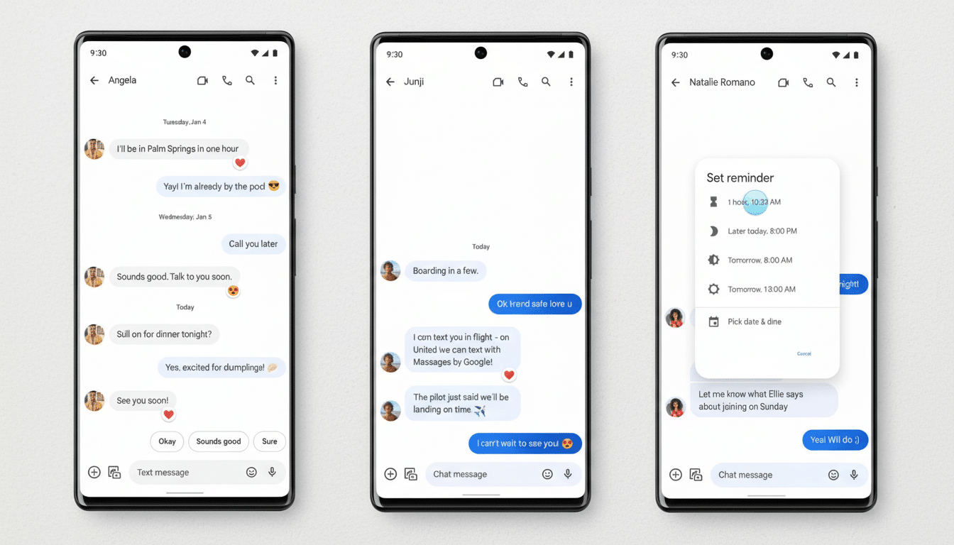
Google is quietly testing a more eye-catching format for link previews in its Messages app, and early testers say the changes could make breaking news stories easier to find — or put unverified rumors on your radar.
Some text has been trimmed, typography tweaked, and a dash of color added to the otherwise grayscale search page — but also some usability and security questions for Google to navigate ahead of any wider release.

What We’re Seeing in the New Link Preview Card
Test builds show four important changes.
- If a message consists only of a URL (no other text), the app might obfuscate the raw link in favor of a card-style preview. If you write some text next to the link, you still get the full URL beneath it.
- The card does away with the longer page description to create a less cluttered layout that focuses on the title and hosting site in heavier type.
- The preview seems to pick up accent colors from each page’s hero image and applies a background or border in order to visually differentiate them as cards. That’s in line with Google’s broader Material You vibe, which follows UI color changes based on content and user themes.
- The preview packs each link’s quick-share shortcuts — like the ones for photos and videos — so you won’t have to tap as many times if you’re interested in forwarding an article elsewhere.
These components were revealed to testers using a new Messages beta with hidden flags turned on. None of these changes are live for the wider user base at this time, and features seen in testing can evolve or be abandoned before reaching release.
Design Gains, but Transparency and Information Are Lost
The nice side is that it’s a lot easier to scan in crowded group threads where space is precious and you get multiple previews stacking. A font size that gives the page title and source priority could make it easier for users to tell at a glance whether a link is worth their time. The color treatment also increases differentiation among the cards, which is important if you’re sharing multiple articles in succession.
The trade-off is transparency. Some users depend on the raw URL to be able to catch red flags (misspelled domains, uncommon top-level domains, or aggressive tracking parameters). Taking the visible link away when it is the only content in a message might undermine those signals. The lack of the longer description also provides less context around pages with suspicious titles or for users who like to skim before clicking.
Security teams for years have urged users to scope out domains as a first line of defense. Global phishing volumes have remained high in recent years, according to the Anti-Phishing Working Group. Google has said its Gmail system blocks over 100 million phishing emails every day. In that context, even a small bit of UX — like whether to show a full URL — can have meaningful impact on how users behave.

How It Compares With Other Messaging Apps
Other platforms propose a full range of measures. iMessage and WhatsApp usually bold a title, image, and domain, rarely giving you the raw link unless it’s pasted as text. Telegram and Signal differ, but in both cases you can get a quick glimpse at the domain and long-press on it or its message bubble to see the URL as well. Most workplace apps, like Slack and Teams, will show link text with an expandable preview that allows the original URL to be kept at hand.
Google’s investigation seems to nudge Messages toward the consumer messaging norm: cleaner cards, fewer lines of text, and domain-forward attribution. It might even be a good default, as long as there’s an obvious way to view or copy the full link from the card — from a tap, menu, or long-press action.
RCS and Business Messaging: Impact on Link Previews
Messages is now a key force pushing people to give RCS a shot. With more brands leveraging RCS to deliver transactional status and promotional updates, link previews fit within a larger trust layer. While clean domain requests serve as strong evidence of legitimate outreach and consistent branding provides a clear signal, predictable previews allow users to separate real from spoofed mail.
If Google actually ships the new design, organizations with verified sender features could get some neater cards while still highlighting that they know where the messages are coming from. On the other hand, power users may desire an option to always show full URLs, especially in high-phishing-risk regions or sectors. Client-side presentation options would not contradict network standards, since the RCS Universal Profile of the GSMA allows for client-side decisions as well.
What to Watch Next as Google Tests Messages Previews
While these changes are all behind flags in pre-release builds, it’s unclear from here how they will roll out. “You should never be in the situation where you do a public beta two months out and there’s no new feature or significant improvement. Look for things: a preference to show the full URL; ‘view link’ on a card; added back descriptions when they prefer accessibility settings,” said Nintendojo via Twitter. Google usually A/B tests visual and safety trade-offs, and then lands on a hybrid.
The upshot: Messages appears set to modernize link cards with more polished design and convenience when sharing. Whether the change sticks, in terms of keeping up quick access to the underlying URL — that which helps users click with confidence — will likely hang on Google’s success at maintaining this small but critical part of the equation.

