Google is revamping its Quick Share app on Windows to feature a cleaner interface, reminiscent of the company’s recent focus on design across platforms. The update, which was discovered in version 1.0.2351.1, brings a new Expressive-style layout to settings and a simplified sharing panel that specifies who can send files to your PC. The consistent observations point toward a staged release, which means not everyone on the latest version will see the retouched UI instantly.
Inside the redesigned Windows Quick Share interface
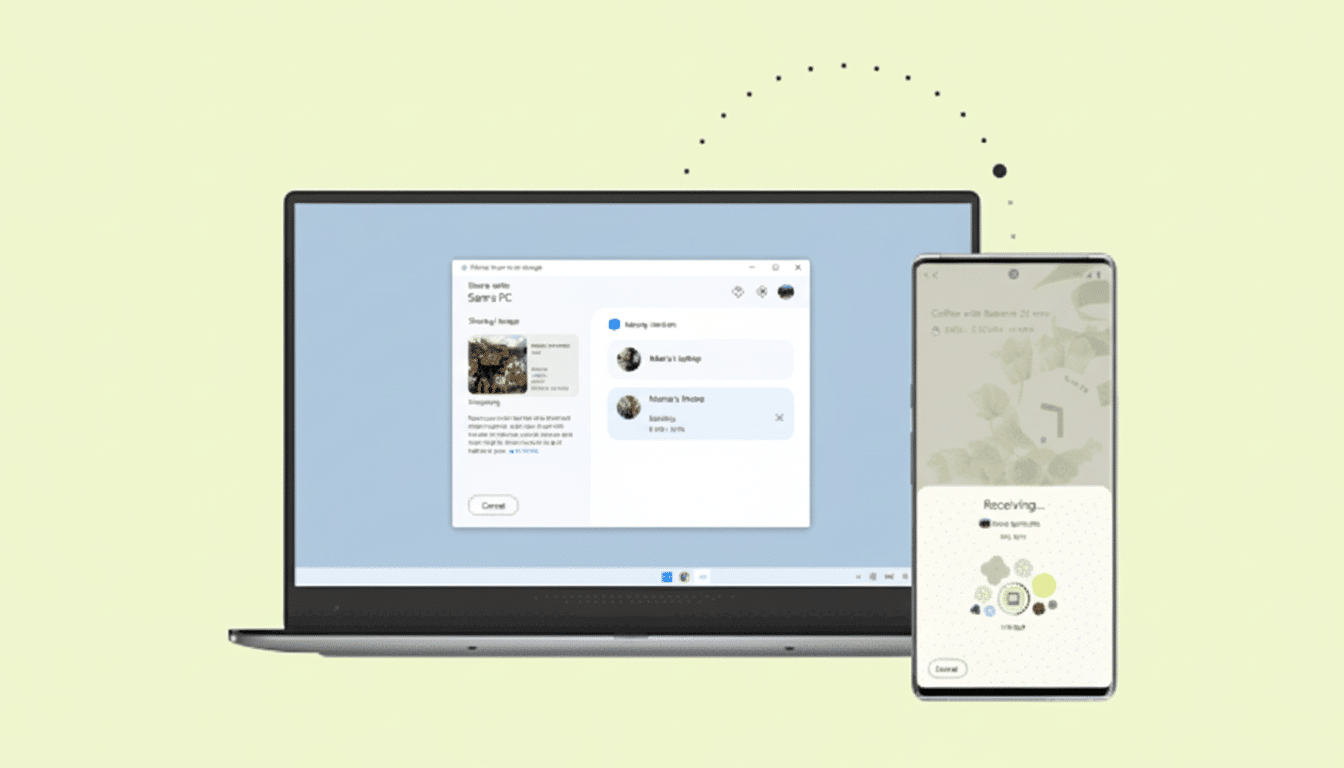
The redesigned settings in the new look are more Expressive-like: options are presented as transparent cards with lines to separate each entry. Names, visibility, and permission controls for devices are combined to ease scanning and make it a quick tap to adjust; promisingly, anything that reduces potential friction could prevent you from missing out on lost or delayed transfers.
The main app view also gets a neat overhaul. The left panel has been simplified, and now emphasizes “who can share with you,” demystifying visibility rules. That small copy change adds up: visibility scopes are widely misunderstood by users, and clearer language reduces time spent troubleshooting and misapplied sends.
Under the bonnet, everything seems to be working. Quick Share still uses a local handshake over Bluetooth and Wi‑Fi to negotiate direct transfers, squirting big files past the cloud and usually achieving faster speeds than uploading them to a drive and then re-downloading. Performance is primarily a question of your devices and network, but the new layout lets you make fewer taps and guesses — where most problems seem to arise — than in the past.
How the Windows Quick Share app differs from Android
Google’s Android app has recently separated the sending and receiving into two distinct screens to keep the flow uncluttered on phones. That tabbed design is not mirrored in the Windows app. Rather, it retains a single-pane experience that emphasizes visibility and nearby devices — a logical decision because on the desktop multitasking and larger canvases make the need for strict separation less necessary.
This disparity highlights Google’s platform-specific thinking: the same visual language where recognition aids comprehension, but different information architecture when screen size and input devices demand it. In reality, the Windows build feels more like an OS Settings app, whereas Android goes for mobile-friendly first steps.
Rollout details and how to check your Quick Share version
The redesign is apparently linked to Quick Share for Windows build number 1.0.2351.1, which means the changes should be available via a server-side toggle for plenty of users.
The new UI has been spotted by Android analyst Mishaal Rahman and others running this update, but other testers who installed the same version of Quick Share are still seeing the old interface, suggesting a staggered rollout.
Check to see if you have the update by opening Quick Share on your PC, going to Settings, and looking for the version string.
Updating via the store is probably the most consistent way to make sure you receive the latest build, but you may not see the visual updates immediately. There are no indications that features were removed; the changes here are largely about polishing and clarifying the UI.
Why This Matters for Cross‑Device Sharing
Quick Share has grown from being a useful Android-to-Android feature to a bridge between devices that at first glance appears to span tablets and even teases support for Chromebooks and Windows PCs. That reach is strategic. StatCounter reports Windows still rules the desktop OS roost globally and Android is tops for mobile, meaning that if you’ve got one of each, a nearly frictionless file handoff between the two ecosystems virtually eliminates one of the last daily pain points for mixed-device households.
The redesign is also the result of Google consolidating branding under the Quick Share name, which has been a joint project between it and Samsung to replace the old Nearby Share moniker. Consistency counts: a single name and familiar UI patterns make users believe that a send will just work, as it does with Apple’s AirDrop in its own domain.
The new layout should, in practical terms, reduce the time it takes to prepare a transfer. For instance, the settings for changing visibility to Contacts or Everyone, as well as renaming a PC so it shows up on your crowded office network, now take front and center. And for tasks like pulling in 4K clips from a phone to a laptop, or dropping presentation assets from your PC onto a tablet, fewer misfires mean real-time savings.
The competitive picture for cross‑platform sharing
Windows has its own Nearby Sharing, and third-party features such as Intel Unison or cloud sync services are widely available, but Quick Share’s virtue is that it can tap into native Android devices without additional setup. With Android atop the world’s smartphone market and Windows is king on PCs, compatibility between Google and Microsoft versions addresses the most broadly used linkage of devices in existence.
The Windows redesign isn’t going to dominate headlines the way new bits of functionality will, but it does the quiet (but important) work of sanding down edges. It’s precisely the sort of incremental polish that cuts down on support questions, steps up completion rates, and makes everyday transfers feel invisible — which is really the measure of good sharing tech in my book.