Google’s next significant visual change for Android has now arrived. Material 3 Expressive adds to Material You with research-driven movement toward interfaces that are livelier, more lucid, and more personal both on phones and wearables. Per the Material Design team, the journey comprised 46 global studies and input from over 18,000 participants, with results suggesting that users could locate core UI elements up to four times faster in expressive layouts.
What is Material 3 Expressive and how it changes UX
It’s not a new generation of Material; it’s an extension of Material You that emphasizes motion, hierarchy, and personality. Think of spring-based physics that make swipes and taps feel responsive, typography based on a brand-new typeface that gives your content legs, and a richer color system that guides you where you need to go without shouting. The mission has two parts: to make Android more emotional and easier to use.
According to Google’s design leads, it approaches topics with “expressive by default, restrained when needed.” That, in practice, means that animations and assets show character — but never to the detriment of legibility, accessibility, or battery life. The company’s in-house targets prioritize swift understanding and easy interaction loops — points that resonate within Android developer guidance, too.
Rollout and supported devices for Material 3 Expressive
Material 3 Expressive first arrived on Pixel phones with the first quarterly platform release of Android 16, and expanded to Pixel 6 and up as well as the Pixel Tablet. Design cues also carry over to Wear OS, as evidenced on the Pixel Watch with its new platform release.
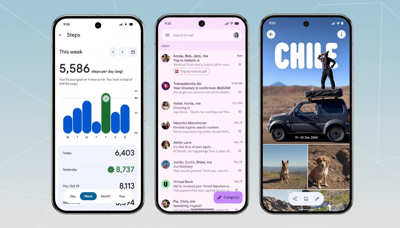
The key is that a lot of these expressive shifts are coming as app, not full system, updates. Crucial Google apps — such as Gmail, Google Docs, Chrome, Google Keep, and Files — have embraced the new visual system, meaning that no matter which Android device you’re using under manufacturer skins, portions of Expressive will shine through. Wider OEM integration will come once Android 16-based builds include the new Material libraries.
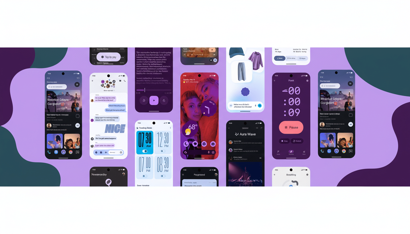
Key features and user interface changes to expect
- Spring-loaded motion and haptics: Animations now incorporate engineered spring dynamics so they feel rooted and more realistic. Swipe a notification away to see the delicate detachment effect, as cards next to it respond accordingly. The feedback is echoed across Recents, volume sliders, and the notification shade, while developers can sync their apps through refreshed Material motion APIs.
- Smarter color hierarchy: Dynamic Color remains, but palettes are more sophisticated with a clearer distinction among primary, secondary, and tertiary colors. The goal is immediate scannability — whatever’s important should pop, while supporting elements recede without vanishing. Wallpaper-driven theming continues to personalize the appearance.
- Typographic intent: Headlines and the most important actions are set in larger sizes and heavier weights to enhance visual hierarchy. Whether you’re beginning a screen recording or triaging messages, the type system here makes priorities immediately self-evident.
- New shapes and components: An updated library of 35 shapes allows for more subtle transitions between states, creating, say, a gentle shape-morphing transition from square to squircle that helps focus during state change. Google also introduced new components (and revamped 15 of them): button groups, split buttons, toolbars, loading indicators, and a refreshed FAB. System icons, such as Wi-Fi and battery, have been enhanced for better visibility.
- More powerful Quick Settings and shade: Within the updated Quick Settings, users have access to more pinned controls (including network and NFC toggles) as well as app-triggered resizable tiles, which allow power users to pack in even more functionality with fewer swipes. The notification shade also picks up a faint background blur that maintains context while improving readability. A new Live Updates surface shows ongoing activities — driving, for example, or packages en route — without hopping between apps.
Wear OS upgrades that mirror the expressive redesign
On the wrist, animations follow the round display for a smooth, edge-to-edge experience. The same springy transitions used on phones make interactions such as entering a PIN or managing media snappier and less punishing. Shape-shifting caters to condensed layouts, and Tiles are cleaner, offering quick access to workouts, timers, and favorite contacts.
Google also lists real gains under the hood: using the upcoming Wear OS platform, internal testing suggests up to 10% better battery life due to animation tuning and further component optimizations. On smaller screens where every tap counts, larger touch targets and clearer type are a quick quality-of-life win.
Why Material 3 Expressive matters for users and developers
For users, Expressive isn’t just a coat of paint. A research-based motion model, more hierarchical structure, and new components make wayfinding faster and reduce mis-taps. Initial community polling seems to favor it, with some describing a livelier look that doesn’t sacrifice legibility.
The directive for developers is to be consistent. Refreshed Material libraries on Android and Wear OS facilitate faster adoption of expressive motion, color roles, and new components without reinventing core patterns. Google’s advice on performance and haptics emphasizes that motion should serve a purpose — signaling state changes, not merely adorning them — and ensuring accessibility across font scaling, contrast, and reduced-motion settings.
Bottom line: Material 3 Expressive is the fullest expression yet of Google’s “feel-first” design philosophy. It further blends the aesthetic with the use cases, and it’s rolling out through system updates and app refreshes — a pragmatic approach meant to make Android feel more cohesive, no matter what screen you’re on.