Google Contacts is quietly preparing a visual refresh that puts Calling Card images front and center, tackling the “too many photos” problem introduced when Calling Cards arrived last year. Evidence in the latest Android build suggests the contact detail screen is being reworked to spotlight the large Calling Card and dial back the legacy avatar, streamlining what you see when you open someone’s profile.
What’s changing in Google Contacts’ contact detail view
Today, a contact can have both a traditional thumbnail photo and a Calling Card image—the latter designed to appear prominently on calls. In practice, that has made the contact page feel crowded. In version 4.73.27.871645217 of the app, new UI elements under development indicate Google is minimizing the classic avatar and giving the larger, poster-style Calling Card room to breathe.
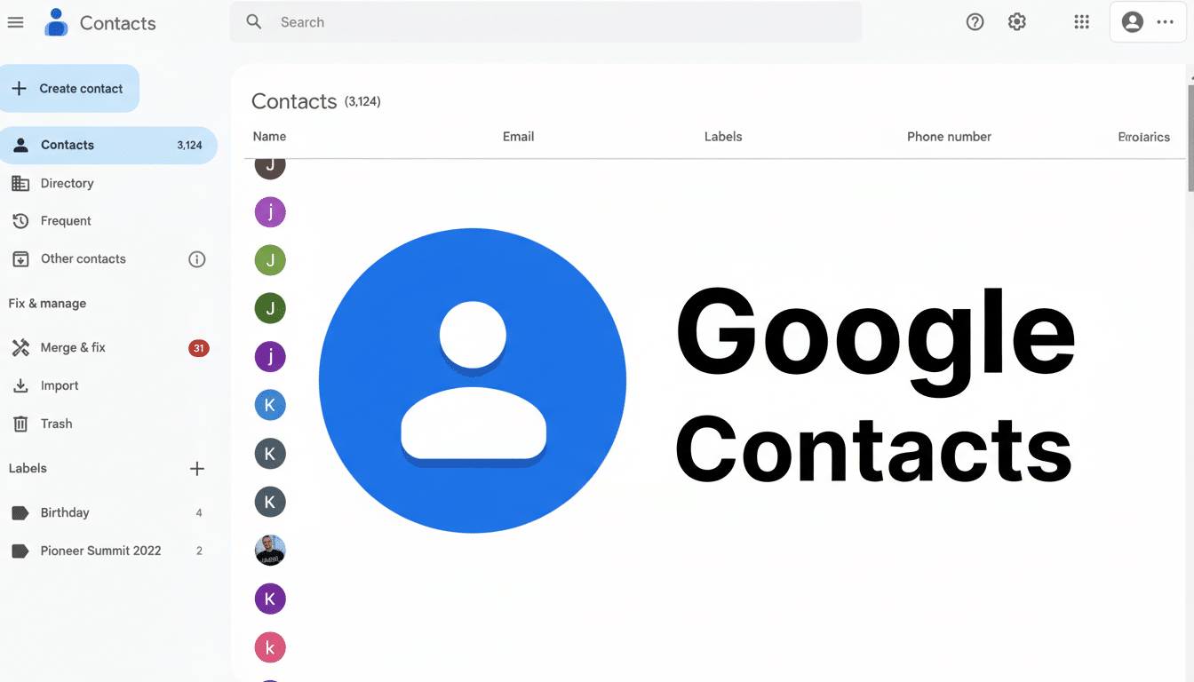
The refreshed layout reduces visual redundancy and frees up space below for the information that matters, like numbers, recent interactions, and linked accounts. If a contact doesn’t have a Calling Card configured, the current behavior remains: the standard photo appears as usual, with no loss of functionality for people who haven’t adopted the newer feature.
It also reads as a Material You refinement. The direction aligns with Google’s broader emphasis on bold, meaningful imagery and simplified hierarchies—less chrome, more content. Expect the Contacts detail screen to better mirror what you see on the Phone app’s incoming call UI, creating a consistent identity from the call screen to the contact profile.
Why Calling Cards matter for identity and recognition
Calling Cards do more than prettify your address book. They give people a clear, consistent identity on outbound and inbound calls, reducing friction and misidentification—especially helpful when you juggle personal, work, and community networks. The approach echoes Apple’s Contact Posters on iOS, underscoring a broader industry push to make calls feel more personal and recognizable.
With Google Contacts counting over 1B installs according to its Play Store listing, even small UI tweaks can shift everyday behavior at scale. A cleaner contact screen lowers cognitive load, shortens task time, and nudges more users to set high-quality Calling Cards—outcomes that benefit both individual users and teams relying on quick recognition.
Sharing and transparency in Google’s Calling Cards
Alongside the layout work, Contacts continues to prepare a “My Calling Card” setup flow that lets you control who can see your card. Under-the-hood strings show a receiving-side attribution—“Calling card shared by %s”—so people will know when a profile image and details came directly from you. That small line adds useful context and helps establish trust when profiles update automatically.
Google is also updating the blocking workflow to explicitly reference a person’s Calling Card. That clarity reduces ambiguity about what you’re blocking: not just a number, but the profile associated with it. In an era of spoofing and spam, every extra bit of transparency can help users feel in control.
What users should watch for as the redesign rolls out
This redesign is not broadly live yet, but the in-app assets and strings in version 4.73.27.871645217 suggest it’s getting close. As is typical with Google, expect a staged rollout gated by server-side flags. Keeping Contacts and the Phone app updated increases your chances of seeing new features earlier.
If you want to be ready, curate a crisp, high-resolution image for your own Calling Card and review sharing preferences as they land. For workplaces, this is a good moment to consider lightweight branding guidelines for employee Calling Cards—consistent imagery makes internal communication faster and external calls more recognizable.
The bottom line: by letting the Calling Card lead and dialing down duplicate visuals, Google Contacts is moving toward a cleaner, more informative profile page. It’s a subtle change with an outsized impact—less clutter, clearer identity, and a smoother path for the next wave of Calling Card features to slot in.