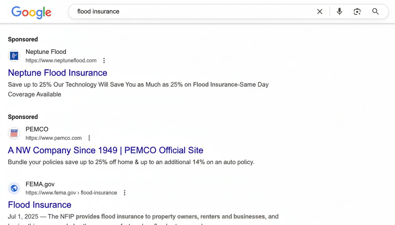
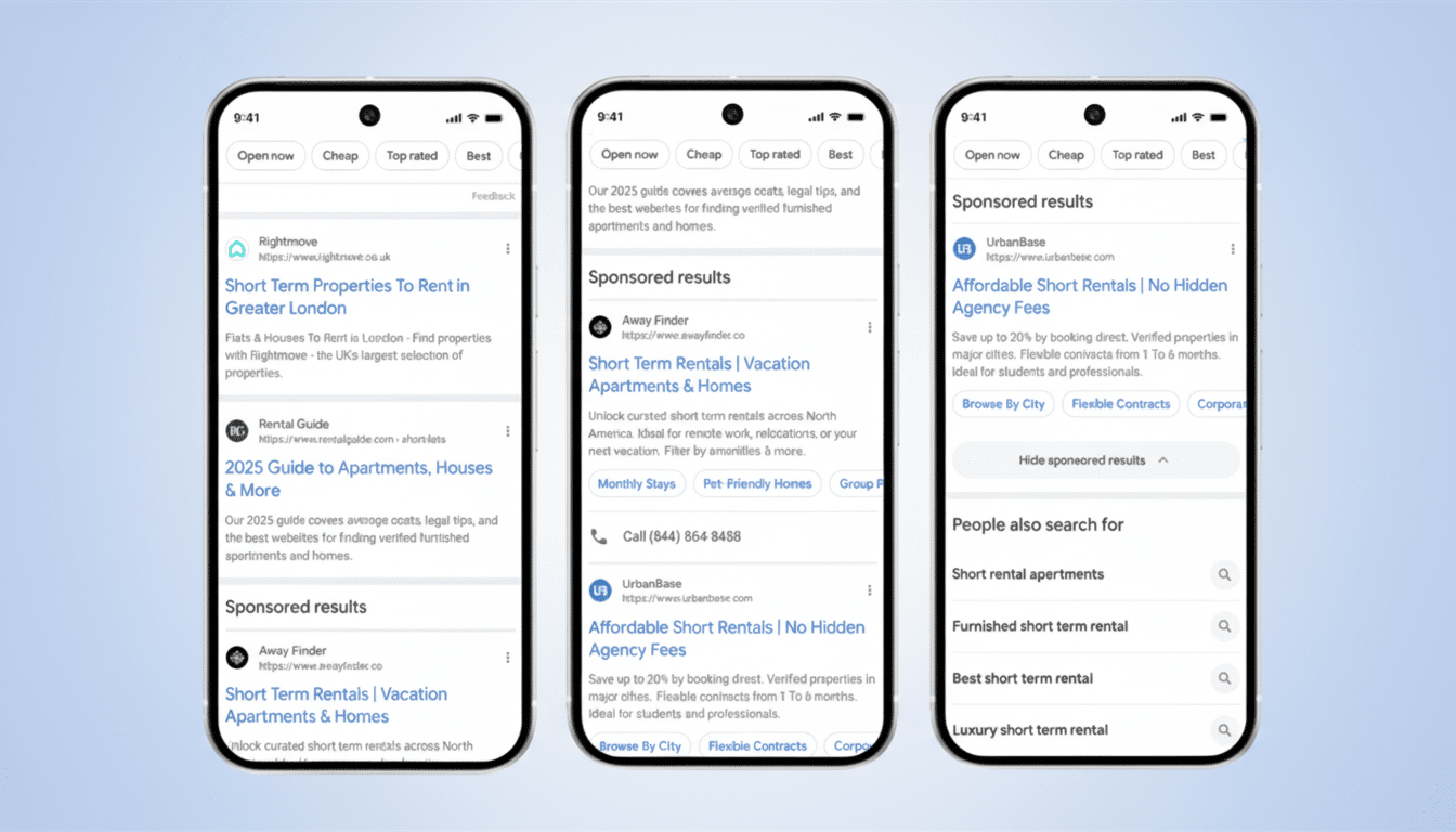
Google is now adding a simple control in Search that lets you collapse sponsored listings instantly, enabling a less crowded view of organic results without changing your settings. It’s a small change with big implications for usability, especially for queries with many advertisements.
What the new “Hide sponsored results” control does
On search results pages, text ads have been divided into a clear grouping tagged “Sponsored results.” On the other side of that grouping, a new “Hide sponsored results” button folds the entire ad category with one tap and reveals organic links beneath that label.
- What the new “Hide sponsored results” control does
- How to use it on desktop and mobile, step by step
- Why Google is adding clearer labels and a hide option
- What this change means for users and advertisers
- How this one-tap ad toggle compares with My Ad Center
- A practical tweak that boosts clarity without blocking ads

This control works broadly throughout Search, including Shopping units, which are labeled “Sponsored products.” Ad sizes are not changing, Google added, promising that it will not display more than four text ads in any grouping. The label is visible as you scroll, and ads can be shown above and below AI Overviews for those that display them.
Ads will be displayed again once you click the control button to show them if you want a crowded page again. But there is an essential restriction: it’s not a set-and-forget option; instead, you have to hide advertisements each time you perform a new search.
How to use it on desktop and mobile, step by step
Start a query where ads typically appear—think of examples like these:
- best credit cards
- running shoes
- business software
- Look for the “Sponsored results” label near the top of the page.
- Select “Hide sponsored results” to compress the ad module. Organic results move up as soon as you do so, meaning you won’t need to scroll as much.
This will be particularly notable on mobile for competitive searches that might otherwise place multiple ad formats on top of organic links. This feature began to roll out to desktop and mobile worldwide. If you haven’t seen it yet, you will soon as the design update finishes.
Why Google is adding clearer labels and a hide option
Clarity and control are the top reasons. Usability research has long revealed “ad blindness,” which refers to people failing to notice or understand sponsored content. Nielsen Norman Group has investigated variations on this theme over the years. By placing more ads together and labeling them more explicitly before allowing users to tuck them away, it mitigates confusion about where ads stop and organic results start.

It also follows an industry-wide push for transparency. In recent years, Google added the Ads Transparency Center and extended the reach of My Ad Center accounts for personalization and topic preferences. Platforms have faced pressure from regulators in several countries, including the Digital Services Act in Europe, to make ads easier to pick out. This implementation, establishing a prominent label and a one-tap hide choice, goes a long way while avoiding an ad ban.
What this change means for users and advertisers
Speed and confidence are key for searchers. When you need information—deciding which clinic to visit, verifying documentation, or comparing product data—collapsing the sponsored blocks makes you feel more comfortable that you’ll find good sources with less scrolling. When it comes to shopping chores, you can swap between ads and user reviews almost instantly.
For advertisers, the impact is mixed. The default viewing state of the label means that the labeled ad still shows, and most users won’t hide it every time. But, on information-seeking queries, Google believes that some segments will choose to collapse ads. Depending on the percentage, that outcome could trim impression depth and shift proportional click distribution. The adjustment might favor the most relevant and trusted ad creatives while prodding weaker placements to bring more value and clarity or opt out.
Context is critical: Google’s parent company, Alphabet, reported well over $230 billion in advertising revenue last year. And Search is the engine room. Google’s result design reflects that business reality. The two-stack ad visual approach keeps ads visible by default and does no more than maintain the current free link to users who prefer it.
How this one-tap ad toggle compares with My Ad Center
How does this ad setting compare to My Ad Center, including personalization adjustments, advertiser muting, and reductions in certain sensitive categories? The new “Hide sponsored results” control is simpler and more immediate. It does not adjust targeting or long-term preferences, and it does not extend across sites. It is a session-level visibility toggle and is only available on the current results page.
A practical tweak that boosts clarity without blocking ads
In conclusion, a single, consistent ad label and a one-press “Hide sponsored results” setting are a practical enhancement to Search. It respects the user’s intent but does not upend the ad model. In a crowded information space, it enhances lookability-based results and offers more power when you seek a quick path to the organic web.

