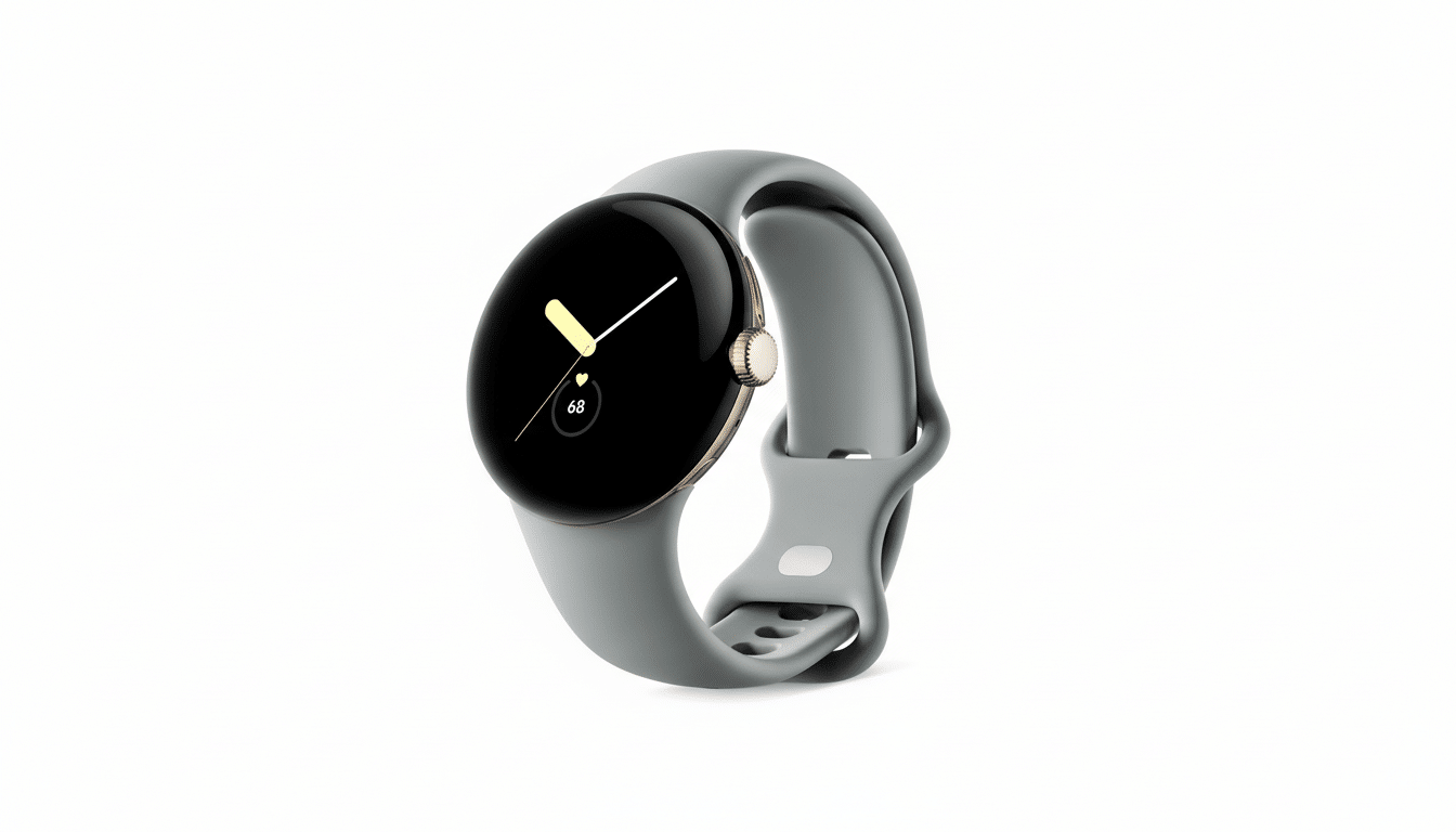
There’s a look to Google’s smartwatch on which you can spy across a room, but the very thing that makes it immediately identifiable is also sealing its destiny. The Pixel Watch’s curved glass, small size and ultra-minimal lines appeal to some users but turn others off, and that polarization is silently capping its mainstream potential.
A Lovely Pebble With Compromises in Daily Use
The ‘pebble’ form is sophisticated and lightweight, covering the wrist with a gentle curve and few visual interferences. It’s also a design that sacrifices practical screen real estate. Even as bezels have shrunk over the generations and displays have gotten brighter, a sphere behind curved glass yields less usable area than does a flat-faced watch of similar dimensions.

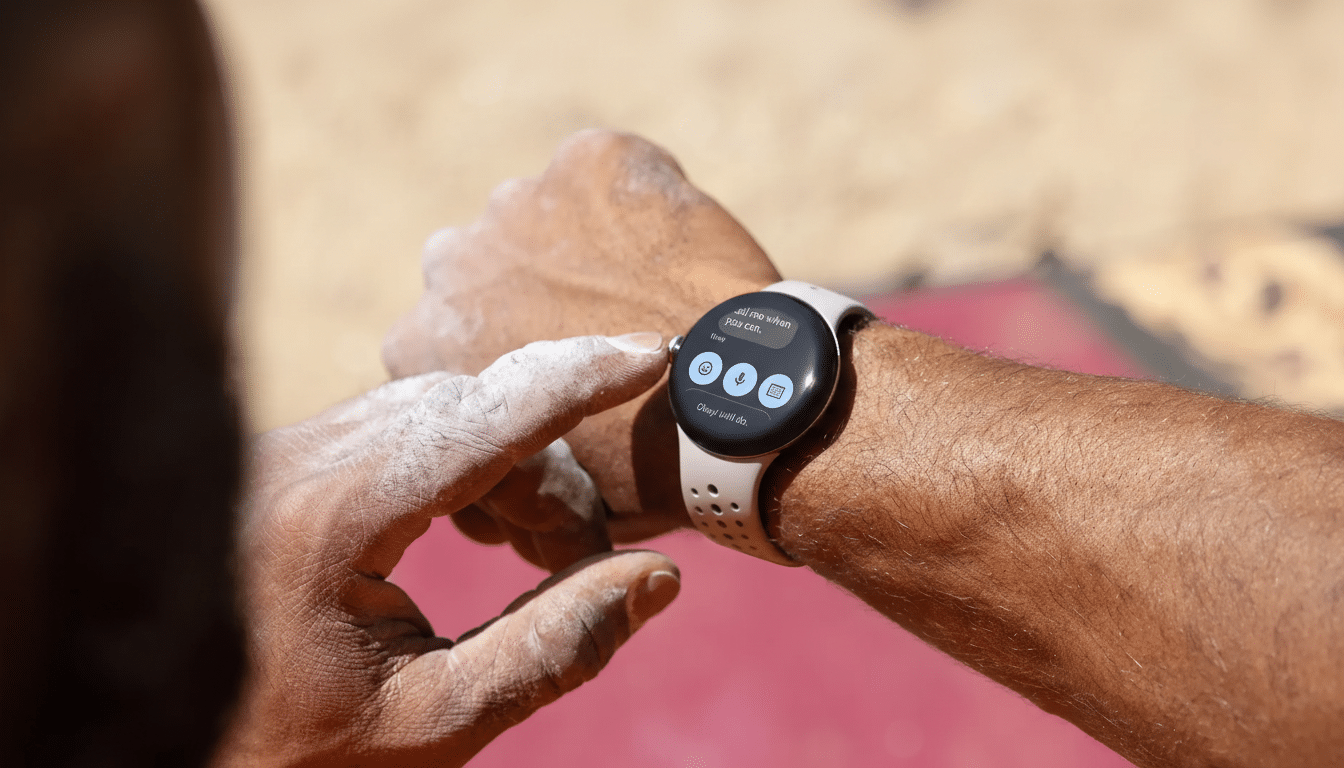
That matters in day-to-day use. With less canvas, message previews cut off more quickly, maps show less context, and fitness fields vie for space. A high-contrast UI can hide the borders, but users still feel it when they try to add additional complications or swipe through compact tiles. The domed crystal also seems to catch a few more reflections from oblique angles, a small though not negligible detriment in bright outdoor conditions.
Ergonomically, this diminutive case feels light and sleek on the wrist, but can wear small or dainty on larger wrists. The result is an aesthetic that some love and others hate, which is seldom the formula for mass-market appeal.
Speak A Design Language That Funnels The Audience
Google has doubled down on a round-only, ultra-minimal direction. It’s coherent and brand-syntonic — but also constraining. So many buyers are demanding a flatter, more classic profile that falls much closer to traditional wristwatches. Others opt for something a bit more pronounced, more technical and aggressive, with visible lugs and a beefier bezel. Some people just want a bigger face, taking more advantage of the footprint.
Even though there are several case sizes, a design language is one design language. Users don’t size up or down (or evenly divide), they move in and out of an ecosystem. Here, proprietary band mounts complicate the issue by limiting the styling choices that can change an otherwise straightforward watch face from “minimalist dome” to a more flat-topped appearance.
What Competitors Teach Us About Choice and Market Share
Competitors have discovered that variety is a big seller. Apple had maintained the same core look for years, then offered the Ultra for people who wanted imposing hardware without jumping ship. Samsung has been bouncing around between Classic, Pro and Ultra tiers to include everything from dressy to outdoorsy. Both companies have multiple sizes as well as different personalities under one brand name.

The market signal is clear. Apple ranks No. 1 in global smartwatch shipments, followed up by Samsung at a comfortable No. 2 — and the two makers are vying for supremacy by catering to different tastes at different prices, according to Counterpoint Research and IDC. The Pixel Watch line still, by comparison, remains a niche player with low single-digit share — a shiny new kid on the block but still kept down by its looks that don’t jibe on every wrist.
That buffering also insulates choice from fleeting trends. And when a single silhouette speaks for an entire line, any shift in taste leaves prospective buyers nowhere to go. Multiple tracks of design are how you keep a brand flush without washing away its identity.
Iteration Shows the Team Can Pivot on Hardware Design
Google has already proven itself capable of reimagining friction points. An upgraded magnetic charger with stand support for nightstand use seems to give a nice bedside experience. Every generation has brought brighter screens, smoother performance and snugger fitness tracking. The battery life is turning the corner on early complaints without excessively bulking up the form factor.
The next unlock is about not ditching the icon — it is giving it children. A version with a flatter crystal and thinner bezels would increase information density without compromising the brand’s clean look. Or a bolder, more angular model with bare lugs and a protruding bezel might lure athletes and adventurers who seek a tool watch look. So if you kept band compatibility and software parity across versions, you could expand the tent without compromising the Pixel experience.
The Bottom Line: Design Variety Could Unlock Broader Appeal
The design of the Pixel Watch is unique, comfortable and very handsome. It’s also polarizing — and polarization is bad for growth. In a category where wrists, tastes and use cases are all over the map, one good-looking face is not sufficient. Google has nailed the basics; it just needs more than one glance to clear them.

