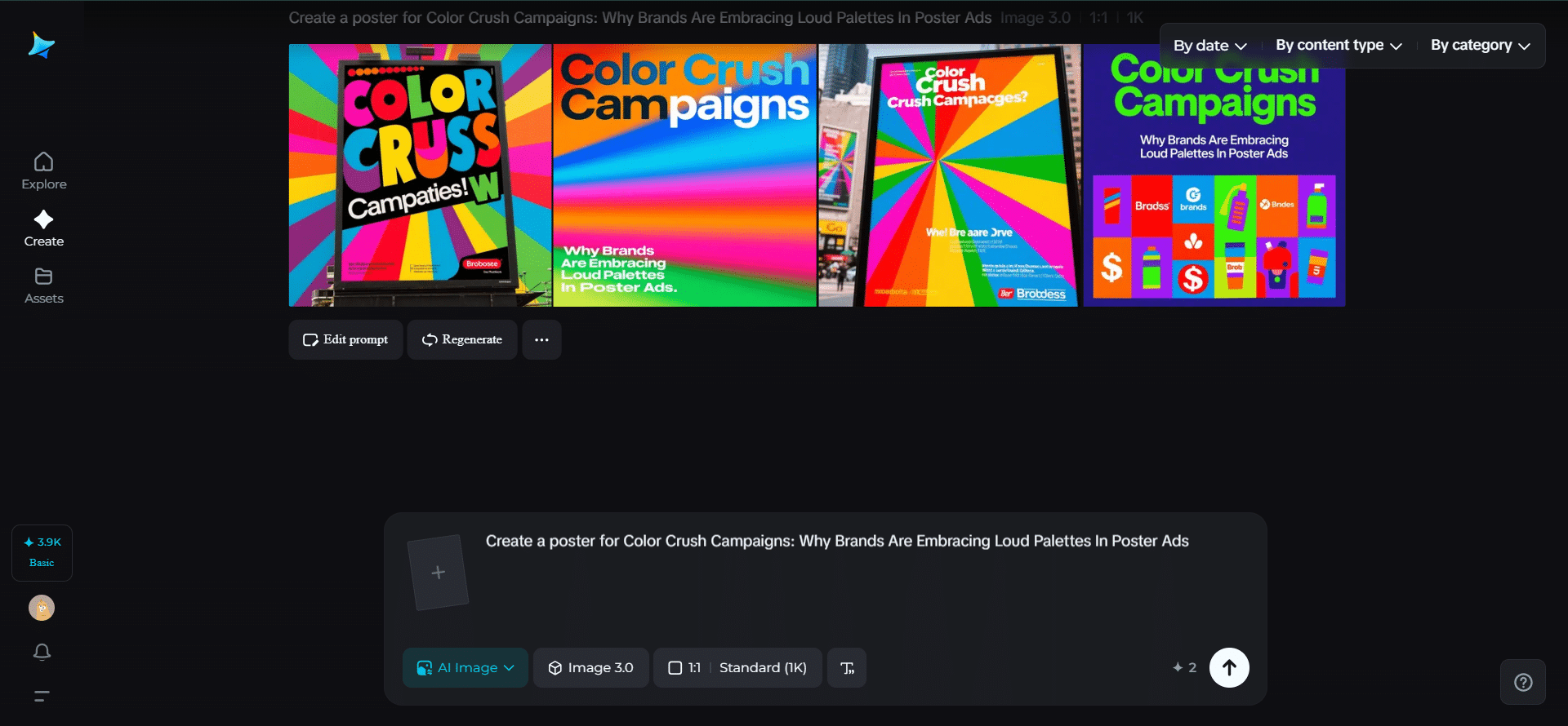
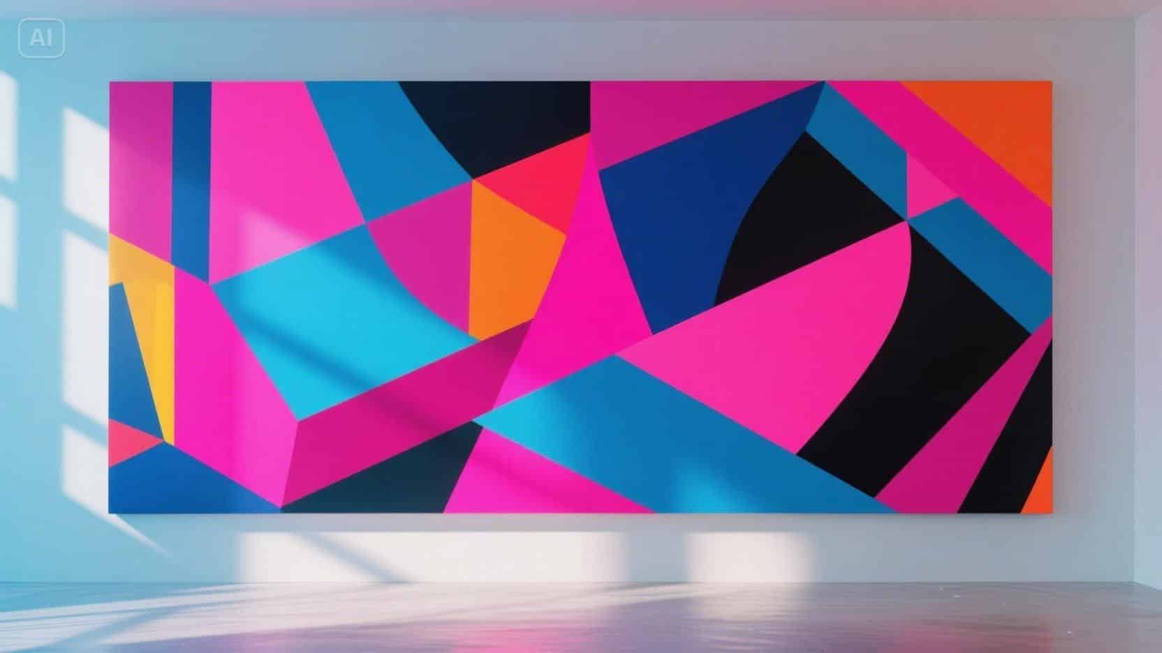
When’s the last time a poster made you stop mid-scroll because its colors literally shouted at you? Neon pinks, electric blues, radiant oranges, and gradients that seem to glow-modern brands are embracing bold palettes like never before. Thanks to tools such as Dreamina and an AI image generator, designers can experiment with color, texture, and contrast without any holdbacks, creating visuals that feel alive, energetic, and impossible to ignore.
Color is not just background anymore; it’s the main act. Color shapes emotion, guides attention, and tells a story before words even appear.
- The psychology behind neon, gradients, and contrasts
- Why bold colors work for brands
- Layering color with composition
- How motion experiments enhance color storytelling
- Making mood through unusual color combinations
- Finding the balance between boldness and clarity
- Inspiration from digital and pop art aesthetics
- Why brands bet big on color
- The future of color-forward posters
- Winding down with Dreamina
The psychology behind neon, gradients, and contrasts
As designers know, color is a language, and different pairings invoke different emotional responses.
- Neon colors inspire energy and curiosity
- Gradients indicate progress and energy, and act modern
- High contrast improves reading and adds visual interest
- Contrasting opposites can be cheeky, rebellious, and unexpected.
When used with intention, posters can do a lot more than inform and educate a viewer’s mind.
Why bold colors work for brands
The human brain is wired to respond to colors. Bright, high-contrast palettes can elicit responses of excitement, optimism, and curiosity. For brands, this translates to audience attention, brand recall, and that emotional oomph that makes you remember an advertisement.
Here are a few reasons why loud colors are pervasive across modern posters.
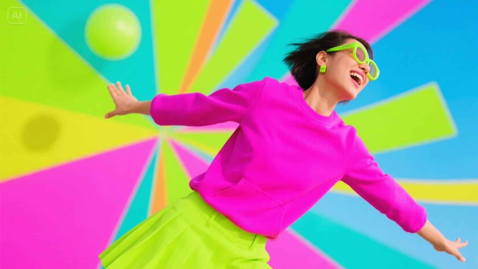
- Immediate attention-grabbing: Neon and saturated colors pop off feeds filled with neutral content
- Emotional storytelling: Color tells mood in an instant; hot pinks for playfulness, electric blue for energy.
- Branded differentiation: A color palette can become your identity, robbed out of its logo
- Product depth: Gradients and blended colors can create a sense of movement and texture.
Bold colors are not just sleazy; they tell a story.
Layering color with composition
It’s not enough to pick a loud color; placement and composition amplify impact. Designers use:
- Color blocking – large swaths of neon that anchor visual hierarchy
- Accent pops – small saturated elements to guide the eye
- Textured gradients give subtle depth behind typography to make it feel dynamic.
- Interaction of shapes and hues-overlapping forms that merge colors to imply movement
Static posters can feel kinetic when colors interact with each other like dance partners.
How motion experiments enhance color storytelling
Animation is the new frontier. Poster campaigns are increasingly experimenting with micro-movements that bring palettes alive. Designers often use an AI video generator to see neon shapes ripple, gradients flow, or geometric elements shift. Even a subtle shimmer or bounce adds life to make the audience feel the energy rather than just see it. Motion allows designers to explore timing, rhythm, and emotional beats that guide viewers through the color story.
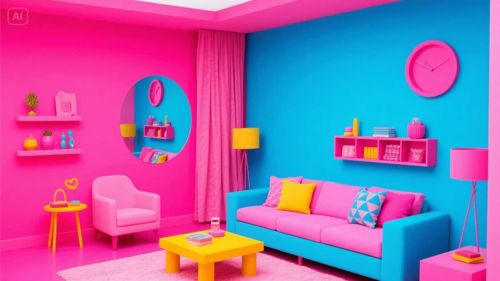
Making mood through unusual color combinations
What’s most exciting about a “color crush” campaign is the very essence of it being unexpected. Designers don’t always select the safest blues and reds; they venture to extend palettes into the outrageous.
- Magenta and lime green for playfulness
- Orange and electric purple for energy and surrealism
- Bright yellow and deep teal for a retro-modern feel
- Gradient overlays for depth (light and shadow)
These unconventional palettes give posters a pulse; they feel alive, immersive, and shareable. More importantly, the audience’s response is instinctive to palettes that are unexpected or outside the norm – this creates a stickiness that lasts beyond the scroll.
Finding the balance between boldness and clarity
“High impact” colors don’t mean out-of-control chaos. An effective campaign finds a good balance between excitement and readability:
- Ensure enough contrast between text and color for readability
- Keep the number of main colors per hierarchy to a minimum
- If you are using gradients and neon, use them to highlight key elements
- Leave white or neutral space for the eye to rest on the page
When color is approached as both emotion and functionality, posters can scream without feeling overwhelming.
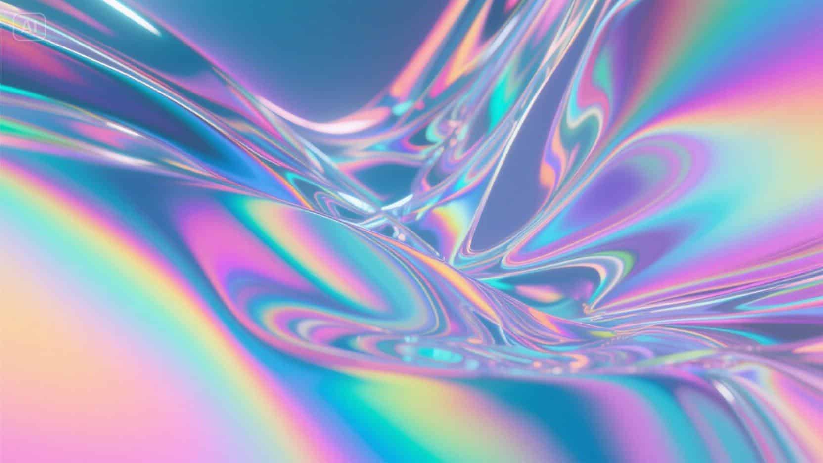
Inspiration from digital and pop art aesthetics
Digital culture and pop art both celebrate color as expression. Posters today often borrow from:
- Pixel art and glitch textures: neon and gradients evoke nostalgia.
- Pop-art exaggeration: ordinary objects in extraordinary color schemes
- Futuristic digital palettes: electric tones, holographic sheen, and iridescence
Other artists then further enhance these experimental looks through an AI art generator to achieve surreal textures or unexpected combinations that are almost impossible to do manually. The result? Posters that feel like collectible micro-art, not just marketing materials.
Why brands bet big on color
Bold color palettes are more than a design trend-they’re strategic tools. Brands know that:
- Social feeds reward scroll-stopping visuals
- Color can be a shorthand for identity
- Vibrant posters are more shareable and engaging
- Emotionally charged visuals reinforce recall
The “color crush” strategy transforms ordinary promotional content into immersive experiences that stick in memory.
The future of color-forward posters
Expect to see posters evolve further:
- Interactive and animated gradients
- AI-assisted palette exploration for personalized campaigns
- Cross-medium consistency, which means that colours should look consistent between digital and physical displays.
- Dynamic visual narratives where color changes tell mini-stories
With smarter tools, designers can experiment with color faster, test options, and create bold, immersive campaigns that audiences will remember long after the scroll.
Winding down with Dreamina
Bright color crush campaigns demonstrate that loud palettes are more than décor–they tell a story, set a mood, and capture one’s attention all at once. In Dreamina, designers are able to take risks with color, discover new textures, and collaborate on layouts that make contemporary poster ads entirely irresistible. Sometimes mixing a neon, a gradient, or a saturated clash can change an ordinary ad into an extraordinary visual experience that captures attention, and even excitement with every scroll of a feed.