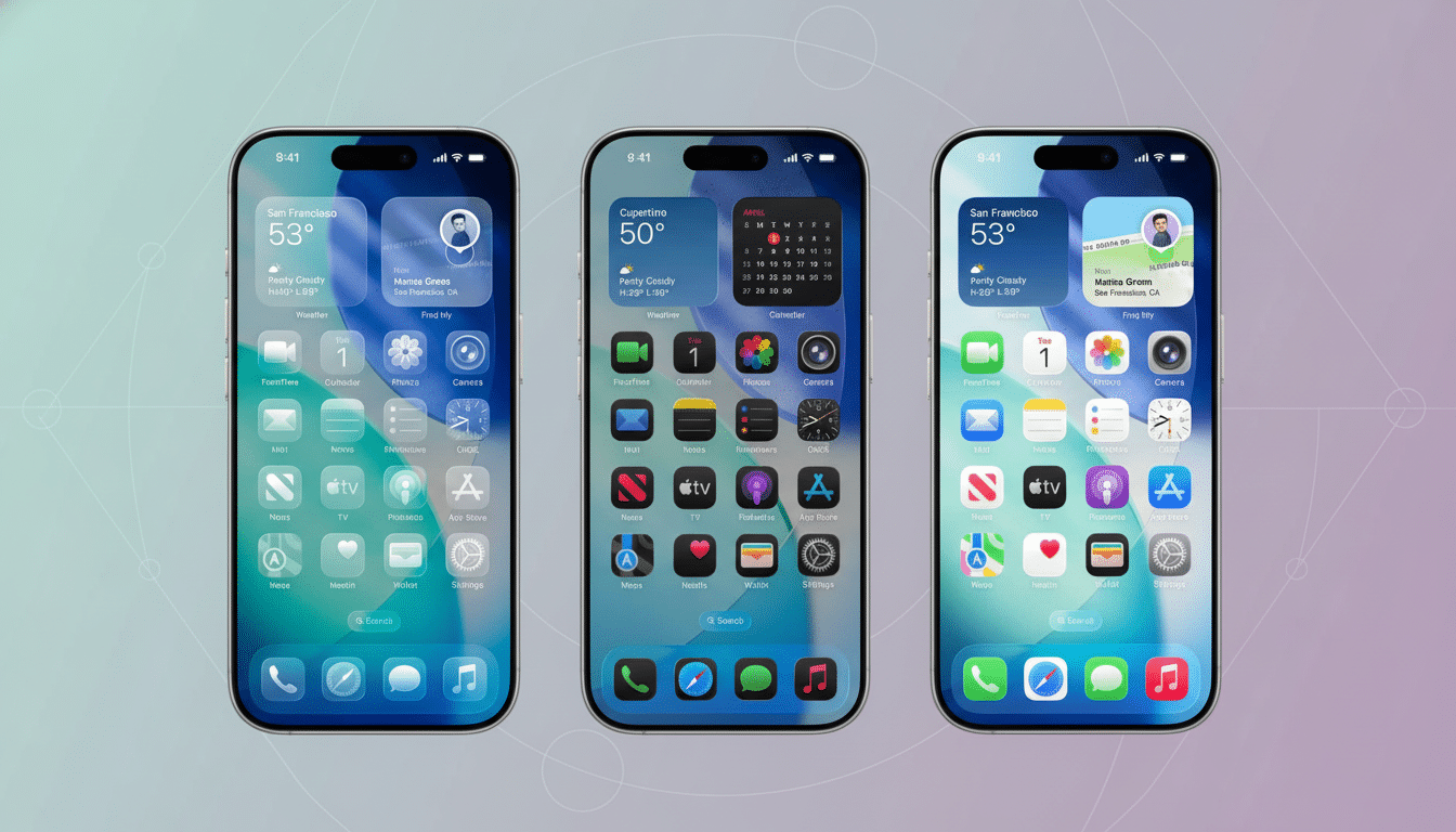
And Apple is also putting users a bit more in control of that bold Liquid Glass look, too, with the introduction of a new “Tinted,” a system setting that increases opacity on blurred interface elements to increase legibility. Deploying in the newest betas for iOS, iPadOS, and macOS, it’s a plain option between Clear and Tinted—basically so people can knock back some of the old “glossy” look that came in with that recent aesthetic revamp.
How the Tinted Option Alters the Liquid Glass Look
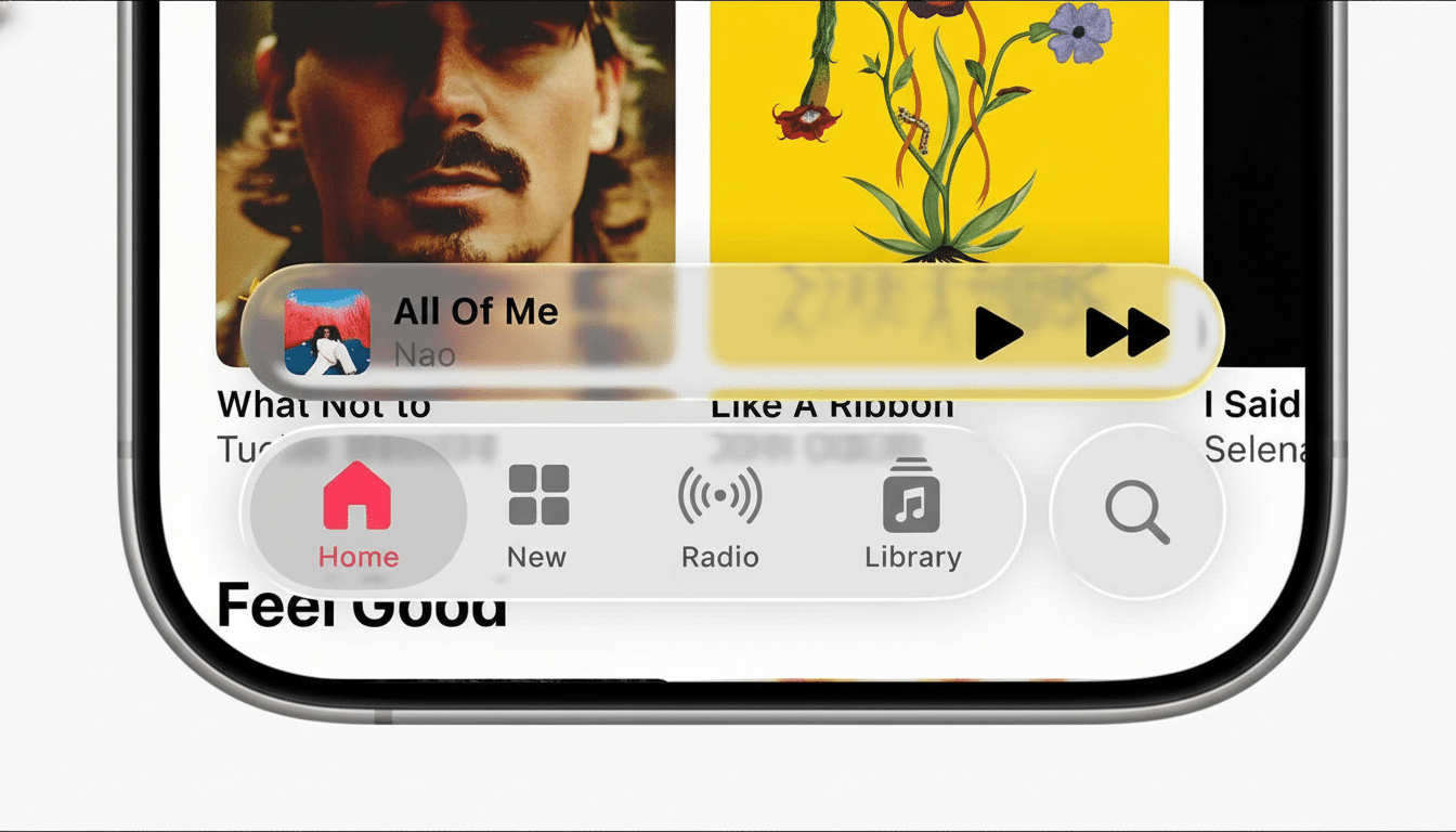
Tinted reduces the amount of transparency for all elements, such as those found in Lock Screen notifications, Now Playing controls, widgets, or navigation bars. In practice, that translates to text, icons, and controls resting on slightly more substantial backdrops, which make edges and type easier to differentiate at a quick glance. Clear maintains the default Liquid Glass look but with increased transparency, deeper blurs, and more of a hint of the wallpaper underneath.
The setting resides under Display & Brightness in Settings on iPhone and iPad, and under Appearance in System Preferences on Mac. After you toggle the setting, the decision is systemwide: It applies even to Apple’s own apps and third-party software that employ Apple’s material effects. The addition was discovered by 9to5Mac in the most recent 26.1 beta builds.
Why Apple Is Offering a Rollback for Liquid Glass
Liquid Glass is Apple’s most drastic interface change since the company moved from skeuomorphic to flat design a decade ago. In the manner of any platform‑wide redesign, reactions have been divided: people who like it praise its depth and motion and polish; others argue that added transparency can make certain text or controls more difficult to read, especially on busy wallpapers or in low light.
Whenever Apple makes ambitious changes to the UI, they tend to ship alongside pragmatic off‑ramps. In a previous release Safari’s address bar migrated, so the company let those who didn’t want the change keep the old placement and also added a toggle to use it. Tinted plays straight from that playbook, letting Apple keep its new design language intact while providing additional readability and comfort for people who desire more visual separation.
Accessibility and Readability Considerations
The shift also dovetails with best practices around accessibility. WCAG 2.1 mandates that body text have a minimum contrast ratio of 4.5:1, and Apple’s default typography and dynamic colors typically meet or exceed those specifications, but stacking transparent materials atop chosen wallpapers can test the limit of what’s possible here. For years, companies like Nielsen Norman Group and WebAIM have highlighted low contrast as a common cause of user frustration.
Apple already has Reduce Transparency and Increase Contrast under Accessibility settings. Tinted has a slightly different focus: rather than killing blur effects or boosting overall system contrast, it ups the opacity of Liquid Glass materials just enough to balance perceived contrast without unnecessarily gutting the aesthetics. That will be enough to help the way notifications and in‑app controls are read, while keeping the general style intact.
Implications for App Developers and Design Teams
Developers using Apple’s materials—UIKit’s UIVisualEffectView or SwiftUI’s Material types—ought to test their designs with both Clear and Tinted. As the system does a lot of heavy lifting, even subtle changes in backdrop opacity can affect how brand colors, strokes, and shadows will read. Have teams check text contrast with overlays, banners, and mini‑players, and make sure their assets aren’t dependent on ultra‑fine strokes that vanish as backgrounds get darker or lighter.
From a QA perspective, we would benefit from Tinted being treated as an appearance state similar to Light, Dark, and Increased Contrast in order to avoid separate tools acting as unknowns. Yes, snapshot tests and dynamic type spot-checks and wallpaper variance testing continue. The toggle between two states, rather than an opacity slider where the value can be any value, should actually make validation easier as it reduces the potential permutations a developer has to support.
How to Switch From Clear to Tinted on Apple Devices
On iPhone and iPad: Settings > Display & Brightness > Liquid Glass > Clear or Tinted. On Mac: System Preferences > Appearance > Liquid Glass > Clear or Tinted. The change takes effect immediately and affects the Lock Screen as well as in‑app chrome. If you’re already using Reduce Transparency, then great; the two can run side by side with no issues, providing a somewhat more nuanced middle ground for people who are interested in that new look but not willing to give up something sensible like readability.
What to Watch Next as Tinted Rolls Out in 26.1
Early testers requested a slider for fine‑tuning opacity. Apple’s commitment to shipping a two‑state control indicates a focus on platform consistency and predictability for developers. If feedback is strong enough, Tinted might see Apple expand the option in future releases, but for now it offers a practical fix that addresses the most muted of complaints while not watering down intent.
As 26.1 progresses from a developer build to wider release, I anticipate the design community weighing in on how Tinted is likely to impact readability in the wild.
If adoption follows the past trend of Dark Mode and Increased Contrast features taking off, this new toggle could establish itself as a default preference for those that adore the Liquid Glass look—except with less glass.