Android’s biggest problem right now isn’t fragmentation or bloatware. It’s the accelerating rush by major Android skins to mimic iOS 26’s look and feel — especially the frosted glass and aggressive transparency aesthetic — and the fallout is far more serious than a coat of paint.
The Copycat Wave Hits Android 17 Across Major Skins
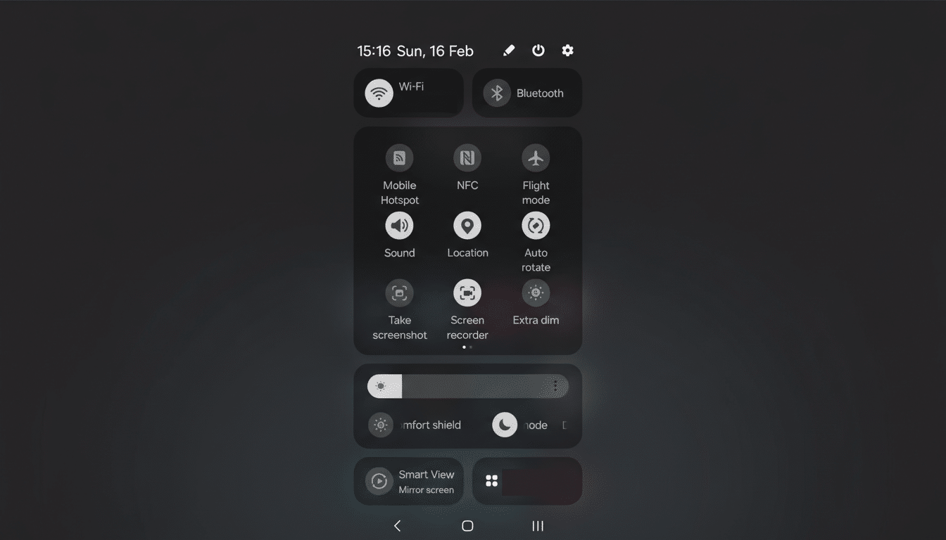
With Android 17 poised to add more translucent surfaces and blurs, several manufacturers are already racing ahead. We’ve seen Samsung revamp Quick Settings layouts to echo iOS-style panels, OPPO and OnePlus add hovering “pill” controls in system apps, and Xiaomi’s Control Center lean heavily into Apple’s visual language. The changes are deliberate, not incidental: they are designed to look familiar to iPhone users at a glance.
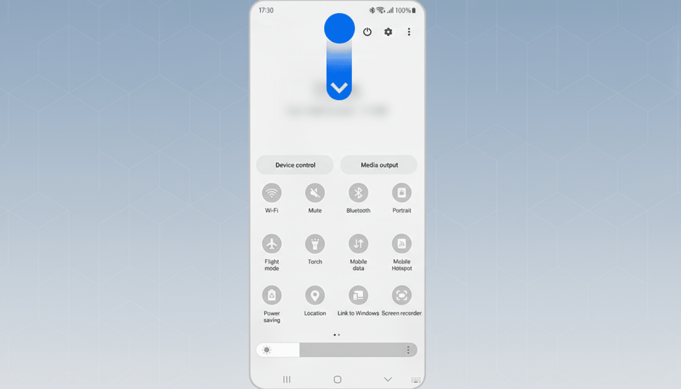
Some of Google’s own tweaks are measured — a more tasteful frosted effect rather than full background bleed — but OEM skins are pushing further. When entire menus, status bars, and in-app toolbars adopt iOS-like forms without adopting iOS’s underlying patterns, users inherit the worst of both worlds: something that looks recognizable but behaves unpredictably.
The commercial incentive is obvious. Counterpoint Research estimates that iOS holds a commanding lead in the U.S. while Android dominates globally, and brands want to siphon switchers by sanding down perceived differences. But conflating aesthetics with loyalty is a misread; Apple’s retention is rooted in consistency and trust, not merely translucency.
Consistency And Cognitive Load Are At Stake
Usability research has warned about this for decades. The Nielsen Norman Group’s “Consistency and Standards” heuristic exists because people rely on mental models. On Android, those models include predictable placement for navigation bars, a clear floating action button for primary tasks, and familiar overflow menus. Material Design and now Material 3 codify these expectations across system and third‑party apps.
When a skin lifts iOS 26’s visual tropes — glassy pills, floating toolbars, relocated toggles — without mapping them to Android-native behaviors, muscle memory breaks. Users spend more time hunting for controls, mis-tap more often, and abandon tasks sooner. In qualitative studies cited by NN/g and Google’s own Android UX guidance, inconsistent patterns reliably increase errors and time-on-task. The cost is real even if the interface looks “premium.”
Accessibility And Performance Take A Hit
Translucency is notoriously hard to get right. Apple’s Human Interface Guidelines and Google’s Material specs both warn against low-contrast blurs that wash out content. The W3C’s WCAG 2.2 calls for a minimum contrast ratio of 4.5:1 for body text — a threshold glassmorphism routinely violates unless designers are disciplined with overlays and shadows.
Beyond readability, heavy blur and transparency are GPU-taxing. Not every midrange device can maintain smooth frame rates while compositing layered backgrounds across notifications, control panels, and in‑app surfaces. The result: microstutter, battery drain, and heat — issues users blame on “Android,” not on a particular skin’s styling choices.
Both platforms offer accessibility toggles like Reduce Transparency and Increase Contrast, but Android’s fractured implementation means those options sometimes don’t reach OEM-skinned components. A visual fad should never override universal access.
Developers And Brands Pay The Price For Skins
For app makers, shifting UI conventions across skins translates into more QA matrices, more device-specific bugs, and more support tickets. Opensignal has long documented the breadth of Android hardware diversity; layering divergent UI patterns on top of that multiplies complexity. A search of public issue trackers at major apps shows recurring OEM-only layout and gesture conflicts after skin updates.
Brands also dilute their identity. One of the reasons Pixel phones punch above their weight in satisfaction surveys is that Google’s design language is coherent and stable. When a manufacturer chases iOS 26 aesthetics this year and something else next year, customers never learn the product’s “grammar.” You can’t clone cachet by cloning chrome.
What Android Should Borrow Instead Of iOS Look
Borrow the principles, not the pixels. If iOS 26 proves anything, it’s that users reward clarity, predictable motion, and sensible defaults. There is room for convergence around fundamentals like legible typography, large touch targets, and thoughtful haptics — all championed in both Material 3 and Apple’s guidelines.
Concretely, OEMs should:
- Keep system navigation and core control locations stable
- Gate heavy transparency behind an easy toggle with accessible defaults
- Publish deprecation schedules for UI changes so developers can prepare
- Contribute upstream components to AOSP so gains benefit the ecosystem, not just a single skin
Android now serves more than 3 billion devices, according to Google. With that scale, small deviations ripple into millions of confused interactions every day. Chasing iOS 26’s look may win a screenshot comparison, but safeguarding consistency, accessibility, and performance is what wins users for life.