The latest YouTube interface change for navigating Google’s video service on Android seems to be going live for everybody; Ergo Apps has the APK available for download if you’re not too keen on waiting. The update redesigns icons, organizes player controls into pill-style groups, and adjusts gestures, leading to immediate comparisons with the web redesign that caused a user storm.
What’s New in the Redesigned YouTube Mobile UI
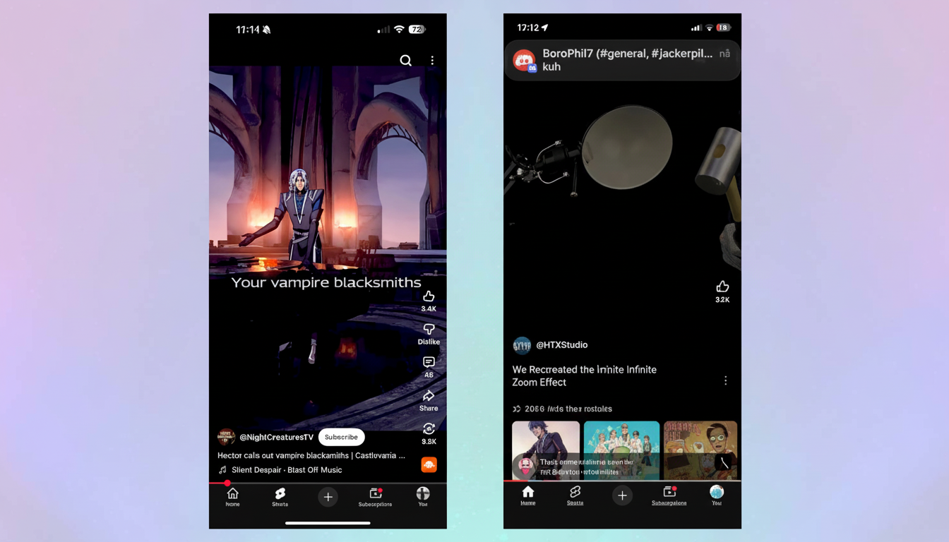
The most dramatic change comes in the video player. Central actions such as like, dislike, share, and download have been moved into rounded containers with higher contrast to make them easier to see and tap. With full-screen mode, the same basic approach is applied, but instead of a bunch of smaller, single lines and narrow, scattered, slender buttons, you get larger, easy-to-hit targets that are banded together rather than floating.
Gestures get a refresh too. Double-tapping to seek is no longer indicated by the familiar triangle chevrons; you’ll see +10 or -10 instead, making quick jumps a little clearer. Beyond the player, thicker, rounder new iconography makes its way through the top bar and bottom navigation for Home, Shorts, Subscriptions, and more, along with refreshed icons across Settings.
A server-side rollout with staged rollouts on Android
Not everyone is going to see the redesign right away. Like most Google apps, it is a server-side rollout, and you may see this change without an update to the YouTube app. A partial refresh is reported by some users—something like only icons or the player UI getting replaced—and you get the rest later.
Early sightings were reported by the app change-tracking site 9to5Google, indicating a phased rollout and a limited number of A/B tests. There isn’t an official switch to go back to the old version, and YouTube hasn’t said it’s making a shutoff available in settings.
Why YouTube is requiring the new look on Android
There are practical reasons for the change beyond aesthetics. Google’s Material Design spec calls for at least 48dp touch targets to prevent mis-taps, and the pill-grouped buttons are no exception to that access-first approach. They make it easier for those with big hands to tap and swipe on bigger screens, and enhance readability at a glance.
There’s also a consistency play. Bringing the web, Android, and iOS experience closer reduces cognitive overhead when switching between devices. The rounded iconography is similar to what’s found elsewhere in Google apps and unifies the brand’s visual language, even if bolder, more “cartoonish” shapes aren’t exactly winning popularity contests so far.
User reaction and backlash factor after redesign
Social posts and community threads trended negatively after the web redesign, with those complaining that the icons were oversized and juvenile. The same is expected for early Android reactions, particularly among long-time users who instinctively interleave muscle memory with basic actions.
The critique isn’t universal. Big, high-contrast targets make it easier for those with motor or visual disabilities and reduce accidental taps, accessibility advocates say. Even small wins in usability can have an impact at an enormous scale: according to YouTube’s publicly shared figures, the service draws more than 2 billion logged-in monthly users worldwide.
Threaded Replies And Other Minor Functional Tweaks
Beyond the visuals, conversation threading in comments is getting deeper. To make it easier to follow conversations without premium access, nested responses are now joined by lines. That shift had been relatively contained, and now it is cascading more broadly across the mobile medium.
None of the bones are moving by themselves, but their weight feels different. The like and dislike buttons are bigger, the download button is more visually prominent, and the share workflow is grouped together. For Shorts, the redesigned icons and large targets are combined with a swipe-heavy design that has become the heart of YouTube’s growth strategy.
What to expect next as YouTube rolls out changes
If you don’t see the redesign already, it’s live or about to be without you needing to do anything. Updating the app might be a fix, but timing is often driven by server-side switches. Historically, YouTube refines controversial changes in baby steps, so you might also see little tweaks to spacing, contrast, or icon shapes as feedback comes in.
What that means exactly is unclear for the time being, but if there’s anything we can tell, it’s a single UI across platforms with more aggressive visuals and larger touch targets. Love it or hate it, that’s the YouTube you will be poking at on Android from now on.