Android 16’s upcoming Quarterly Platform Release is looking not to be just a “beneath-the-hood” fine-tuning. The few early glimpses found in the QPR2 beta show a punchier, higher-contrast color treatment for the home screen Google Search widget body fill, and larger action icons, which bodes well overall.
What changed in QPR2 for Search widget colors and icons
Testers have seen wallpaper-driven color palettes applied to the Search bar, for instance, with a tone that transitions more dynamically between light and dark hues.
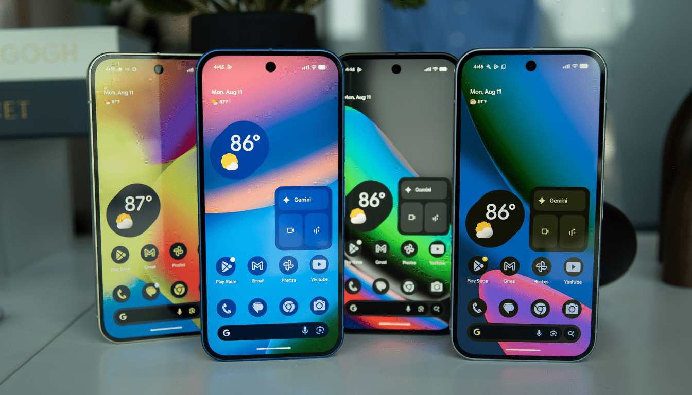
In dark mode, the padding around the field uses a more muted saturation value to tone it down from the tap target and, conversely, in light mode, is at full saturation to punch up contrast.
Icons for mic, Lens, and the AI shortcut also appear even a tad larger and with more distinct hues. That may not seem like much, but a few pixels’ added size and a cleaner break in tone from the background make for fewer mis-taps and more glanceable clarity.
These alterations were originally noted by independent testing communities and have been validated by visual comparisons published by 9to5Google. Although some early color combinations are said to continue to look a little off, that’s the nature of pre-release tuning as Google perfects tonal mapping ahead of becoming generally available.
Why it’s important for usability and accessibility
Contrast is more than aesthetics; it is ergonomics. The Web Content Accessibility Guidelines suggest a ratio of 4.5:1 for normal text and 3:1 for larger elements, and Google’s Material Design guidelines encourage designers to aim for or exceed those. A more saturated accent over a neutral field makes it easier for users to pinpoint and tap quickly on where and what happens next.
There is also a direct interaction benefit. It is a rule of thumb that larger targets are both quicker and more accurate to acquire, corroborated by Fitts’s Law. Even slight enlargements of the mic, Lens, or AI icons can shave time to action and lower error rates, particularly on larger devices where many users are reaching toward the extremities.
A savvy cue, this desaturated padding versus the active field treatment is for all of those who rock dark theme on the millions of devices. It establishes a visual hierarchy that directs the thumb without forcing one to look a second time — small but valuable gains in day-to-day use.
The bigger widget story behind Android 16 QPR2 changes
This update comes as part of Android’s wider Material You evolution. Dynamic color has been able to sample tints of wallpapers and apply them as a theme to system elements since Android 12. The more desaturated tones QPR2 uses on the Search widget imply Google is doubling down not only on what color containers and interactive zones inherit, but how they’re colored.
Third-party widgets might benefit if these refinements lead to clearer guidance and better defaults. Developers who use Jetpack Glance and Material 3 already use dynamic color and can choose from the same color roles that the launcher uses. Better, more uniform tonal mapping would help things like weather tiles and finance widgets look cohesive and legible on any wallpaper.
There is one other thing to watch: forced icon theming. We’re due for QPR2 that’s supposedly going to roll out themed icons more aggressively, and combined with a richer widget palette, home screens could start to feel both cohesive and high contrast. For users, it means less visual noise; for brands, it forces teams to create icons and widget assets that still read properly under many tints.
What to look out for with QPR2 on the horizon
Pre-release builds of the operating system occasionally include color sets that don’t quite work well on every wallpaper. Google will continue to iterate on hue, chroma, and contrast targets as it seeks to balance light and dark extremes in imagery. The Material Design team has been gradually migrating to HCT-based palettes in order to have more perceptually uniform colors, and QPR2 seems to continue this trend.
Developers should trial their widgets against both light and dark themes with dynamic color enabled on the device, check contrast against WCAG thresholds, and ensure touch targets meet Material Design guidance of 48 dp. Users, in the meantime, can expect a poppier Search widget on light wallpapers that recedes when it ought in dark mode and serves up larger, more finger-friendly actions as well.
With Google’s Android ecosystem surpassing 3B active devices and subtle changes to UI being pushed, the impact is far-reaching. If QPR2’s color upgrade makes the cut, not only will it beautify the Search bar, it will also do so silently, establishing a new benchmark for how Android widgets find that sweet spot between personality and legibility.